Overview
This article covers how to use Jinja Templating to retrieve a time grain filter selection that can be used directly in a Virtual Dataset's SQL query:
The Process
This process consists of 3 steps:
- Create or edit your Virtual Dataset.
- Create a Chart and add it to a Dashboard.
- Configure the Dashboard and filters.
Let's have a closer look at each step.
Step 1: Create or edit your Virtual Dataset
For this example, we'll use the Vehicle Sales table from the examples database.
Consider the query below:
SELECT
date_trunc(
{%- if time_grain == 'P1D' -%}
'day'
{%- elif time_grain == 'P1W' -%}
'week'
{%- elif time_grain == 'P1M' -%}
'month'
{%- elif time_grain == 'P3M' -%}
'quarter'
{%- elif time_grain == 'P1Y' -%}
'year'
{%- elif time_grain == 'P1Y' -%}
'year'
{% else %}
'month'
{%- endif -%}
, order_date) as order_date
,sales
,product_line
FROM "Vehicle Sales"
group by date_trunc(
{%- if time_grain == 'P1D' -%}
'day'
{%- elif time_grain == 'P1W' -%}
'week'
{%- elif time_grain == 'P1M' -%}
'month'
{%- elif time_grain == 'P3M' -%}
'quarter'
{%- elif time_grain == 'P1Y' -%}
'year'
{%- elif time_grain == 'P1Y' -%}
'year'
{% else %}
'month'
{%- endif -%}
,order_date)
,sales
,product_line
A Virtual Dataset created using this query will have three columns: order_date, sales and product_line. This is a simple example where the dashboard filter is applied to the inner query, rather than the outer dataset query.
The if statement sections handle the time_grain logic. In this example, month is set as the default time grain.
To execute this query in SQL Lab:
- Access your Workspace.
- Navigate to SQL > SQL Lab.
- Make sure the examples connection is selected.
- Paste the query and click RUN.
.png)
This is the produced SQL query:
-- 6dcd92a04feb50f14bbcf07c661680ba
SELECT
  DATE_TRUNC('MONTH', order_date) AS order_date,
  sales,
  product_line
FROM "Vehicle Sales"
GROUP BY
  DATE_TRUNC('MONTH', order_date),
  sales,
  product_line
LIMIT 1001
-- 6dcd92a04feb50f14bbcf07c661680ba
Click CREATE CHART to build a chart from this query.
Step 2: Create a Chart and add it to a Dashboard
In the Chart Builder, create a table chart using the default configurations:
- Click SAVE in the top right corner.
.png)
- Name your chart and also create a dashboard to it:
.png)
- Click the SAVE & GO TO DASHBOARD button.
Step 3: Configure the Dashboard and filters
The dashboard will open in your browser. Here are the steps to configure the filter:
- Click on the right arrow to expand the Filter menu.
.png)
- Click the Cog icon and Add or edit filters and controls
.png)
- In the Filter Type field, select "Time grain", and in the Filter Name field, enter a name for the filter.
- In the Dataset field, select the dataset created in Step 1.
- Navigate to the Scoping tab and make sure the filter is mapped to the chart that was added to the dashboard.
- Click Save.
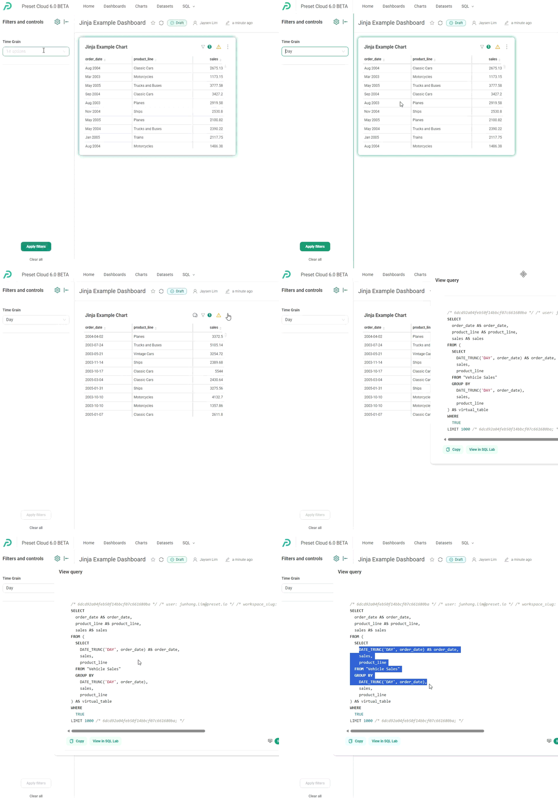
Great work! Now, let's see the filter in action: