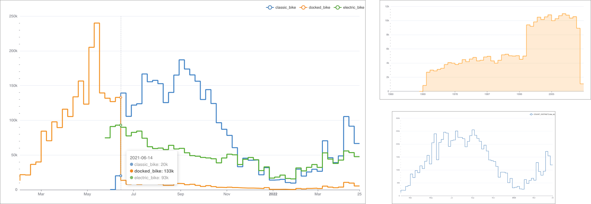
The Stepped Line chart excels at showcasing change over time, especially for continuous values. Here are some examples:
Reference Content
If you're new to visualizing data in Preset, we recommend the following reference articles:
- Creating a Chart: A walkthrough of the overall process of chart selection and creation.
- Using Preset Chart Builder: How to work with the Chart Builder page, the primary interface used when creating a chart.
Creating a Stepped Line Chart
To create a Stepped Line chart, you need to define the following values:
- the column you want as the X-axis
- the metric(s) you want to visualize on the Y-axis
- the column(s) you want the metric(s) to be grouped / categorized by
These are all defined in the Data tab within Chart Builder.
Simple Stepped Line Chart (no dimensions)
Below is a very simple stepped line chart that shows a single metric varying over time.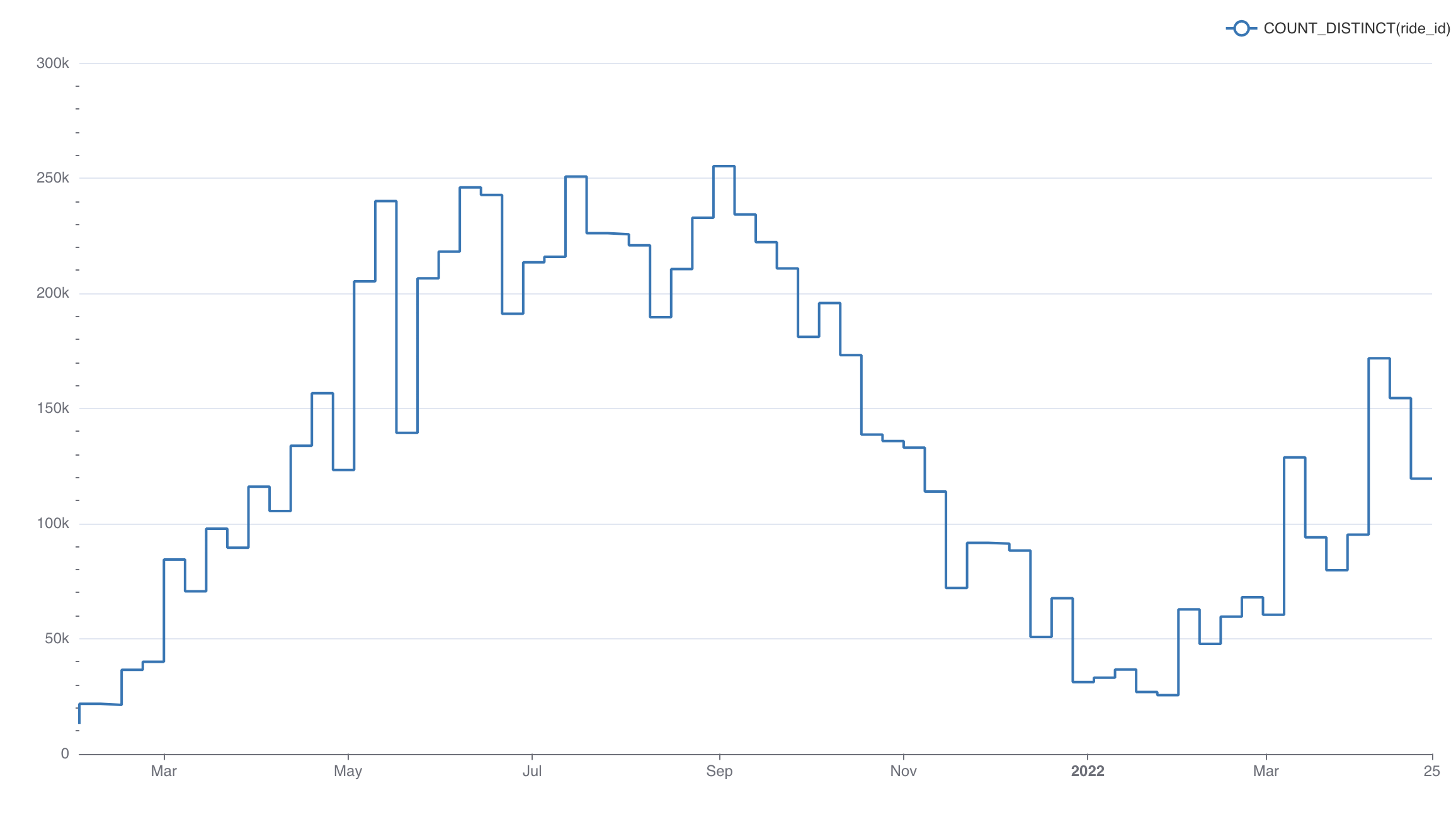
Here's an explanation of the selections we made in the chart builder interface to generate this chart.
.png) | Temporal X-axis
|
.png) | Metric(s) on Y-axis
|
Here's the SQL query that Preset generated:
SELECT DATE_TRUNC('DAY', started_at) AS "started_at",
       count(DISTINCT ride_id) AS "COUNT_DISTINCT(ride_id)"
FROM dbt_smukherjee.citibike_trips
WHERE started_at >= '2022-04-01 00:00:00.000000'
  AND started_at < '2022-05-01 00:00:00.000000'
GROUP BY DATE_TRUNC('DAY', started_at)
ORDER BY "COUNT_DISTINCT(ride_id)" DESC
LIMIT 10000
This hopefully helps you understand the mapping from the chart builder options above to the final generated SQL query.
Stepped Line Chart (with dimensions)
Below is a similar chart to the one above but with a dimension (bike type) added.
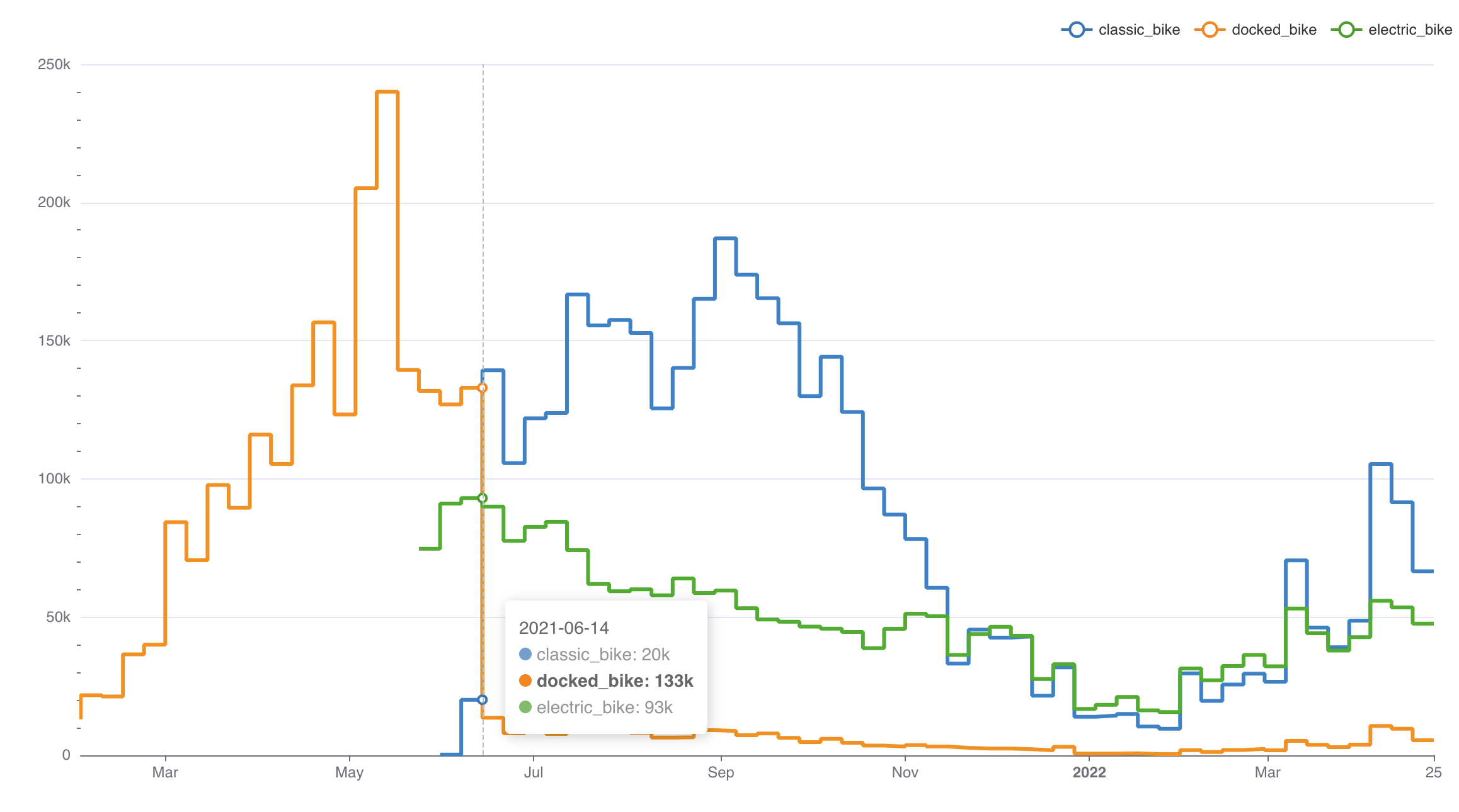
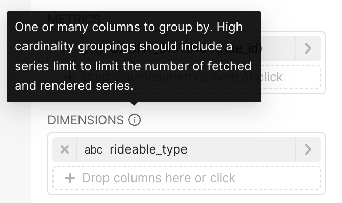
To generate this chart, we re-used the same selections from the first chart but made the following, additional selections:
 | Dimensions
|
Here's the SQL query that Preset generated:
SELECT DATE_TRUNC('DAY', started_at) AS "started_at",
       rideable_type AS "rideable_type",
       count(DISTINCT ride_id) AS "COUNT_DISTINCT(ride_id)"
FROM dbt_smukherjee.non_member_trips
GROUP BY DATE_TRUNC('DAY', started_at),
         rideable_type
ORDER BY "COUNT_DISTINCT(ride_id)" DESC
Advanced Analytics
As with most visualizations in Preset, the Stepped Line Chart supports Advanced Analytics features like: