Theming is in Gradual Rollout
Theming is currently available to select teams and will be rolling out to more teams in the coming weeks.
To see where the theming tokens are used in Preset, view our library of tokens and see the effects of each token.
TL;DR
Token | Purpose |
|---|---|
Brand + primary actions | |
Positive outcomes | |
Caution, attention | |
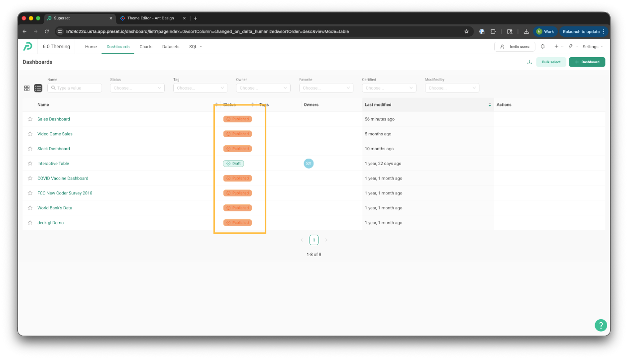
Failure, danger | |
Neutral information | |
Default link text | |
Default foreground text | |
Default background |
colorPrimary
The core brand color.
Drives the visual identity of primary UI elements
Used for:
Primary buttons
Active states
Represented by orange in screenshots
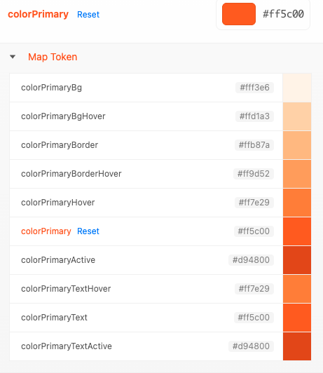
Note: The following Map Tokens inherit a gradient of the parent colorPrimary token
colorPrimaryBgHover
colorPrimaryBorder
colorPrimaryBorderHover
colorPrimaryActive
colorPrimaryTextHover
colorPrimaryText
colorPrimaryTextActive
colorSuccess
Represents successful or positive states.
Used for:
Success alerts
Success messages
Validation success states
Success icons
Typically a green tone, but brand-adjustable (Represented by orange in screenshots)
Note: The following Map Tokens inherit a gradient of the parent colorSuccess token
colorSuccessBg
colorSuccessBgHover
colorSuccessBorder
colorSuccessBorderHover
colorSuccessHover
colorSuccessActive
colorSuccessTextHover
colorSuccessText
colorSuccessTextActive
.png)
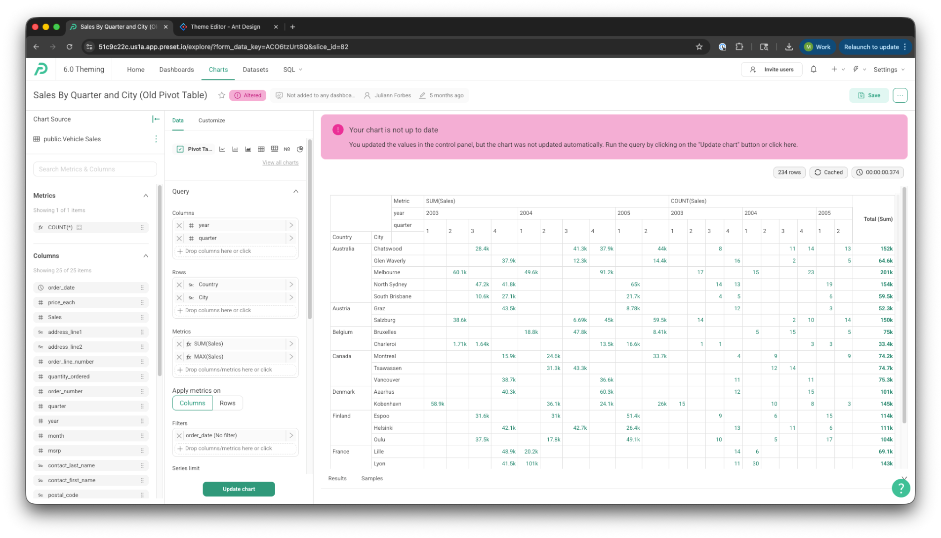
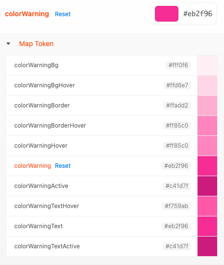
colorWarning
Represents caution or potential risk.
Used for:
Warning alerts
Non-blocking validation warnings
Status indicators that need attention
Often a yellow or amber tone (represented by pink in the screenshots)
Indicates “be aware,” not failure
Note: The following Map Tokens inherit a gradient of the parent colorWarning token
colorWarningBg
colorWarningBgHover
colorWarningBorder
colorWarningBorderHover
colorWarningHover
colorWarning
colorWarningActive
colorWarningTextHover
colorWarningText
colorWarningTextActive
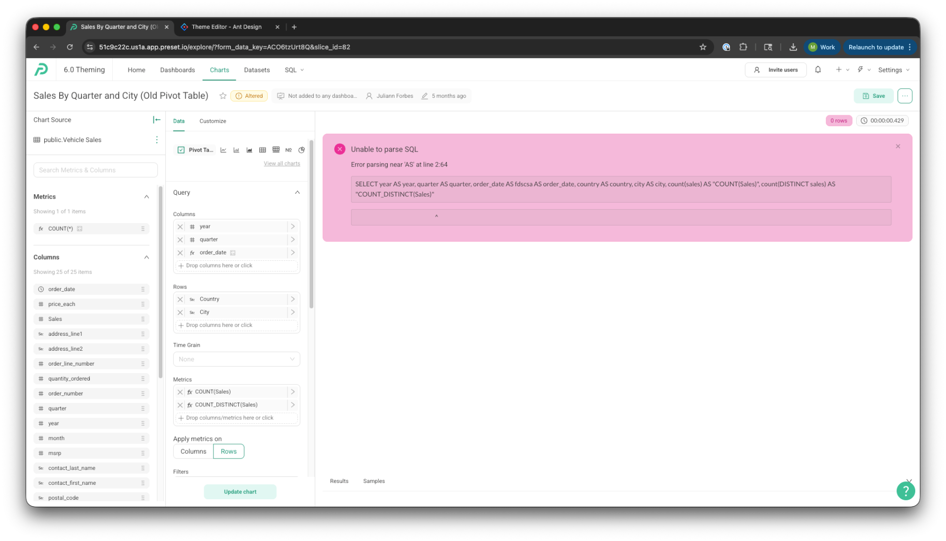
colorError
Represents errors or destructive states.
Used for:
Error alerts
Validation failures
Destructive actions
Error text and icons
Commonly red (represented by pink in screenshots)
Strong visual emphasis to signal something is wrong
Note: The following Map Tokens inherit a gradient of the parent colorError token
colorErrorBg
colorErrorBgHover
colorErrorBorder
colorErrorBorderHover
colorErrorHover
colorErrorActive
colorErrorTextHover
colorErrorText
colorErrorTextActive
.png)
colorLink
The default color for text links.
Used for:
Inline links
Anchor elements
Clickable text actions
By default, often equals [colorPrimary]
Optimized for readability and accessibility in text contexts
Represented by orange in screenshots
.gif)

Note: The following Map Tokens inherit a gradient of the parent colorLink token.png)
colorLinkHover
The color applied to links on hover.
Typically:
Slightly darker or more saturated
Provides clear interactive feedback without overpowering surrounding text

colorLinkActive
The color applied to links while actively clicked or pressed.
Represents the “pressed” interaction state
Usually darker or more intense than hover
Ensures consistent interaction feedback across browsers and devices
Seed Text Color
The base foreground (text) color. (colorTextBase)
Used for:
Primary text
Secondary text
Disabled text
.png)

Seed Background Color
The base background color of the application. (colorBgBase)
Used for:
Layout backgrounds
Cards
Popovers
Containers
.png)
