Customize the appearance of your Preset workspace and dashboards with token-based theming. Create branded experiences that align with your organization's visual identity.
Overview
Preset uses Ant Design v5's token-based theming system, allowing you to customize colors, typography, spacing, and component styling across your workspace. You can create multiple themes and apply them at different levels:
- Workspace-wide themes: Set default and dark mode themes for your entire workspace
- Dashboard-specific themes: Apply themes to individual dashboards
- Chart customizations: Fine-tune ECharts visualizations within your themes (chart styling is configured at the theme level and applies wherever that theme is used—workspace-wide or on specific dashboards)
Themes in Preset are the recommended approach for customization, as they're more maintainable and less brittle than CSS overrides.
Looking for inspiration? Check out our Theme Gallery for pre-built themes you can copy and customize for your workspace.
Creating a New Theme
Permissions required: Workspace Admin
Step 1: Design Your Theme
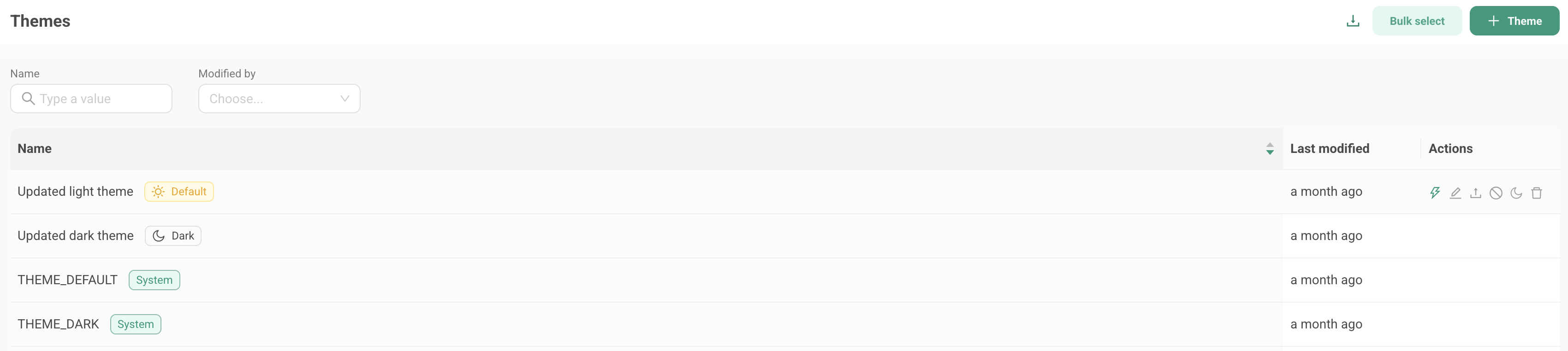
- Navigate to Settings > Themes in Preset
- Click + Theme to create a new theme
- Open the Ant Design Theme Editor in a new tab
- Design your theme by customizing:
- Colors: Primary colors, success/warning/error states, and backgrounds
- Typography: Font families, sizes, and weights
- Components: Buttons, inputs, cards, and other interface elements
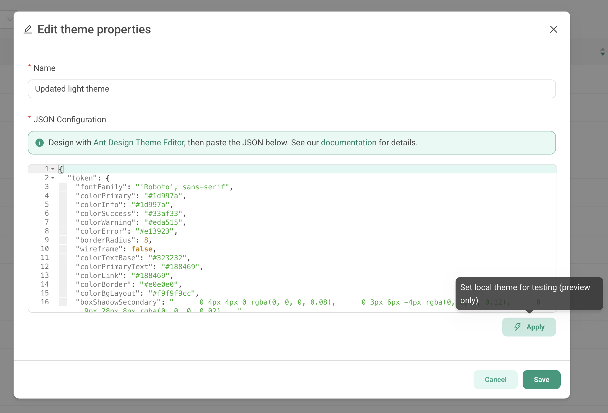
- When finished, click the Config button in the theme editor
- Copy the JSON configuration from the modal
For more information on tokens used in the theme editor, visit our Theming Token Library.
Step 2: Add your Theme into Preset
- Return to Preset and paste the JSON into the theme definition field
- Give your theme a descriptive name (e.g., "Corporate Brand - Light")
- Click Add
Your theme is now available to use in your workspace.
Preset-Specific Tokens
In addition to standard Ant Design tokens, you can extend your theme with Preset-specific customizations:
Brand Logo:
json
{
  "token": {
      "brandLogoUrl": "https://preset-assets-production.s3.us-west-2.amazonaws.com/logo_p.png",
      "brandLogoAlt": "Company Logo",
      "brandLogoHref": "https://manage.app.preset.io",
      "brandLogoHeight": "42px",
      "brandLogoMargin": "4px 8px 4px 16px",
      "brandIconMaxWidth": "150px"
  }
}
Note: Logos customized in themes will override any team logo that you had previously set.
Custom Spinner:
json
{
  "token": {
      "brandSpinnerUrl": "https://example.com/spinner.gif",
      "brandSpinnerSvg": "https://example.com/spinner.svg"
      }
}
Custom Fonts:
Set your brand's font family using the fontFamily token:
json{
  "token": {
    "fontFamily": "Roboto, sans-serif"
  }
}
Note: Custom fonts must be web-accessible (e.g., Google Fonts or self-hosted). If a font isn't available in the user's browser, the fallback font will be used.
Preset also provides additional font size and weight tokens beyond the standard Ant Design options, giving you finer control over typography:
json{
  "token": {
    "colorPrimary": "#2893B3",
    "fontFamily": "Inter, sans-serif",
    "fontSizeXS": "11px",
    "fontSizeXXL": "32px",
    "fontWeightNormal": 400,
    "fontWeightLight": 300,
    "fontWeightStrong": 600
  }
}
| Token | Description |
|---|---|
fontSizeXS |
Extra-small font size (e.g., captions, labels) |
fontSizeXXL |
Extra-extra-large font size (e.g., page titles) |
fontWeightLight |
Light font weight |
fontWeightNormal |
Normal/regular font weight |
fontWeightStrong |
Bold/strong font weight |
Dashboard Status Labels
| Token | Description |
|---|---|
labelPublishedColor |
Text color for the "Published" label |
labelPublishedBg |
Background color for the "Published" label |
labelPublishedBorderColor |
Border color for the "Published" label |
labelPublishedIconColor |
Icon color for the "Published" label |
labelDraftColor |
Text color for the "Draft" label |
labelDraftBg |
Background color for the "Draft" label |
labelDraftBorderColor |
Border color for the "Draft" label |
labelDraftIconColor |
Icon color for the "Draft" label |
Dataset Type Labels
| Token | Description |
|---|---|
labelDatasetPhysicalColor |
Text color for the "Physical" dataset label |
labelDatasetPhysicalBg |
Background color for the "Physical" dataset label |
labelDatasetPhysicalBorderColor |
Border color for the "Physical" dataset label |
labelDatasetPhysicalIconColor |
Icon color for the "Physical" dataset label |
labelDatasetVirtualColor |
Text color for the "Virtual" dataset label |
labelDatasetVirtualBg |
Background color for the "Virtual" dataset label |
labelDatasetVirtualBorderColor |
Border color for the "Virtual" dataset label |
labelDatasetVirtualIconColor |
Icon color for the "Virtual" dataset label |
Secondary Button
| Token | Description |
|---|---|
buttonSecondaryColor |
Text color for secondary buttons |
buttonSecondaryBg |
Background color for secondary buttons |
buttonSecondaryBorderColor |
Border color for secondary buttons |
buttonSecondaryHoverColor |
Text color on hover |
buttonSecondaryHoverBg |
Background color on hover |
buttonSecondaryHoverBorderColor |
Border color on hover |
buttonSecondaryActiveColor |
Text color when active/pressed |
buttonSecondaryActiveBg |
Background color when active/pressed |
buttonSecondaryActiveBorderColor |
Border color when active/pressed |
Step 3: Test Your Theme
Before applying a theme workspace-wide, you can preview it locally:
-
From the Theme Creation Modal: Click the ⚡ Apply button to test the theme
-
From the Themes Page: Hover over any theme and click the ⚡ icon
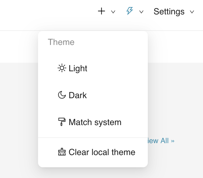
This applies the theme just for you, not for other users in the workspace. To remove the test theme, use the theme picker in the top right corner and select Clear local theme.
Setting Workspace Themes
System Default Theme
Click the sun icon (☀️) on any theme to set it as the workspace-wide default theme. This theme will be applied to all users who haven't selected a different theme.
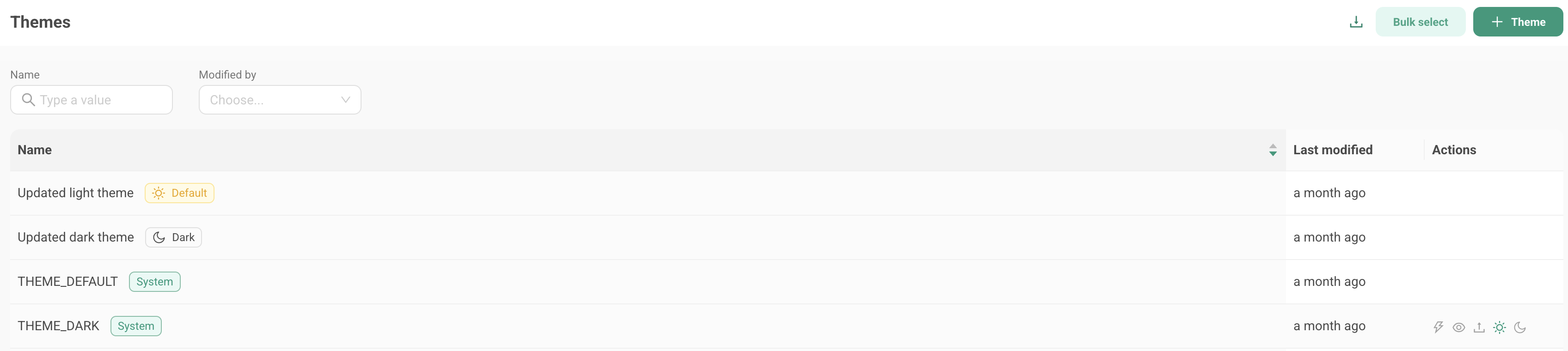
System Dark Theme
Click the moon icon (🌙) on any theme to set it as the workspace dark mode theme. This theme will be applied to all users who are using the Preset workspace in dark mode.
Managing Workspace Level Themes
- Default and dark modes set by the Workspace Admin are indicated with badges in the theme list.
- System themes created by Preset are also indicated with special badges in the theme list. These themes can be viewed but not edited, and will be the fallback theme in rare cases where custom themes can't be loaded.
- Only one default theme and one dark theme can be active at a time
User Light and Dark Theme Selection
Users can control their individual theme preference using the theme picker in the top right corner. Users have three options:
- Light: Always use the workspace default (light) theme
- Dark: Always use the workspace dark theme
- Match System: Automatically switch between light and dark themes based on their system preferences
This allows each user to customize their viewing experience while maintaining consistent branding across the workspace.
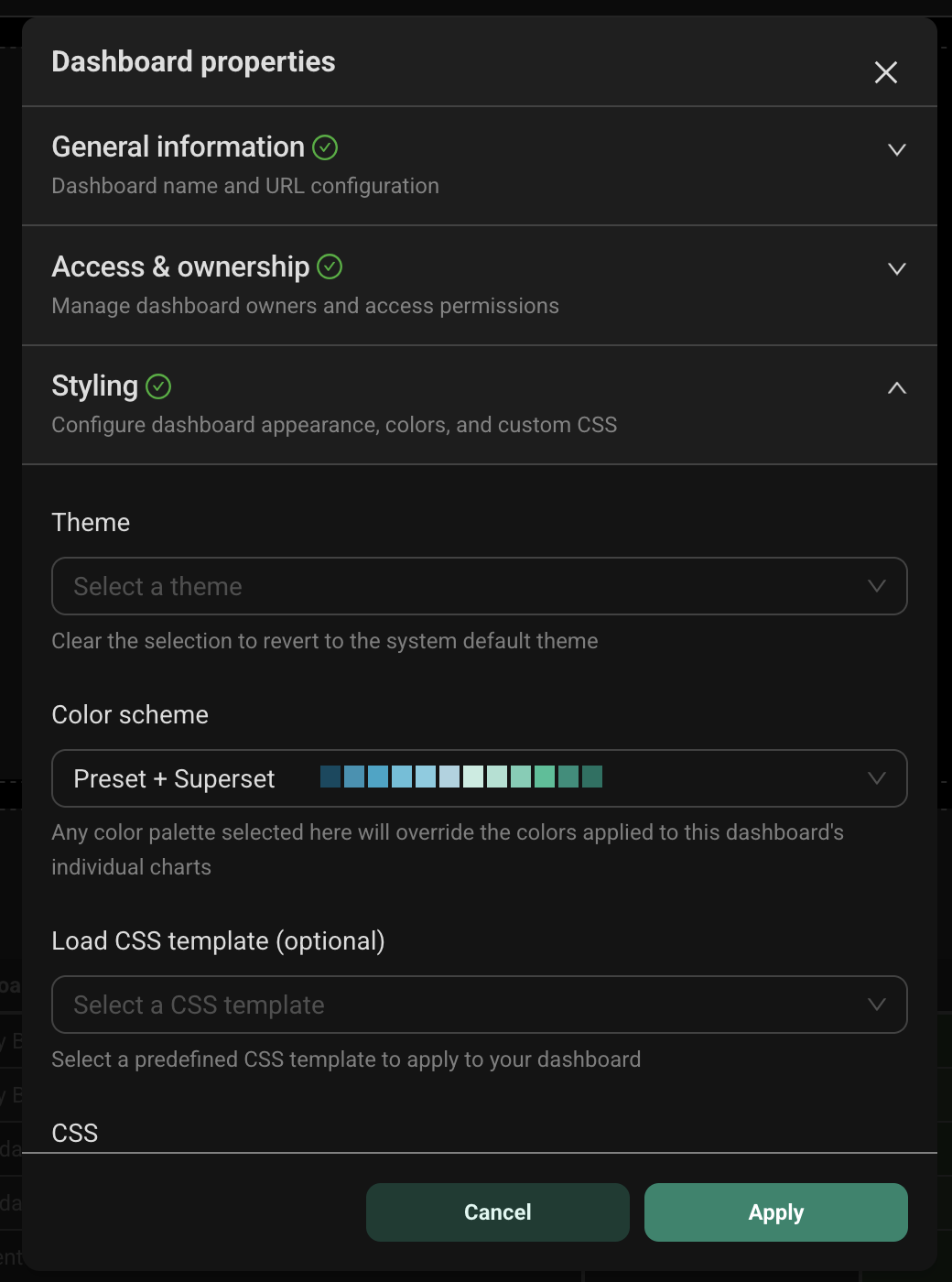
Applying Themes to Dashboards
Once created, themes can be applied to individual dashboards for branded or context-specific styling:
- Navigate to your dashboard and click Edit dashboard
- Click the ... menu in the top right corner
- Select Edit properties
- Expand the Styling section
- Choose your custom theme from the Theme dropdown
- Click Save to apply the changes
Note: Dashboard themes only affect the dashboard view, not the Preset UI navigation or other interface elements.
Customizing Chart Visualizations
You can customize the appearance of ECharts-based visualizations (listed below) directly in your theme configuration. This applies your styling to all charts of that type, so you don't need to modify each chart individually.
| Chart Type |
|---|
| Area Chart |
| Bar Chart |
| Big Number |
| Big Number with Trendline |
| Box Plot |
| Bubble Chart |
| Funnel Chart |
| Gantt Chart |
| Gauge Chart |
| Generic Chart |
| Graph Chart |
| Heatmap |
| Histogram |
| Line Chart |
| Mixed Chart |
| Pie Chart |
| Radar Chart |
| Sankey Chart |
| Scatter Plot |
| Smooth Line |
| Stepped Line |
| Sunburst Chart |
| Tree Chart |
| Treemap |
| Waterfall Chart |
Global Chart Overrides
Apply settings to all
visualizations by adding echartsOptionsOverrides to your theme. For example:
{
  "token": {
    "colorPrimary": "#2893B3",
    "echartsOptionsOverrides": {
      "grid": {
        "left": "10%",
        "right": "10%",
        "top": "15%",
        "bottom": "15%"
      },
      "tooltip": {
        "backgroundColor": "rgba(0, 0, 0, 0.8)",
        "borderColor": "#ccc",
        "textStyle": {
          "color": "#fff"
        }
      },
      "legend": {
        "textStyle": {
          "fontSize": 14,
          "fontWeight": "bold"
        }
      }
    }
  }
}
Chart-Specific Overrides
Target specific chart types using echartsOptionsOverridesByChartType, as in the example below:
{
  "token": {
    "colorPrimary": "#2893B3"
    "echartsOptionsOverridesByChartType": {
      "pie": {
        "legend": {
          "orient": "vertical",
          "right": 10,
          "top": "center"
        }
      },
      "echarts_timeseries_line": {
        "xAxis": {
          "axisLabel": {
            "rotate": 45,
            "fontSize": 12
          }
        }
      },
      "bubble_v2": {
        "grid": {
          "left": "15%",
          "bottom": "20%"
        }
      }
    }
  }
}
When global ECharts overrides and chart specific overrides are defined, the chart specific overrides will take precedence.
The following charts support chart-specific overrides:
| Chart Type | Token Name |
|---|---|
| Bar Chart | echarts_timeseries_bar |
| Area Chart | echarts_area |
| Line Chart | echarts_timeseries_line |
| Pie Chart | pie |
| Big Number with Trendline | big_number |
| Big Number | big_number_total |
| Scatter Plot | echarts_timeseries_scatter |
| Generic Chart | echarts_timeseries |
| Gantt Chart | gantt_chart |
| Graph Chart | graph_chart |
| Funnel Chart | funnel |
| Mixed Chart | mixed_timeseries |
| Bubble Chart | bubble_v2 |
| Radar Chart | radar |
| Waterfall Chart | waterfall |
| Sankey Chart | sankey_v2 |
| Gauge Chart | gauge_chart |
| Sunburst Chart | sunburst_v2 |
| Tree Chart | tree_chart |
| Treemap | treemap_v2 |
| Smooth Line | echarts_timeseries_smooth |
| Histogram | histogram_v2 |
| Stepped Line | echarts_timeseries_step |
| Box Plot | box_plot |
| Heatmap | heatmap_v2 |
Import & Export of Themes
To share a theme with another workspace or export it for backup:
- Navigate to Settings > Themes
- Click the export icon on the theme you want to copy
- A YAML file will be downloaded
- Extract the JSON configuration from the YAML file
- Import it into your target workspace by clicking the import button on the Themes page
Dashboard CSS (Legacy Method for Customization)
While themes are the recommended approach, you can still use CSS for dashboard customization. However, CSS is more brittle and may break with future updates.
If you have CSS applied to a dashboard, it will override the theme configuration for that dashboard. For more information on using CSS with theming, see CSS and Theming.
Theming for Embedded Dashboards
Embedded dashboards in Preset support dynamic theme configuration, allowing host applications to control the appearance of embedded content.
Configuring Embedded Themes
When embedding a dashboard, you can specify theme configurations in the embedded SDK. For example:
embedDashboard({
  id: "dashboard-id",
  supersetDomain: "https://your-instance.example.com",
  mountPoint: document.getElementById("dashboard"),
  fetchGuestToken: () => fetchToken(),
}).then((dashboard) => {
  dashboard.setThemeConfig({
    theme_default: {
      token: {
        colorPrimary: "#2893B3",
        fontFamily: "Inter, sans-serif"
      }
    },
    theme_dark: {
      algorithm: "dark",
      token: {
        colorPrimary: "#2893B3"
      }
    }
  });
});
Best Practices
Theme Design
- Start with global Echart overrides for consistent styling across all charts
- Use chart-specific overrides only when a visualization type requires unique styling
- Test in both light and dark modes before setting a theme as your default light or dark theme. Use the "Set local theme" option to test.
- Document your customizations to help team members understand your theme choices
Creating Dark Mode Themes
To design themes that work well in both light and dark modes:
- Use contrasting bold colors that maintain visibility in both modes
- Avoid pure black (#000000) and pure white (#FFFFFF) - use slightly softer shades for better readability
- Test iteratively using the Ant Design Theme Editor's preview feature
- Consider accessible contrast ratios (WCAG AA standard recommends 4.5:1 for normal text)
- Use the theme editor's algorithm property - set to
"dark"for dark themes to automatically adjust component colors
Example dark theme configuration:
{
  "algorithm": "dark",
  "token": {
    "colorPrimary": "#1890ff",
    "colorBgBase": "#141414",
    "colorTextBase": "#e8e8e8"
  }
}
API Access
For programmatic theme management, Preset provides REST endpoints:
GET /api/v1/theme/- List all themesPOST /api/v1/theme/- Create a new themePUT /api/v1/theme/{id}- Update a themeDELETE /api/v1/theme/{id}- Delete a themePUT /api/v1/theme/{id}/set_system_default- Set as system default theme (admin only)PUT /api/v1/theme/{id}/set_system_dark- Set as system dark theme (admin only)DELETE /api/v1/theme/unset_system_default- Remove system default designationDELETE /api/v1/theme/unset_system_dark- Remove system dark designationGET /api/v1/theme/export/- Export themes as YAMLPOST /api/v1/theme/import/- Import themes from YAML
These endpoints require appropriate permissions and are subject to role-based access controls (RBAC).