Overview
Datasets that you add to Preset from your database can be customized to more closely align with your unique audience, such as defining availability of data in fields, specifying date formats, and changing labels. Within each dataset you can modify its metrics, columns, and also create calculated columns.
In this article we will discuss how to make these change and customize your dataset so that it can better serve your audience.
Access Dataset Details
Changing dataset settings is done via the Edit Dataset panel. This is accessible from two locations on Preset: the Datasets page and the Explore page.
Changing Settings
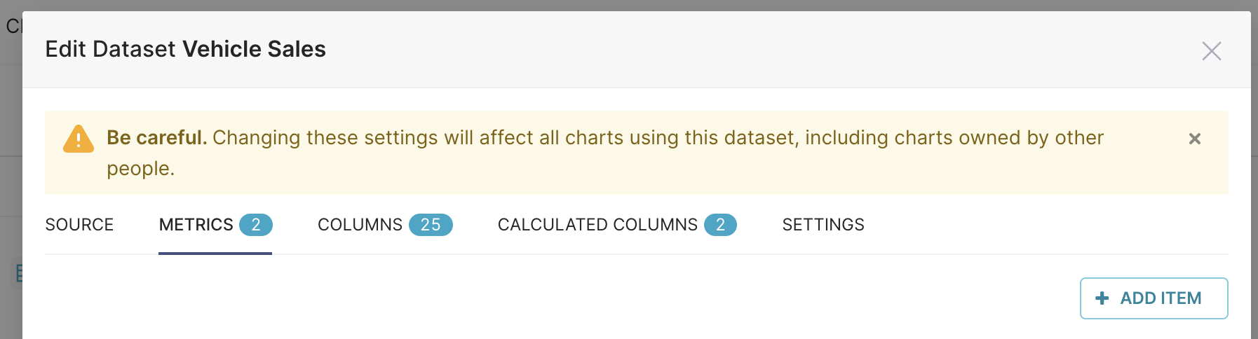
Changing a metric's settings will affect all charts using this dataset, including charts owned by other people.
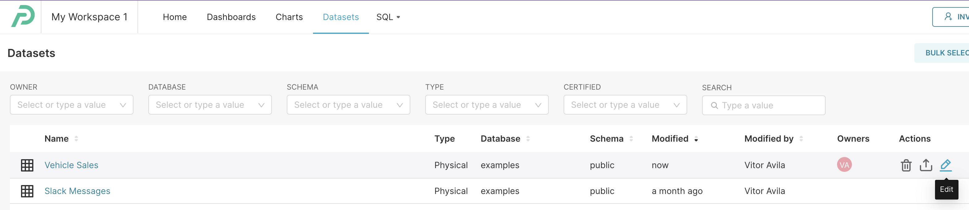
Via the Datasets Page
In the Toolbar, navigate to Datasets. The Datasets page will appear.
This page features a table that lists all of your datasets. To edit a dataset, simply hover your cursor over a dataset row and, under the Actions column header on the right, select the pencil Edit icon. The Edit Dataset panel will appear.
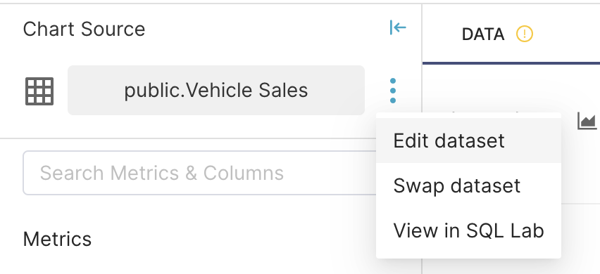
Via the Explore Page
The Edit Dataset panel can also be launched via the Explore page when exploring a chart. In the Dataset panel, on the far left, select the ellipsis icon and then select Edit dataset.
Source
In the Source tab, you can manage the source powering your dataset. It's possible to specify the type (Physical or Virtual), and also map it to a database and schema.
For Physical Datasets, users can specify the table powering it. For Virtual Datasets, it's possible to set a title and a SQL query to power it.
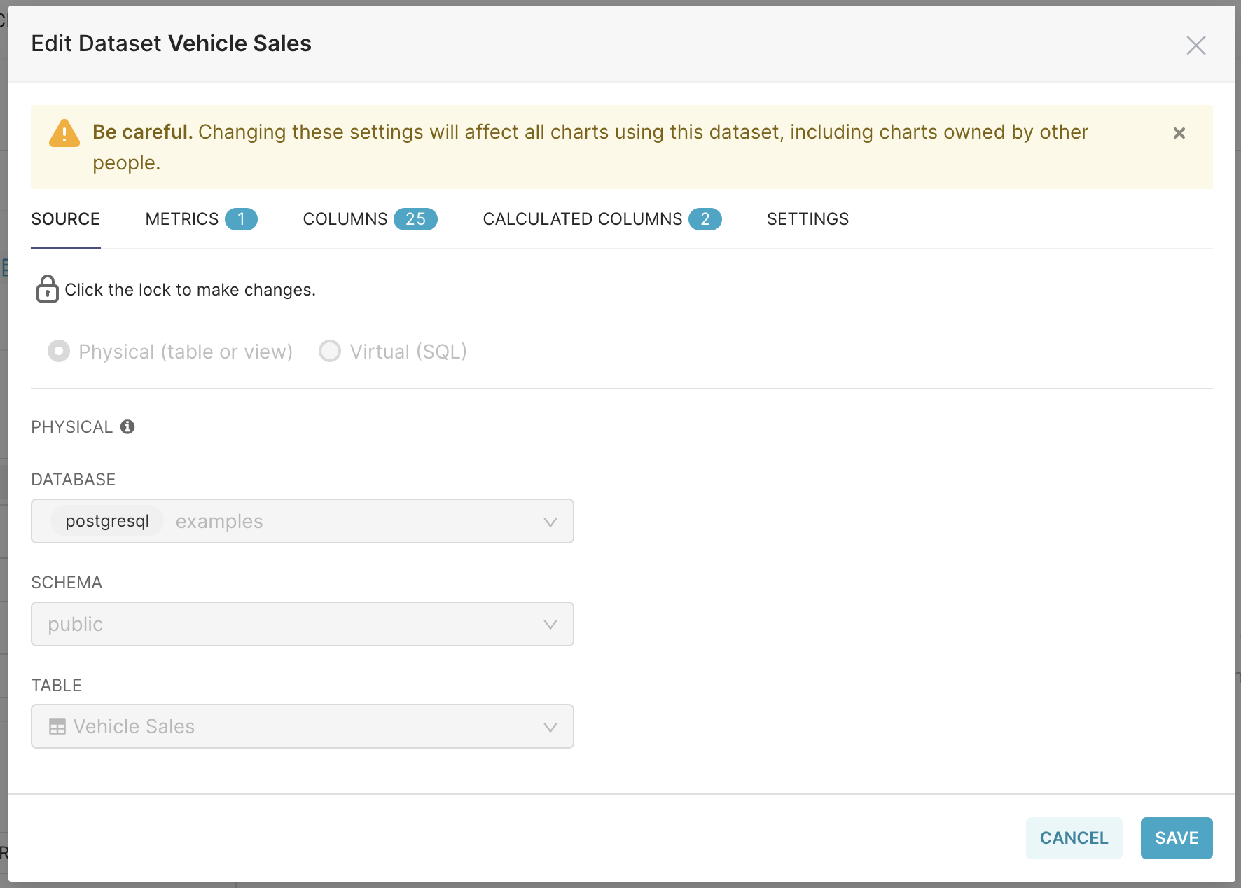
To prevent un-intentional changes, users need to click on the padlock icon to modify these settings.
Metrics
Metrics are used to perform operations with a set of data (i.e., applies to more than 1 row). They are predominantly used for:
Calculations based on aggregation
Calculations to pivot rows to columns
Metrics are replaced by a SQL expression in a SQL statement, but defined metrics are not available in SQL Lab.
To begin, select the Metrics tab.
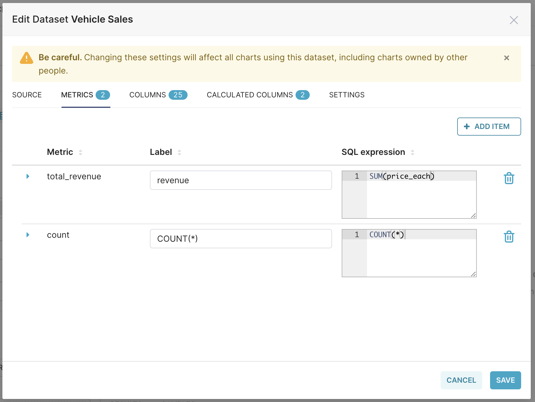
A listing of all metrics within the dataset are displayed as a table. Fields directly editable on the table include:
Metric: The name of the metric.
Label: Text field that displays as the metric's label — this is what the user sees as the metric's name.
SQL Expression: The SQL expression associated with the metric — this appears as a tooltip when the user hovers over the question mark "?" icon.
To edit other fields associated with the metric, select the expansion arrow on the left side of the metric row.
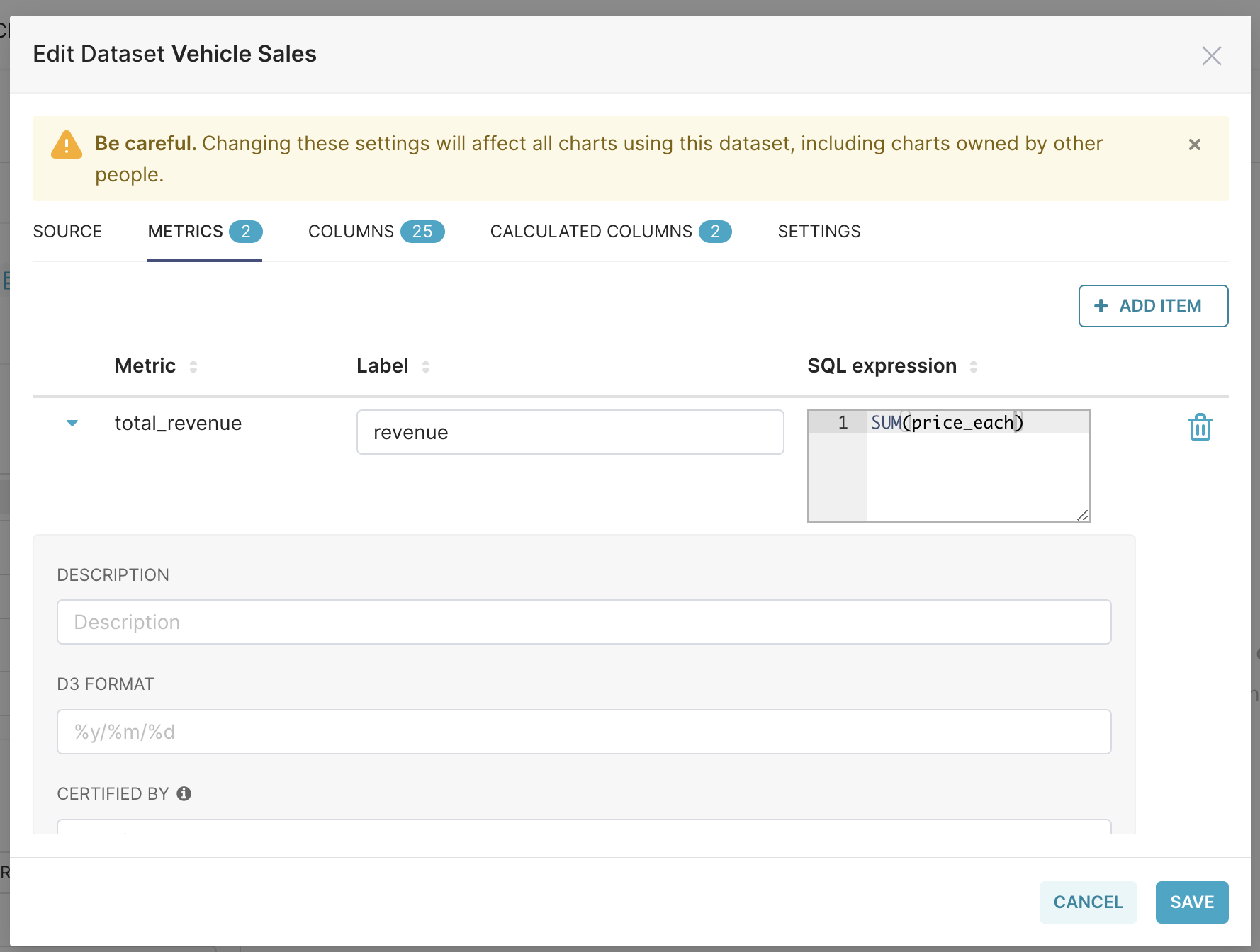
Editable fields here include:
Label: Text field that displays as the metric's label — this is what the user sees as the metric's name (same editable field in collapsed metric row).
Description: A short description of the metric — this appears as a tooltip when the user hovers over the letter "i" icon.
D3 Format: Format values based on the D3 format. Example:
Given a value of 1234.567
.2% = 123456.7%
.2k = 1K
,.2r = 1,200
Metric Currency:
Prefix / Suffix: Choose whether the currency symbol should appear before (Prefix) or after (Suffix) the number
Currency:Either select a currency from the drop-down or type the three letter abbreviation for the currency (example "AUD" for the Australian Dollar)
Currency formatting is supported in the following chart types:
Table
Pivot Table
Big Number
Big Number with Trendline
Series Echarts
Pie
Gauge
Funnel
Treemap
Certified By: Name of certifying organization/person.
Certfication Details: Details about the certification.
Warning: A warning message that, if defined, appears in the Metric selection field.
Adding a Metric
To add a new metric, select + Add Item.
...a new row will appear, named <new metric>.
To define details, expand the new row. Complete all fields based on the field descriptions above, starting with selecting <new metric> and changing the name, as needed.
When done, select Save.
To see examples of defined metrics, please read Using Metrics and Calculated Columns.
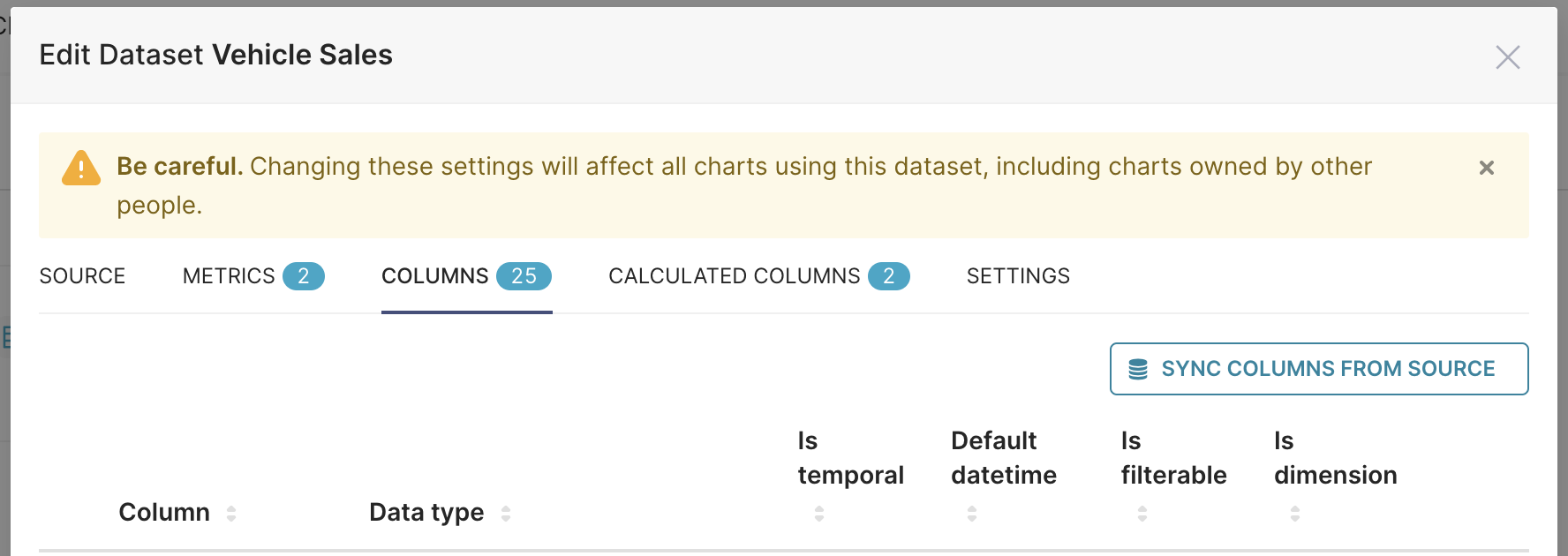
Columns
Now, select the next tab: Columns.
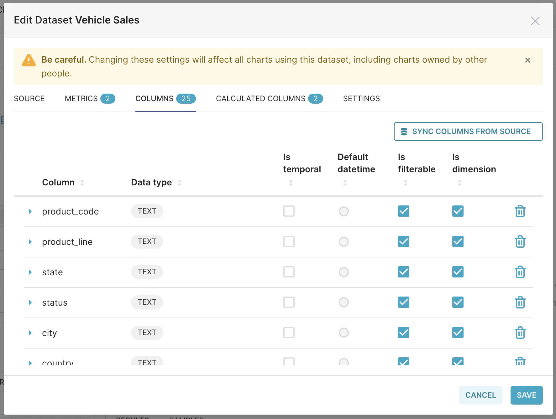
The Columns tab displays all column data within the dataset, displayed as a table.
The table headings are as follows:
Column (editable): Displays the name of the column.
Data type: Displays the type of data within the column (e.g., integer, float, variable character, timestamp, etc.).
Is temporal (editable): Select the checkbox to indicate that the column is a timestamp and should be available as an option in the Time panel.
Is filterable (editable): Select the checkbox tio indicate that the column should be included as an option in the Filter field.
Is dimension (editable): Select the checkbox to indicate that the column should be included as an option in the Group By field.
Delete: Select the trash can icon to delete the column.
Select the expansion arrow on the left side of the column row to define additional column data.
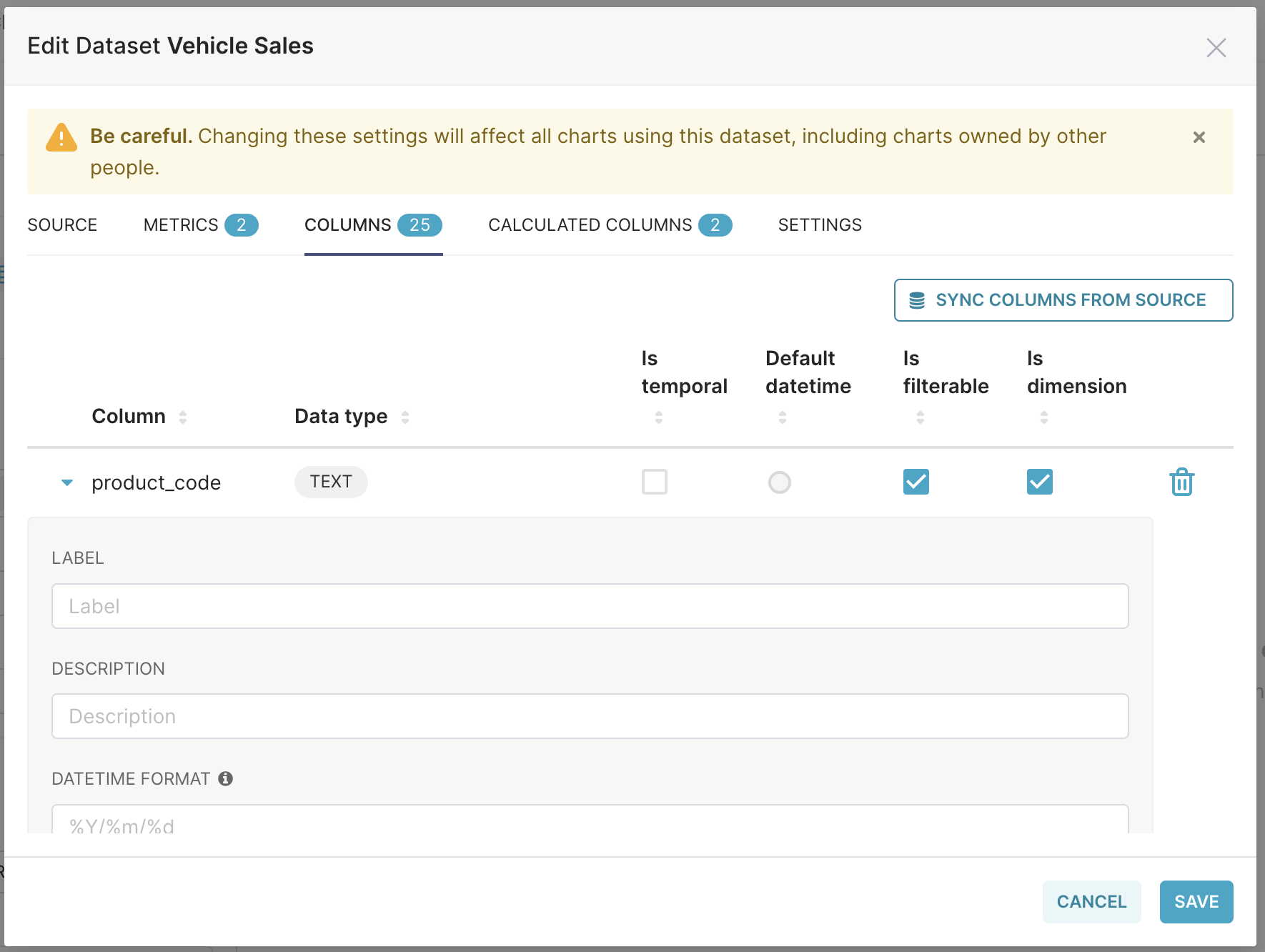
Editable fields here include:
Label: Change the label of the column — this is what the user will see as the column's name.
Description: Enter a brief description of the column — this appears as a tooltip when the user hovers over the letter "i" icon.
Datetime Format: Enter the format of the date and time stamp in Python format. Examples:
%m-%d-%Y= 02-27-2020
%a %d, %y = Tue 2, 2020
%x %X = 02/27/2020 17:41:00
%B-%Y = February-2020
Epoch_m = If date is an epoch integer
The Sync Columns from Source button is used to fetch updated metadata from the dataset source (either a table or a SQL query), and reflect changes to the columns (add new columns and remove deleted ones).
While performing modifications to the dataset source, the Sync columns from Source button is greyed out. Finish modifying the source configuration to be able to sync columns.
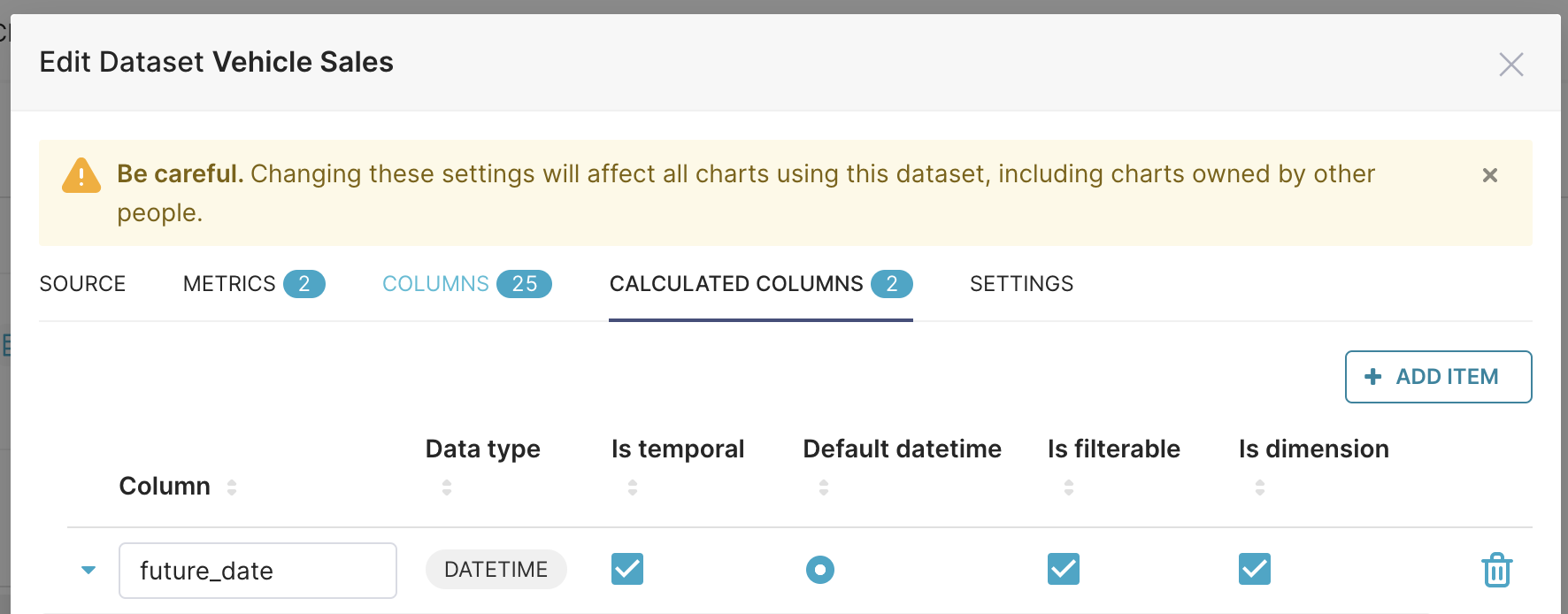
Calculated Columns
First, let's discuss some concepts behind Calculated Columns. Calculated columns are used for data munging, which is simply the process of refining raw data into a format that is more meaningful to end-users, with the purpose being to provide meaningful data based on the end-user audience.
Examples of data munging methods include:
Data Transformation: Changing data to different formats.
Data Enrichment: Adding meaningful information to the data.
Data Validation: Correcting and validating data.
In Preset, Calculated Columns are replaced by a SQL expression in a SQL statement, but they are not available in SQL Lab.
To start, select the Calculated Columns tab.
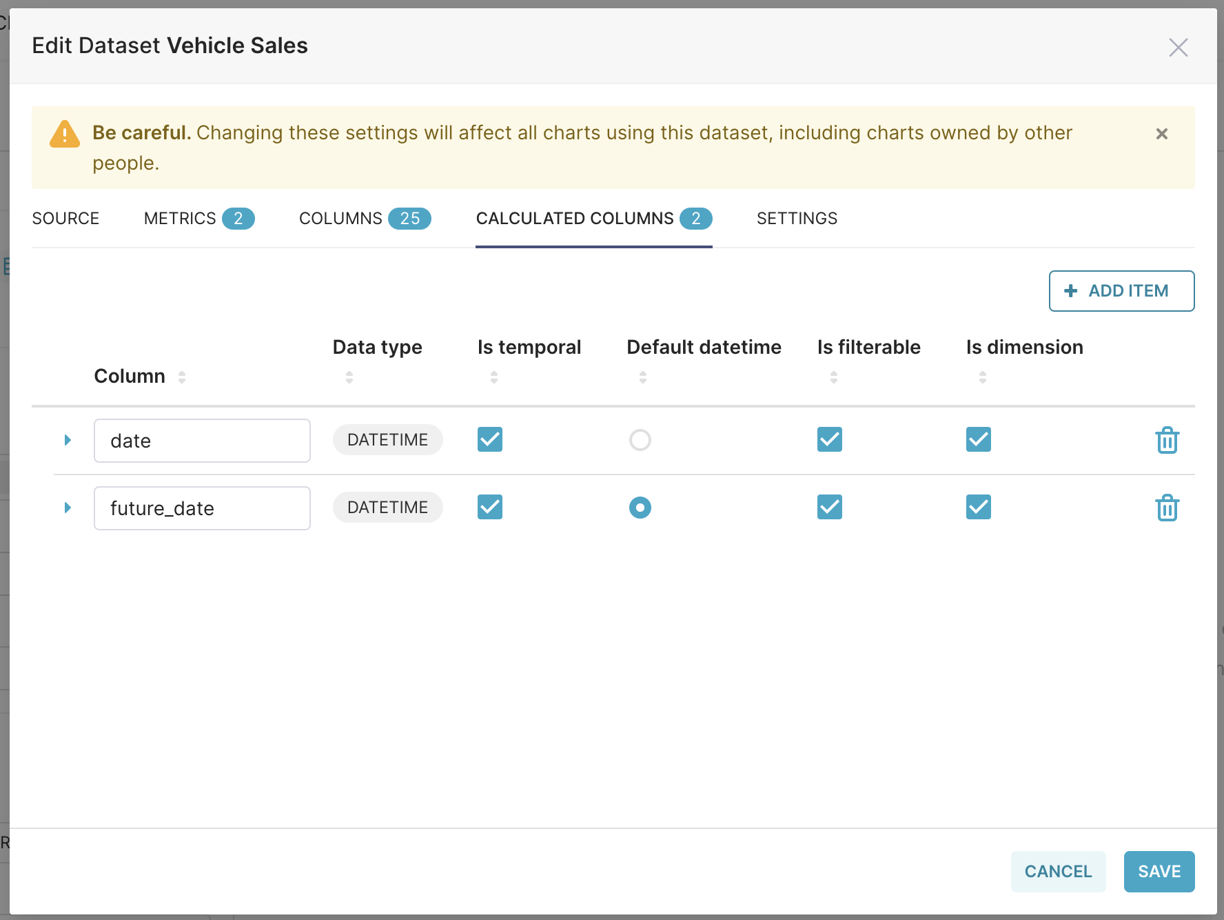
The Calculated Columns tab displays all calculated column data within the dataset, displayed as a table.
The table headings are as follows:
Column (editable): Displays the name of the column.
Data type: Displays the type of data within the column (e.g., integer, float, variable character, timestamp, etc.).
Is temporal (editable): Select the checkbox to indicate that the calculated column is a timestamp and should be available as an option in the Time panel.
Is filterable (editable): Select the checkbox tio indicate that the calculated column should be included as an option in the Filter field.
Is dimension (editable): Select the checkbox to indicate that the calculated column should be included as an option in the Group By field.
Delete: Select the trash can icon to delete the calculated column.
Select the expansion arrow on the left side of the calculated column row to define additional data.
Editable fields here include:
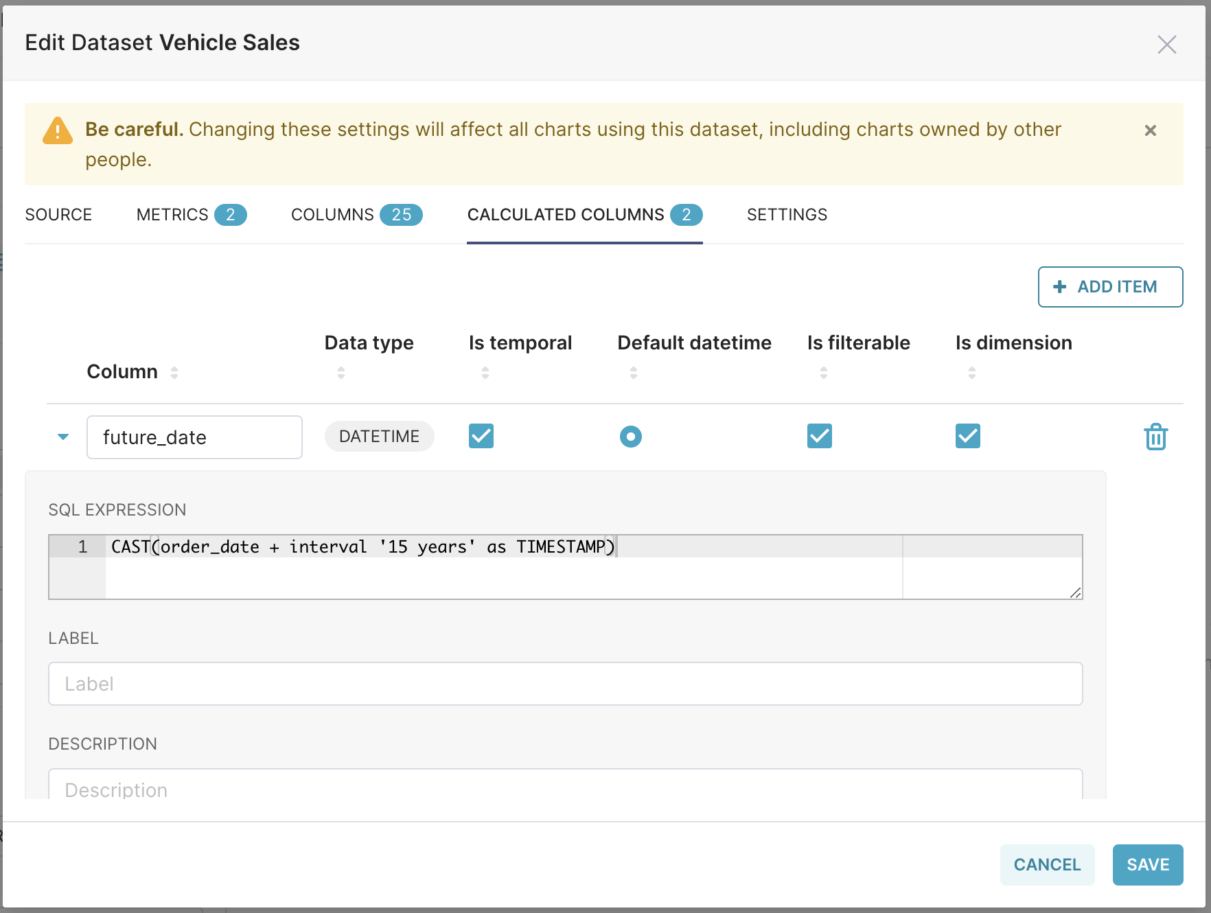
SQL Expression: The SQL expression associated with the calculated column — this appears as a tooltip when the user hovers over the question mark "?" icon.
Label: Change the label of the column — this is what the user will see as the calculated column's name.
Description: Enter a brief description of the calculated column — this appears as a tooltip when the user hovers over the letter "i" icon.
Data Type: Displays the type of data within the column (e.g., integer, float, variable character, timestamp, etc.).
Datetime Format: Enter the format of the date and time stamp in Python format
 . Examples:
%m-%d-%Y= 02-27-2020
%a %d, %y = Tue 2, 2020
%x %X = 02/27/2020 17:41:00
%B-%Y = February-2020
Epoch_m = If date is an epoch integer
Adding a Calculated Column
To add a Calculated Column, select + Add Item.
...a new pre-expanded row will appear. By default, the Is filterable and Is dimension checkboxes are selected.
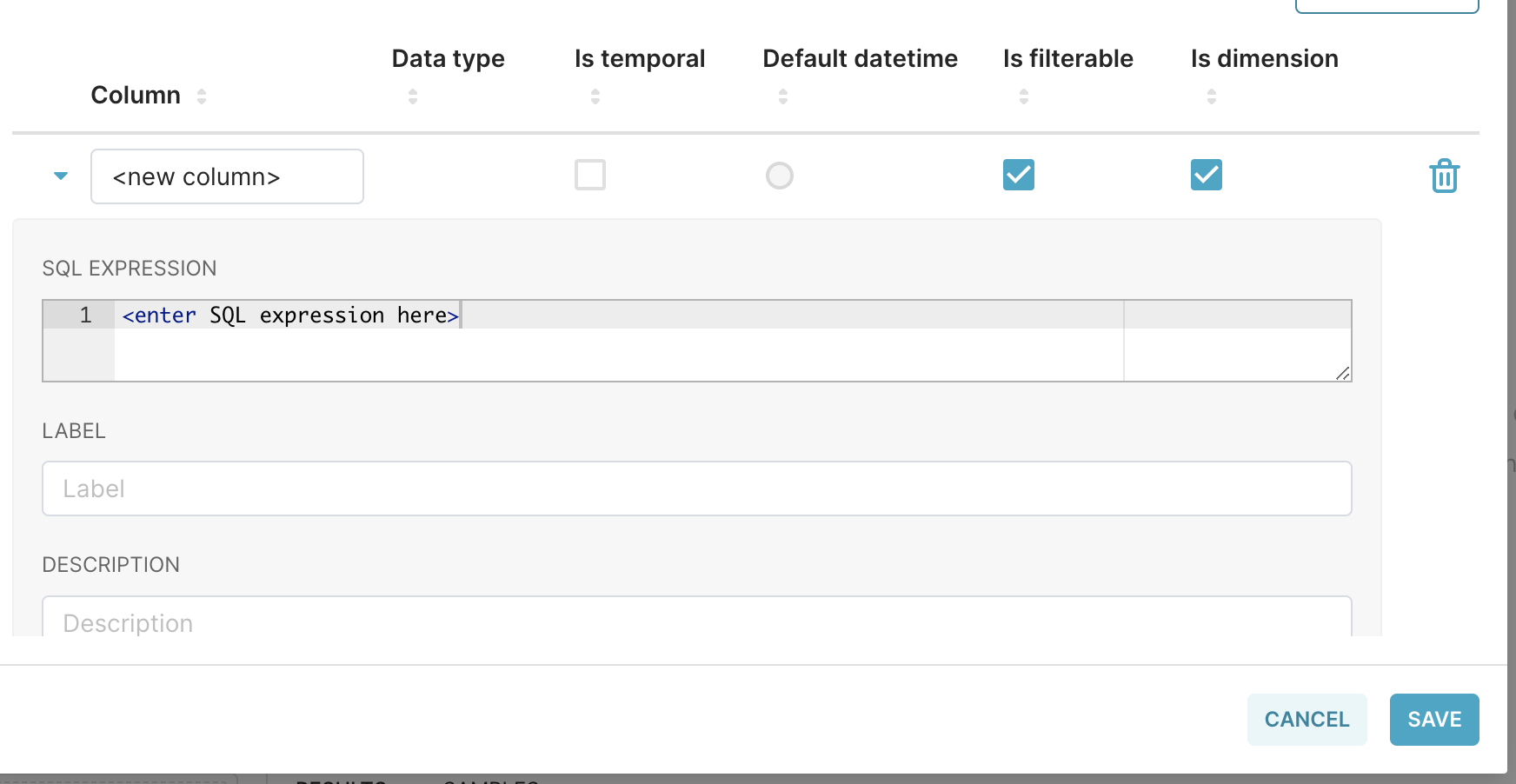
To start, under the Column header, select the <new column> text placeholder and enter a name for your new calculated column.
Next, in the SQL Expression field, enter a SQL expression for the new calculated field. This will also appear as tooltip text when a user hovers their cursor over the calculated column's "?" tooltip icon.
In the Label field, enter a label name for the calculated column — this is what the end-users will see.
In the Description field, enter a brief description of the calculated column. This will appear as tooltip text when a user hovers their cursor over the calculated column's "i" tooltip icon.
In the Data Type field, select an appropriate data type for the calculated column.
Lastly, in the Datetime Format field, enter a date & time format using the Python format .
When done, select Save.
To see examples of Calculated Columns, please read Using Metrics and Calculated Columns.
Folders
Dataset Folders are in Beta
Folders are currently only managed via the API. Please refer to our API documentation to create folders for your dataset.
Folders allow you to better organize your metrics and columns in the Explore page:
.png)
Some considerations:
Folders are always displayed on top of your Metrics and Columns in the Explore view.
A folder can contain both Columns and Metrics.
Nested folders are supported. However, a metric/column can only be added once in the hierarchy. Also, folder
uuidandnamevalues must be unique.
Please refer to our API documentation to manage folders for your datasets.
Use Case: Creating Hyperlinks for Table Chart
You can use calculated columns to create clickable links to other webpages.
Example Use Cases:
Link to other Preset dashboards.
Link to external resources such as a customer relationship management (CRM) company page.
.gif)
How to Create a Hyperlink:
We recommend initially creating & testing your calculated column in the Chart Builder for ease of troubleshooting.
Create a Calculated Column:
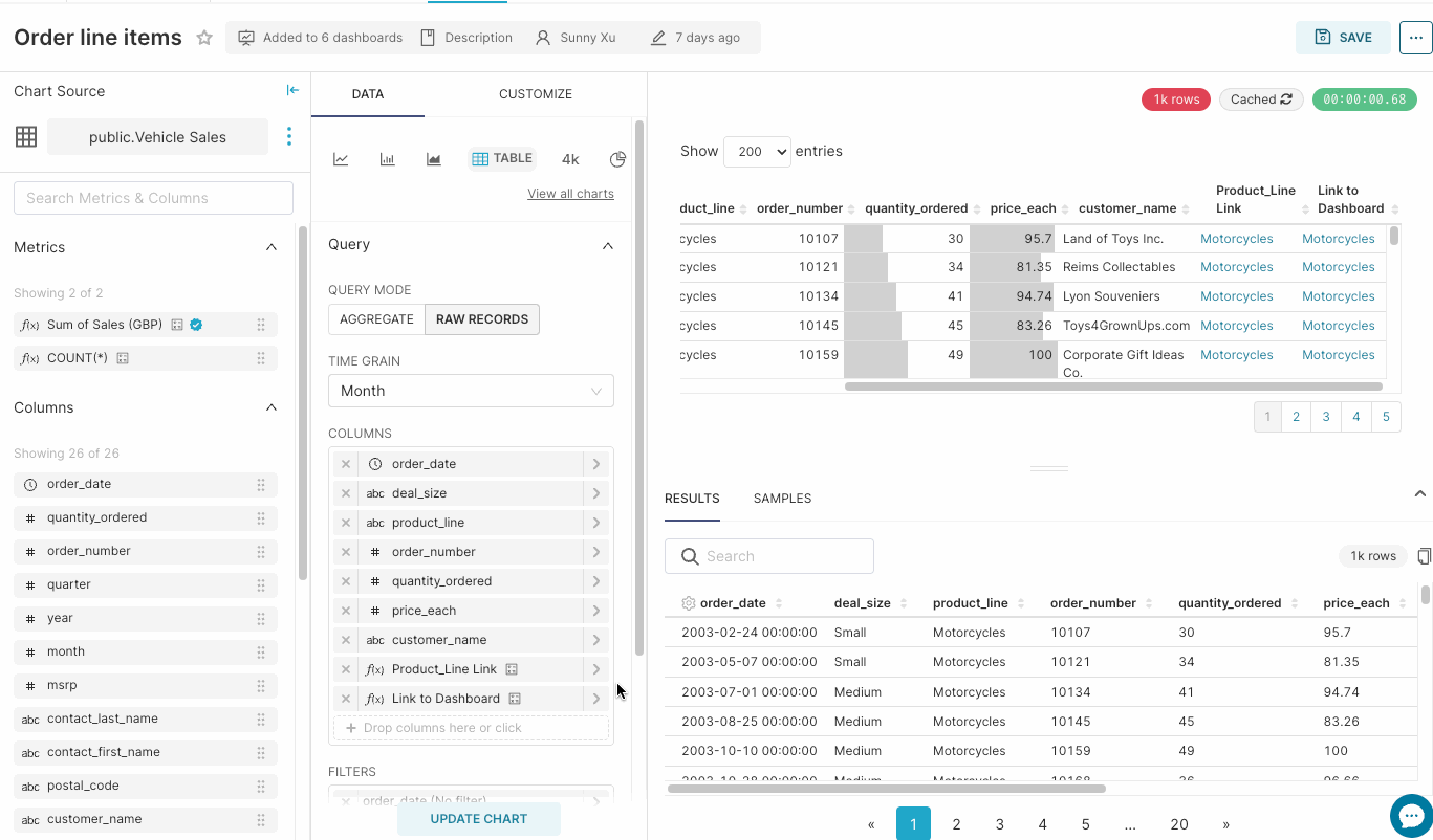
Go to the chart builder, selecting your source dataset and select the Table chart type.
Click into the "Dimensions" form field and go to the "Custom SQL" tab.
Copy this SQL / HTML into the custom SQL field as a starting point:
PL/SQL
'<a href="https://www.google.com/search?q=' || product_line || '">' || product_line || '</a>'Replace
https://www.google.com/search?q=with your desired source URL. You can use the syntax: || product_line || to insert a column name into your url. In this example "product_line" is a column in my dataset.Save.
Add any other required chart option and click "Update Chart".
Test to make sure your links are working and check for any syntax errors.
Once you are happy with your calculated column, move it to your dataset.
Copy to custom SQL you created.
Click on the three dots next to your dataset in the top left hand corner of your screen and select "Edit Dataset".
Go to the "Calculated Columns" tab and create a new column by creating a label and pasting the custom SQL.
Save.
Now you have a calculated column which you can use to link to other websites.
Example: Creating Links to Other Dashboards
You can link to other Preset dashboards by following the below steps:
Create the dashboard(s) you'd like to link to.
In your source dataset, identify which column's values you'd like to use as the linking value.
Set a custom URL slug which matches the column values you identified in Step 2.
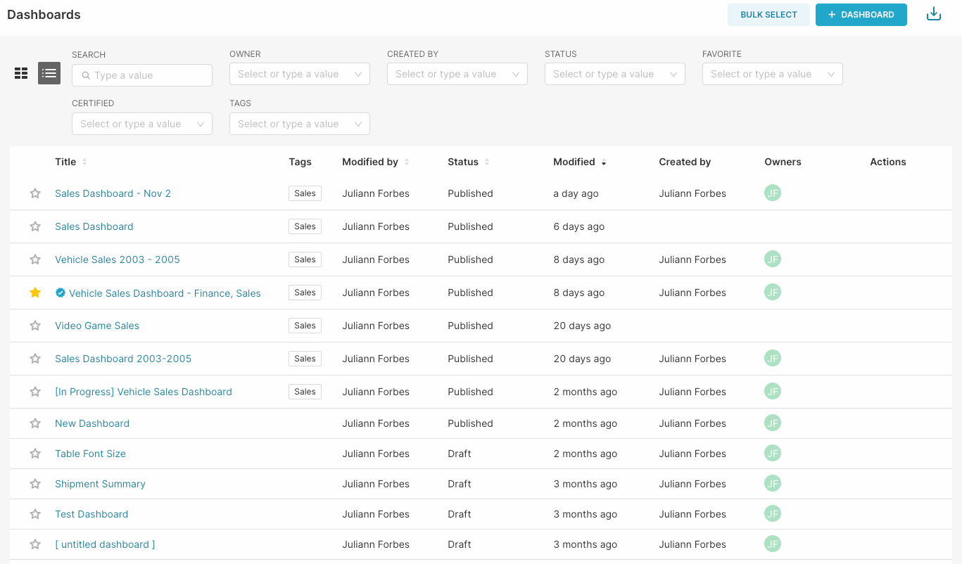
From with your workspace go to the dashboard tab and find your dashboard.
Click on the "Edit" icon under the Actions column.
Set your custom "URL Slug" to be the column value you identified in Step 2.
Repeat for all destination dashboards.
Create a Calculated Column:
Go to the chart builder, selecting your source dataset and select the Table chart type
Click into the "Dimensions" form field and go to the "Custom SQL" tab
Insert the following template:
'<a href="https://[workspace_slug].[workspace_region]acbd1234.us1a.app.preset.io/superset/dashboard/' || product_line || '" target="__blank">' || product_line || 'a>'Replace the URL
https://[workspace_slug].[workspace_region].app.preset.io/superset/dashboard/with your workspace URL which will contain an 8-digit hexadecimal value for the workspace identifier and a value for your deployment region (in this example us1a).Replace the
[column_name]with your previously selected column name. In this example, product_line is my column name. (Note: the second occurance of [column_name] can be replaced with any text. It is used as the text which will display in place of the link).Save.
Add any other required chart option and click "Update Chart".
Test ensure sure your links are working as expected and check for any errors.
Once you are happy with your calculated column, move it to your dataset.
Copy to custom SQL you created.
Click on the three dots next to your dataset in the top left hand corner of your screen and select "Edit Dataset".
Go to the "Calculated Columns" tab and create a new column, add a label and paste the custom SQL.
Save.
Now you have a calculated column which you can use to link dashboards together.