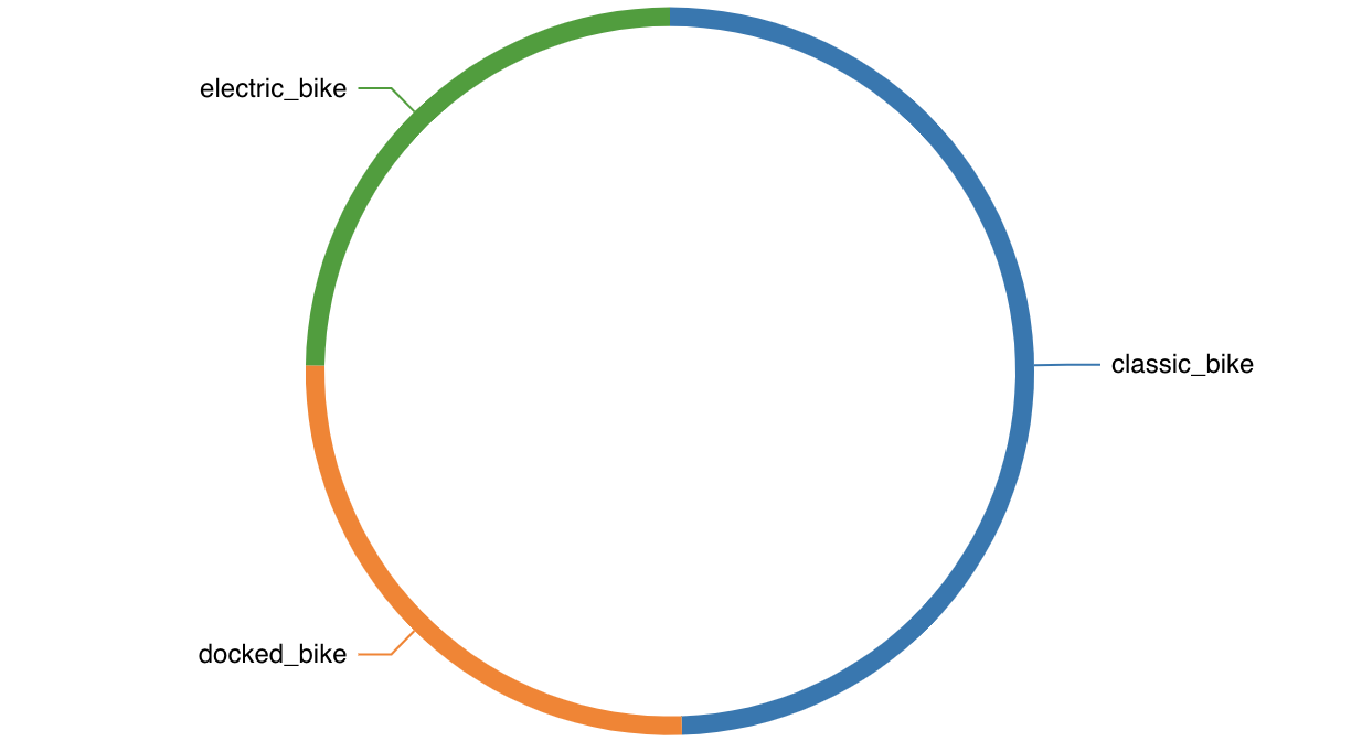
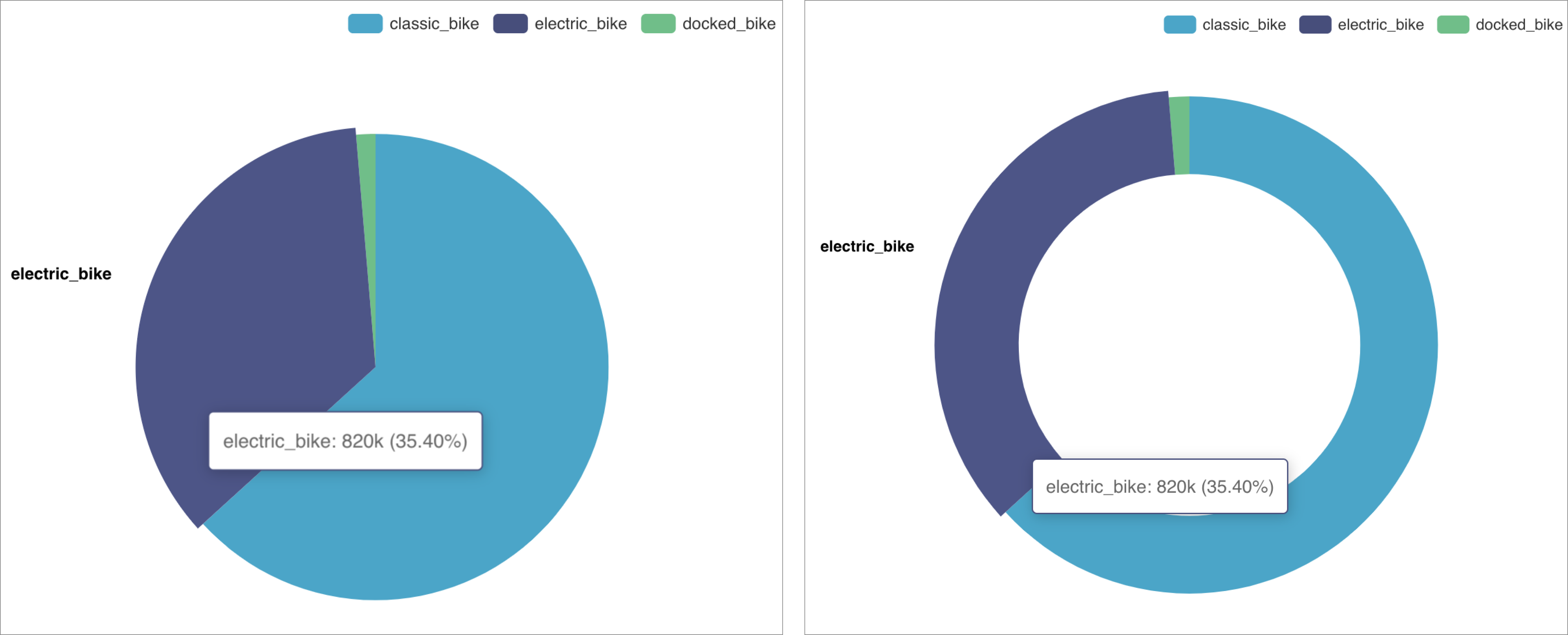
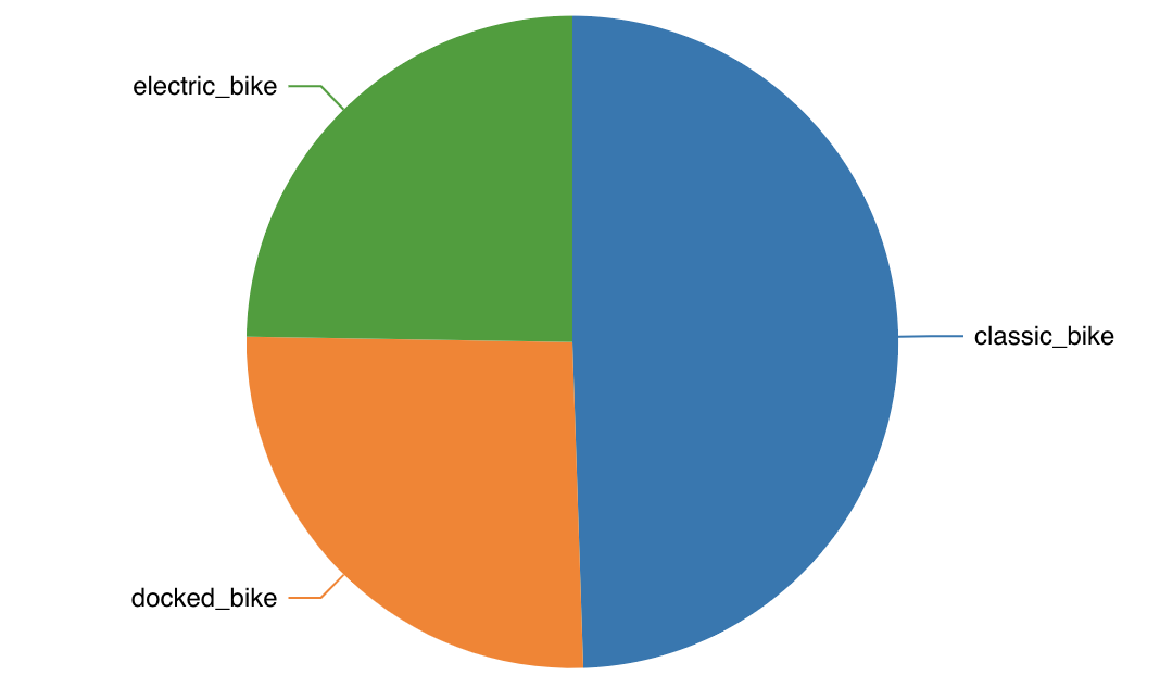
The pie chart is a classic visualization that represents proportions of a whole using slices of a circle. Here are two examples of the same pie chart, one rendered as a classic pie and one rendered as a donut.
 Reference Content
The following articles may be useful resources as you build your chart:
- Creating a Chart: A walkthrough of the overall process of chart selection and creation.
- Using Preset Chart Builder: How to work with the Chart Builder page, the primary interface used when creating a chart.
Creating a Pie Chart
Pie Chart Using a Single Dimension
To create a Pie Chart, you need to define:
- the Metric you want to visualize
- the Dimension(s) you want the metric to be sliced by
Here's a simple example:
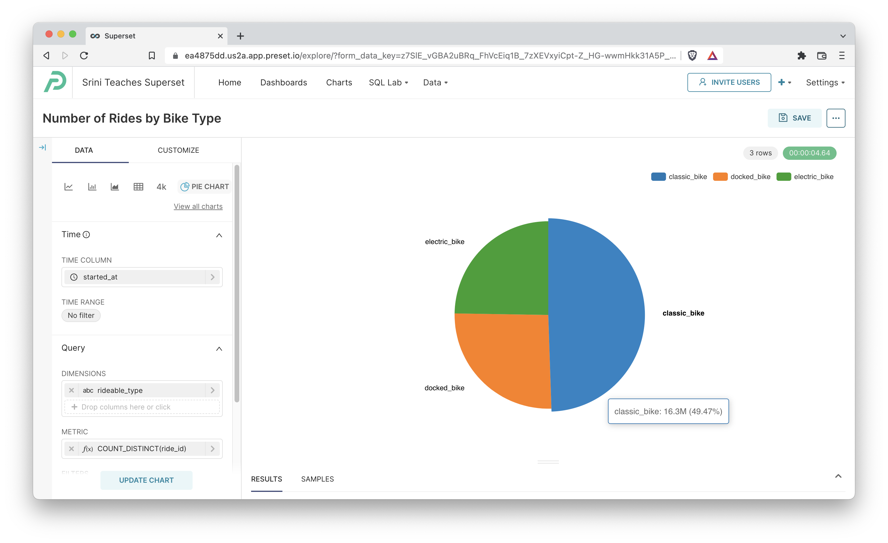
We set the Dimension to rideable_type and the Metric to COUNT_DISTINCT(ride_id), which resulted in the following SQL query:
SELECT rideable_type AS "rideable_type",
       count(DISTINCT ride_id) AS "COUNT_DISTINCT(ride_id)"
FROM dbt_smukherjee.citibike_trips
GROUP BY rideable_type
ORDER BY "COUNT_DISTINCT(ride_id)" DESC
Pie Chart Using Multiple Dimensions
You can also include multiple dimensions in your pie chart. The result will be a m by n combination of pie slices used in the grouping. Here's an example where we have two dimensions:
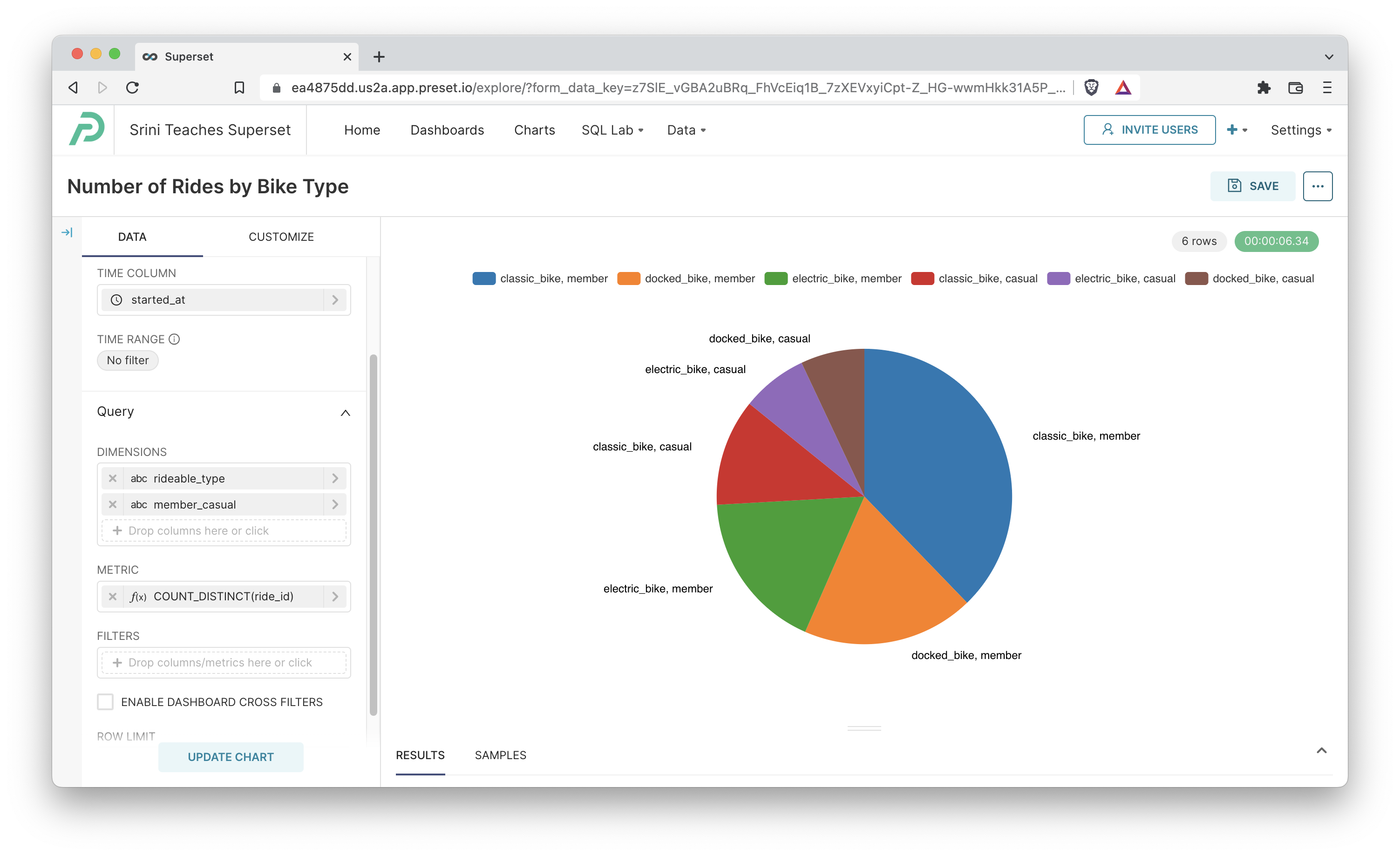
Here's the query Preset generated:
SELECT rideable_type AS "rideable_type",
       member_casual AS "member_casual",
       count(DISTINCT ride_id) AS "COUNT_DISTINCT(ride_id)"
FROM dbt_smukherjee.citibike_trips
GROUP BY rideable_type,
         member_casual
ORDER BY "COUNT_DISTINCT(ride_id)" DESC
Customizing your Pie Chart
You can customize your pie chart with the options in the Customize tab. Here's an overview of some of the options:
- Legend
- Show Legend: shows legend if this checkbox is ticked
- Type: specify if the legend should be scrollable or a default plain one
- Orientation: location of the legend
- Margin: extra padding to add around the legend (in pixels)
- Labels
- Show Labels: shows a label for each pie slice if this checkbox is ticked
- Puts Labels Outside: places labels on the outside of the pie slices if this checkbox is ticked (otherwise inside the slices)
- Label Line: adds connecting lines between the pie slice labels and the slices themselves if this checkbox is ticked
- Show Total: shows total metric value count across all the groups
- Pie Shape:
- Outer Radius: slider for specifying the radius of the overall pie chart
- Donut: switches pie chart to a donut pie chart if this checkbox is ticked
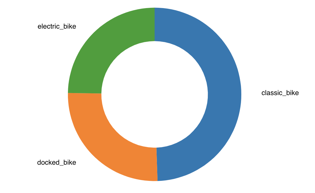
- Donut > Inner Radius: slider for specifying the radius of the inner circle in a donut chart