Applying Filters
You can get specific insights and custom views by applying filters to a dashboard.
There are two ways to apply filters: applying cross filters and from the filter bar.
Cross Filters
Cross filtering allows you to click on a data point in one chart and apply a filter with that property across all applicable charts on the dashboard.
You can see which charts have been effected by the filter by the blue filter icon which will appear on the top right of the chart with the number of filters applied.
To clear a cross filter, go to the source chart and click the blue icon of two circles with an arrow. The charts should all now revert to their original display.
Filter Bar
On the far left side of the screen, select the right-arrow Expand icon.
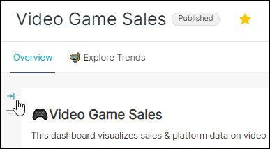
This will toggle the Dashboard Filter sidebar.
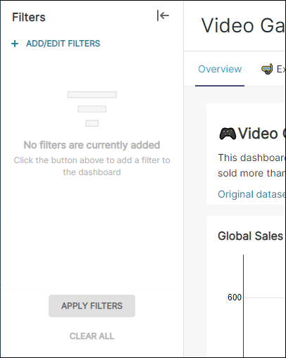
To retract the sidebar, select the left-arrow icon.
Applying Different Filter Types
Value Filter
This filter type consists of a drop-down menu populated by all available values associated with the selected column.
For example: When you apply a Value filter type with the value of Platform, you can select one or more value from a drop-down filter menu. When applied, all applicable charts within the dashboard will only display data as it relates to the selected "Platform" filter.
Here's what this filter looks like: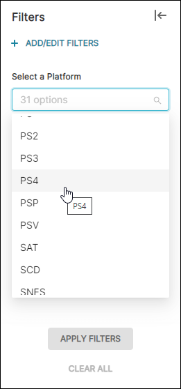
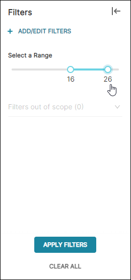
Numerical Range Filter
This filter type creates a range slider that enables you to specify a starting & ending point based on numerical values available from data in the selected column.
For example: If you select a Numerical range filter type and then—in the Column field—you select EU sales, then a range slider filter appears that enables you to select a starting & ending range. When applied, all charts within the dashboard will only display data as it relates to the selected sales range filter.
Range slider filter, titled "Select a Range" from the Filter Name field, appears as follows:
Time Range Filter
This filter type is a button filter that, when selected, launches Preset's Edit Time Range functionality.
In this example, we specified a default value of "Last month" and defined a filter name of "Select Time Range".
This configuration would appear as follows:
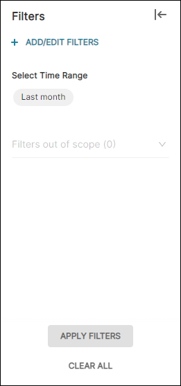
To apply the filter, select a time range, then select Apply Filters. The charts within the dashboard will refresh and display the filtered data.
Time Column Filter
This filter type is a drop-down menu that enables you to select a new dashboard-level time column that will overwrite any existing time columns defined at the chart level.
Here's what the this might look like:
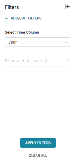
To apply the dashboard-level time column, select a time column options and then select Apply Filters. The charts within the dashboard will refresh and display the filtered data.
Time Grain Filter
This filter type is a drop-down that enables you to select a time granularity. When applied, all timestamps are grouped based on the selected time grain.
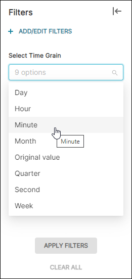
In the above example, we opted to specify a time grain of Minute.
To apply the dashboard-level time grain grouping, choose a time grain and then select Apply Filters. The charts within the dashboard will refresh and display the grouped data.
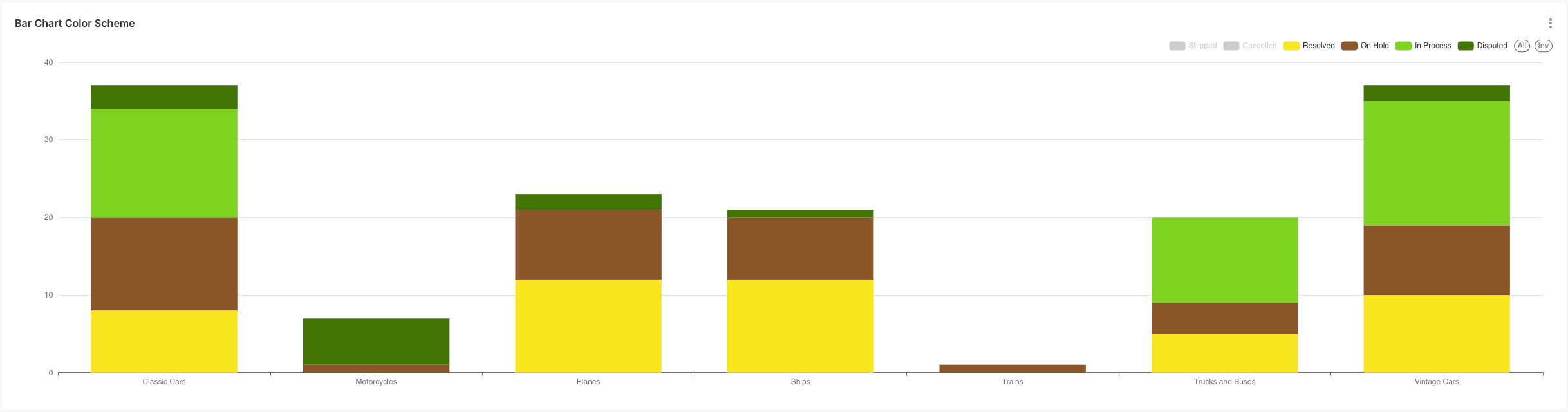
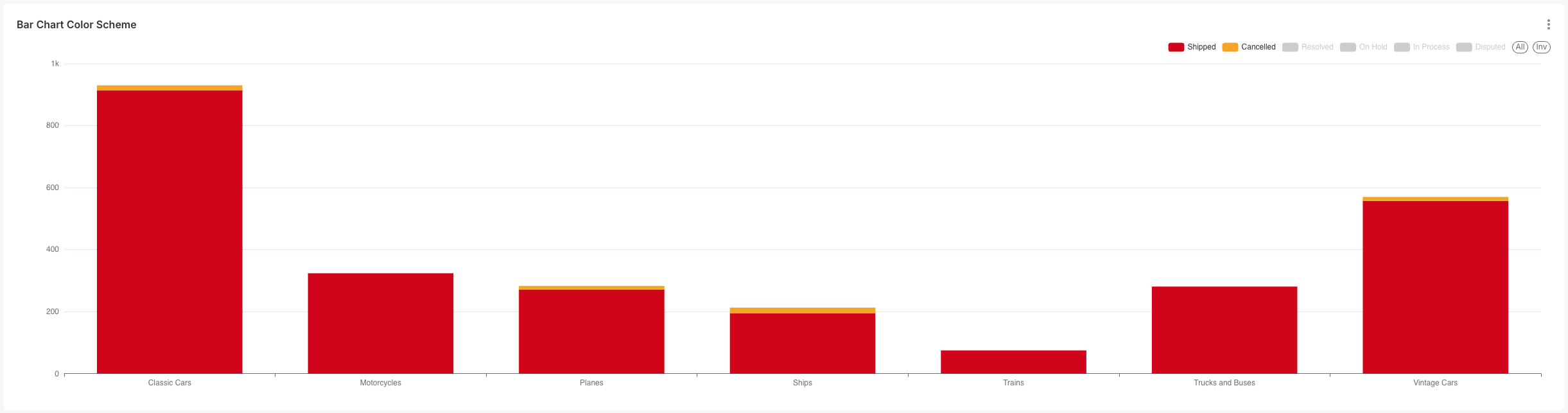
Legend Interactivity
You can also interact with the legends in the chart.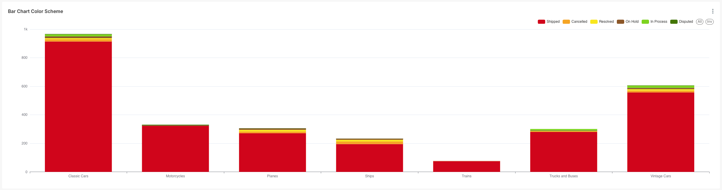
Clicking the legend label will exclude the data from the chart:
Clicking the ALL button will display all legends available in the chart.
Clicking the INV button will invert the selection of the legends. For example, after excluding the Shipped and Cancelled values from the legend, clicking the INV button will invert the selection and display the Shipped and Cancelled values instead.
Drilling Down Into Your Data
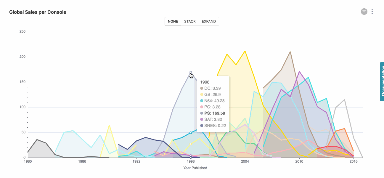
View Tool Tip
To view more details on a chart, you can hover your mouse over the data and a tool tip will appear to show you more detailed information.
Note: Not all charts support tool tips at this time
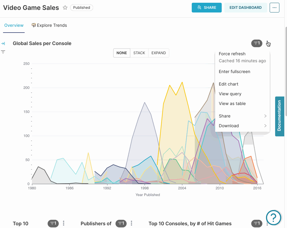
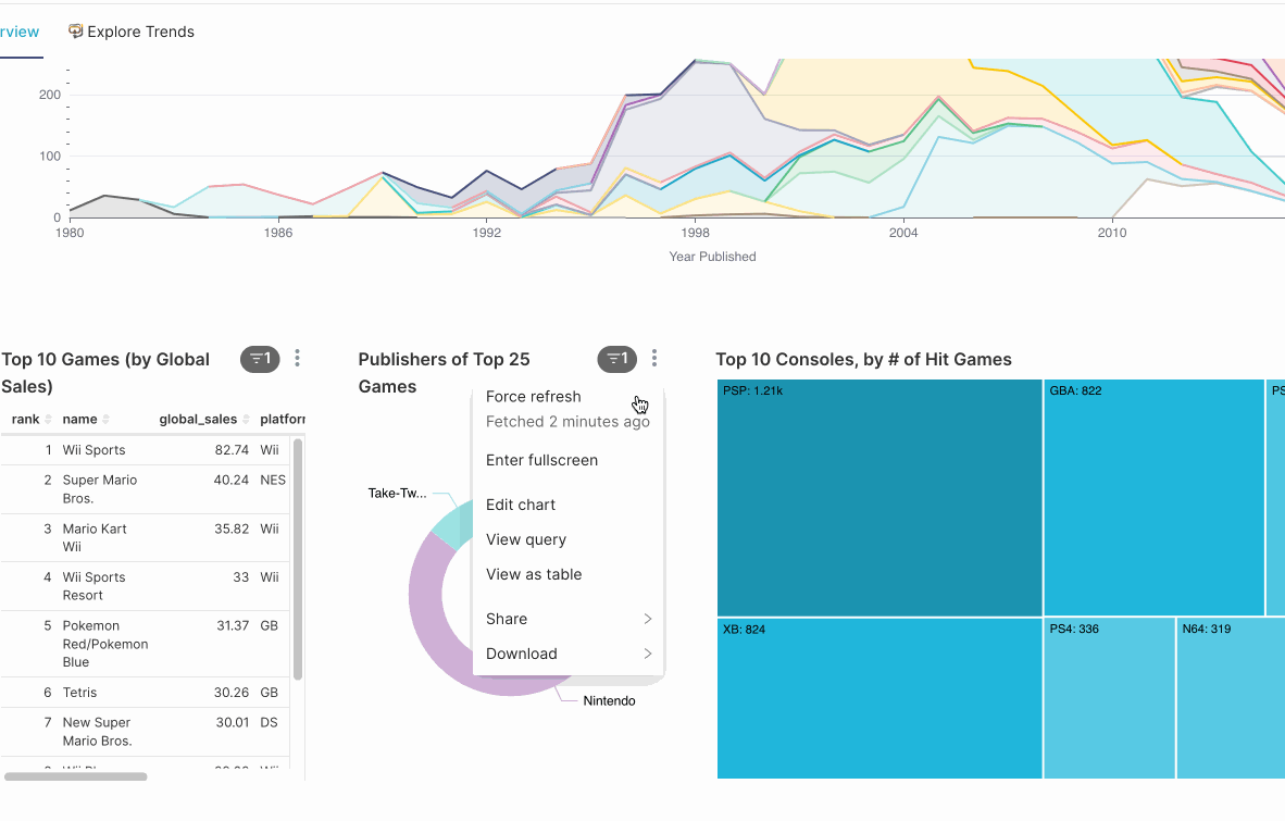
View as Table
To see a tabular representation of the data behind the chart, click on the three dots at the top right of any chart and click on "View as table" .
Download as a CSV or Image
To export a chart as either a CSV or an image, click on the three dots at the top right of any chart and click on "Export to .CSV" or "Download as image". Note that the CSV export is limited to 100k rows of data or the "row limit" that was specified by the chart creator, whichever is lower.