This chart type re-uses gauges from the scientific and industrial setting to showcase partial progress towards a specific number. They're also often referred to as speedometer charts (in references to dashboards in cars) or dial charts. Here are some examples:
Gauge charts are simple, easy-to-understand charts that visualize one value at a time. They shine in KPI (or strategic) dashboards over a standard big number chart, where you want to succinctly communicate the progress towards a goal or KPI of interest (instead of just the metric itself).
Reference Content
The following articles may be useful resources as you build your chart:
- Creating a Chart: A walkthrough of the overall process of chart selection and creation.
- Using Preset Chart Builder: How to work with the Chart Builder page, the primary interface used when creating a chart.
Creating a Gauge Chart
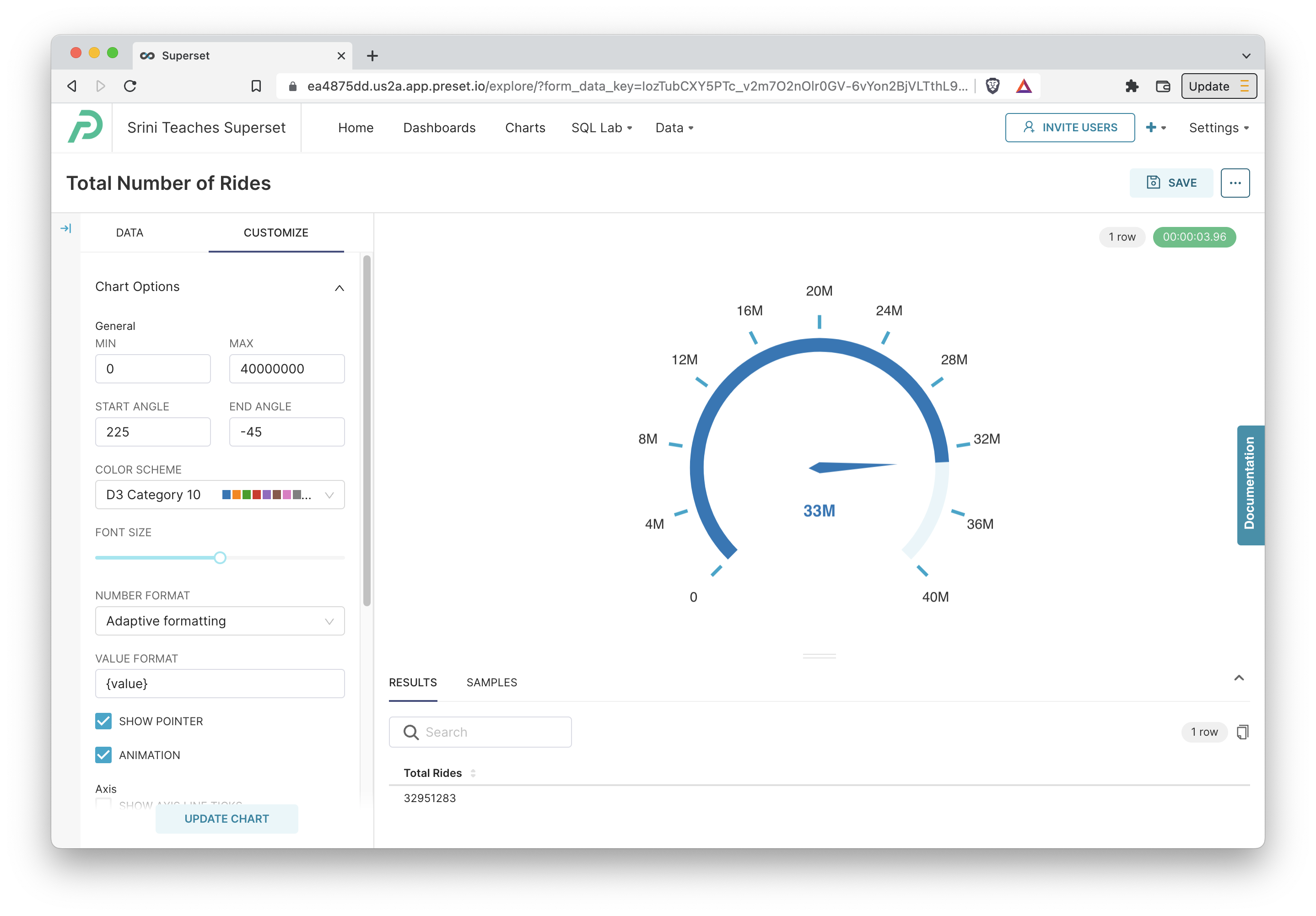
Simple Gauge Chart
To create a gauge chart, the only required field is the Metric you want to visualize. To make a gauge chart useful though, you'll also want to customize the goal that maps to 100% of the gauge.
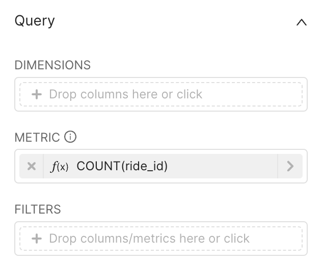 | Data -> Metric
|
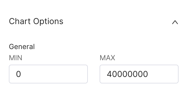 | Customize -> Chart Options -> Min and Max
|
Here's the resulting chart:
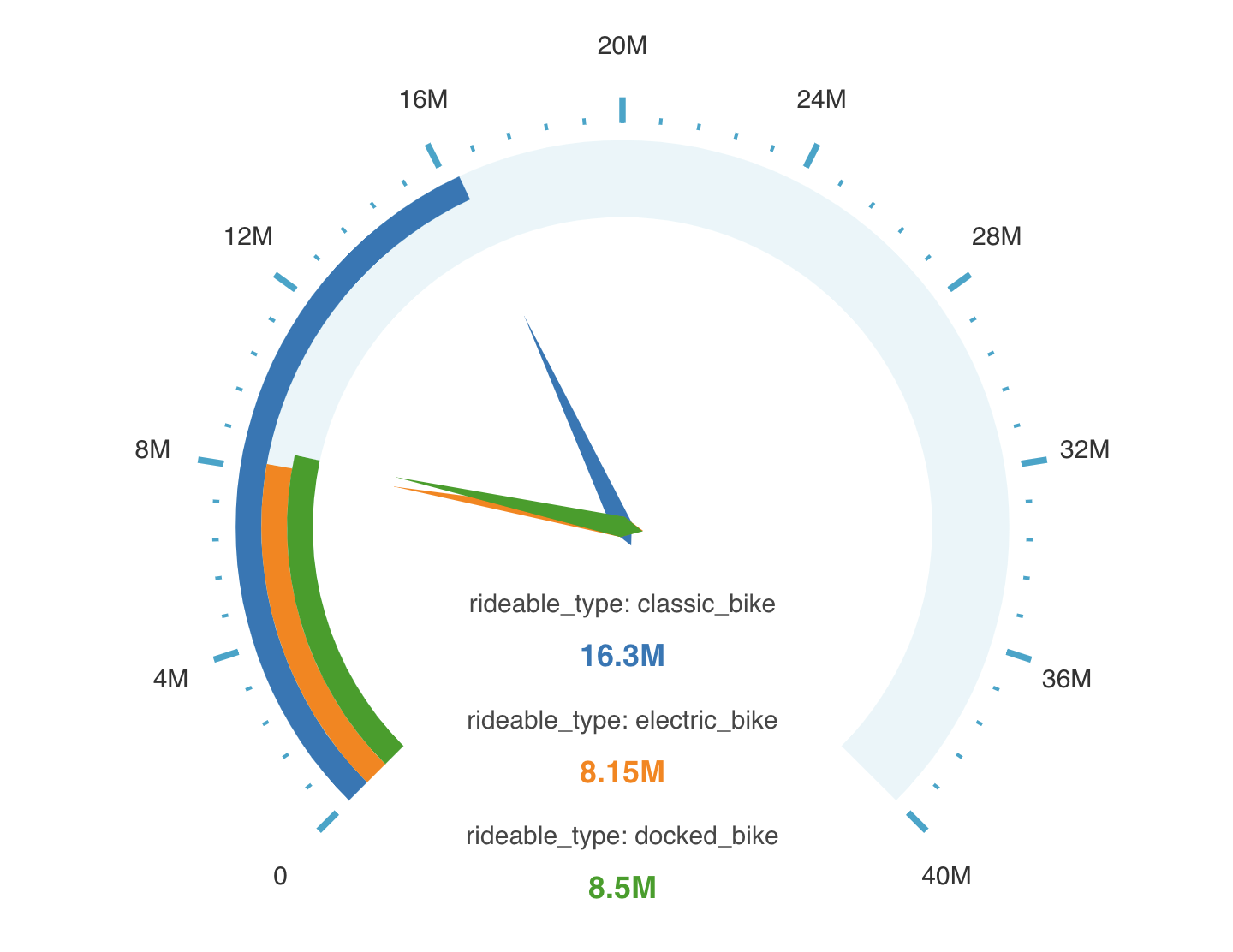
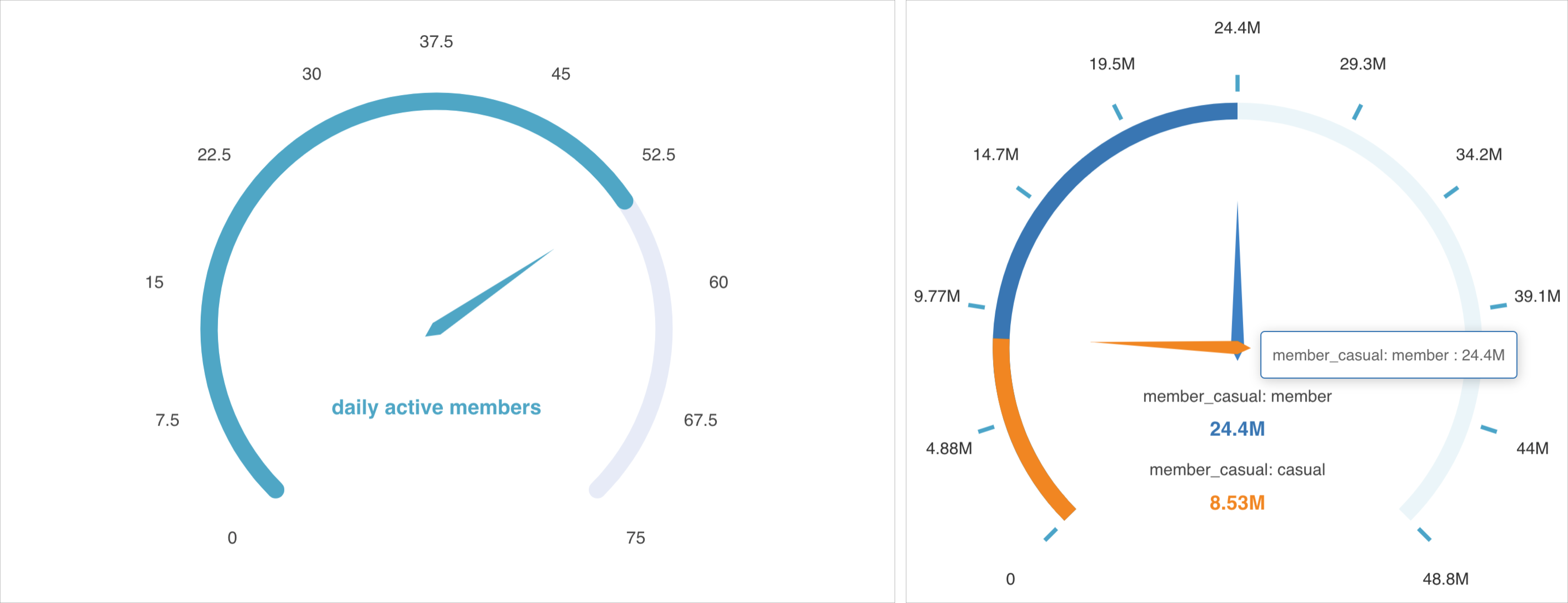
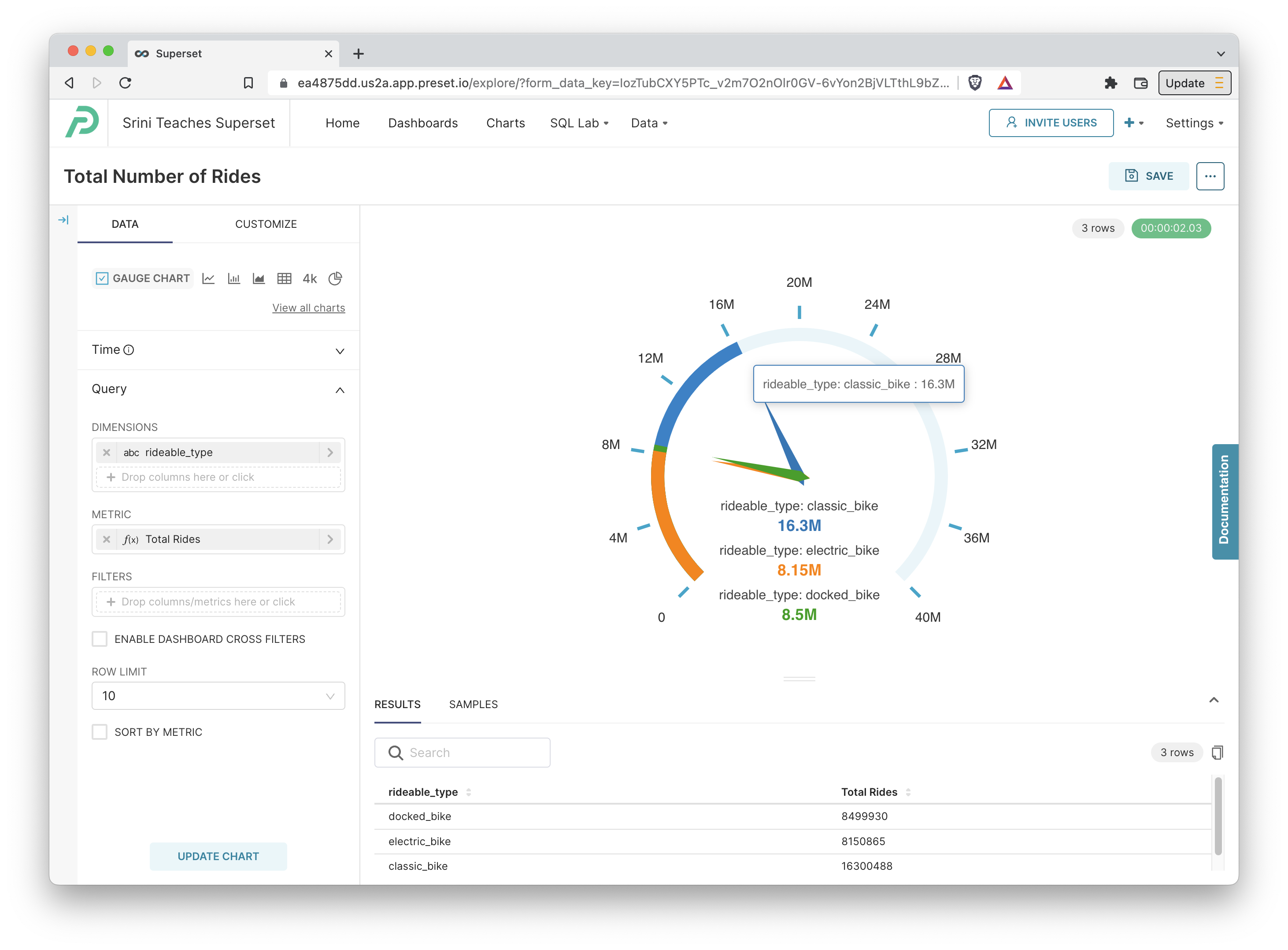
Gauge Chart with Dimensions
In the following example, we're able split up the type of ride.
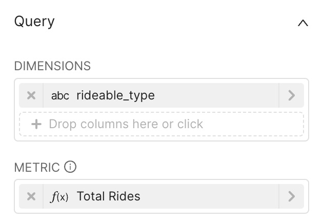 | Dimensions
|
Here's what the resulting chart looks like:
Customizing your Gauge Chart
The Customize panel for a graph chart exposes a large variety of options to further clarify your chart. Here's a breakdown of some of these fields:
- General
- Min and Max: let you specify the starting and ending values of the gauge chart.
- Start Angle and End Angle: how you want the gauge to be angled
- Show Pointer: if this checkbox is ticked, the dials from the center are shown (on by default).
- Animation: if this checkbox is ticked, animation is used when updating the values or rendering the chart.
- Axis
- Show Axis Line Ticks: if this checkbox is ticked, the minor split lines are shown along the gauge.
- Show Split Lines: if this checkbox is ticked, the major split lines are shown along the gauge.
- Split Number: slider for choosing the number of splits used for the split lines. Higher means more frequent and smaller distances between splits.
- Progress
- Show Progress: if this checkbox is ticked, the partial progress bars are shown (on by default). We generally recommend keeping this enabled!
- Round Cap: if this checkbox is ticked, the ends of bars are rounded off (instead of rectangular). Makes for better aesthetics!
- Overlap: if this checkbox is ticked, dimension level progress bars stack together along a single bar. We generally recommend not ticking this if you have more than few dimensions!