A funnel chart visualizes stages in a pipeline of some sort. Funnel Charts are extremely common in sales, marketing, product, and operations teams. Here's an example of a sales funnel, visualized using this chart:
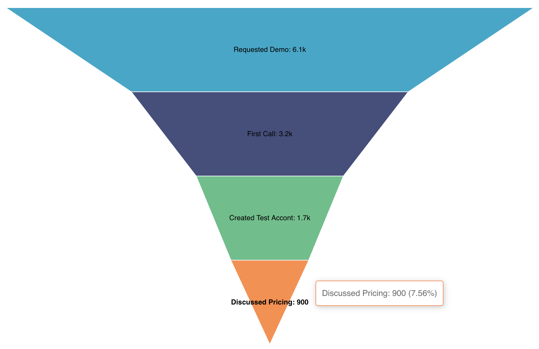
In this documentation article, we'll showcase how to generate the above funnel chart both from raw, un-aggregated data and from aggregated data.
Reference Content
If you're new to visualizing data in Preset, we recommend the following reference articles:
- Creating a Chart: A walkthrough of the overall process of chart selection and creation.
- Using Preset Chart Builder: How to work with the Chart Builder page, the primary interface used when creating a chart.
Creating a Funnel Chart
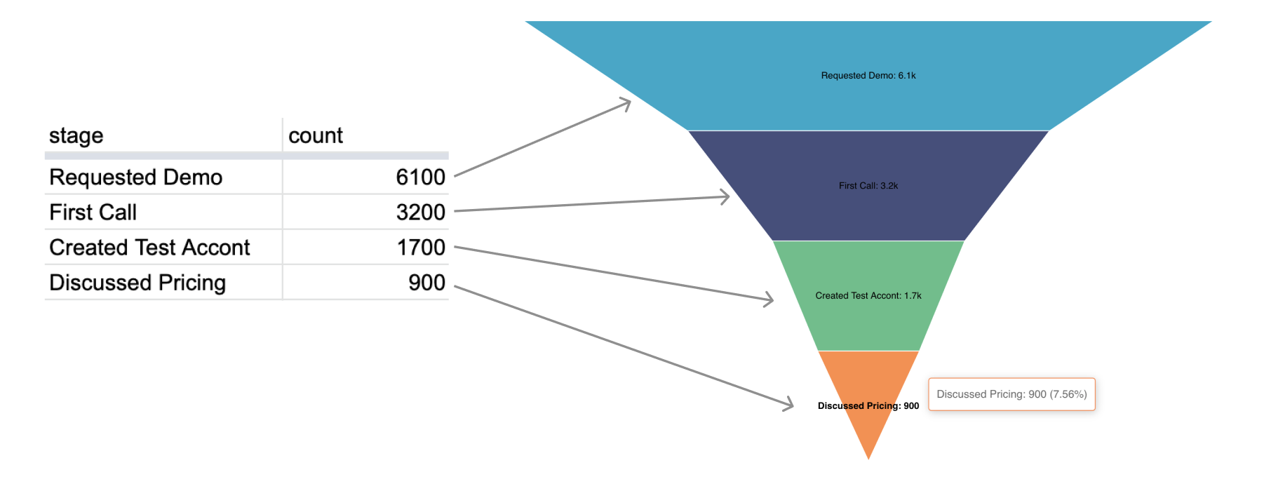
To create the funnel chart, your data needs to resemble the following shape:
Funnel Chart from Unaggregated Data
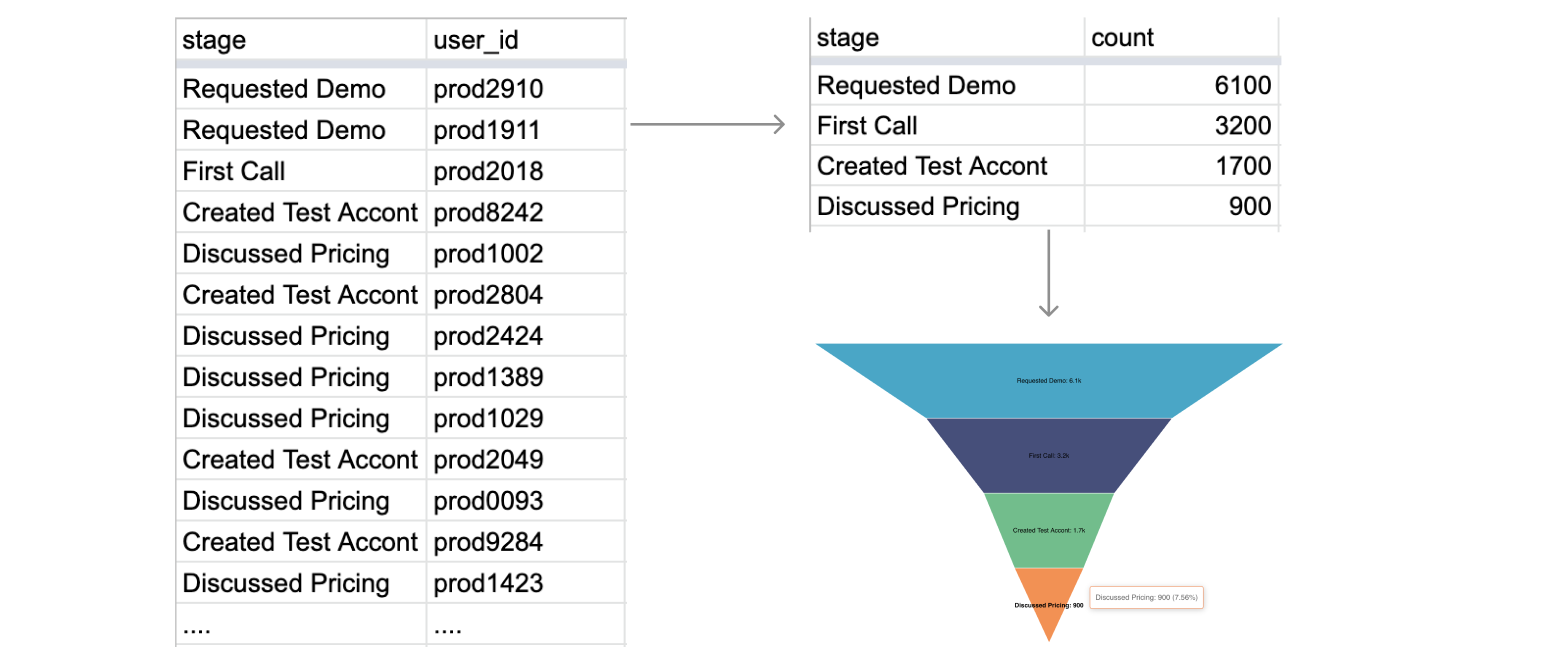
If your data is unaggregated, you'll need to specify the relevant column and how you want the values in that column to be aggregated. Here's an overview of the before and after snapshots of the data:
Here's an explanation of the selections we made in the chart builder interface to generate this chart.
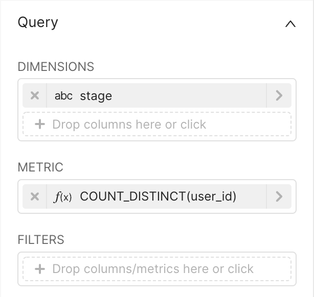 | Dimensions
Metric
|
Here's the SQL query that Preset generated:
SELECT stage AS "stage", count(DISTINCT user_id) AS "COUNT_DISTINCT(user_id)"
FROM db.sales_stages
GROUP BY stage
ORDER BY "COUNT_DISTINCT(user_id)" DESC
Funnel Chart from Aggregated Data
If your data is already aggregated by stage, then you can select an aggregation function that yields an identical value for aggregated values (e.g. MIN or MAX).
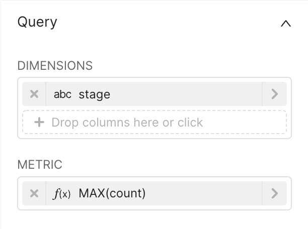 | Dimensions
Metric
|
Here's the SQL query that Preset generated:
SELECT stage AS "stage", MAX(count) AS "MAX(count)"
FROM db.sales_stages
GROUP BY stage
ORDER BY "MAX(count)" DESC