👤 This documentation is intended for Limited Creators, Secondary Creators, Primary Creators, and Workspace Admins. Check with your Team Admin for additional access.
Overview
In this detailed walkthrough, we will familiarize ourselves with how the Chart Builder page works and demonstrate the process of configuring a chart and running a query.
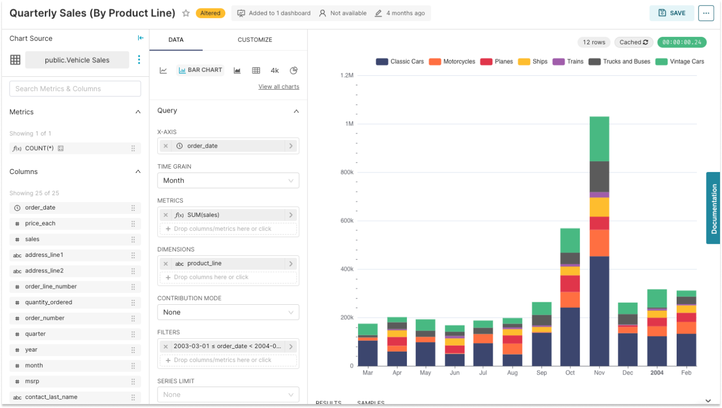
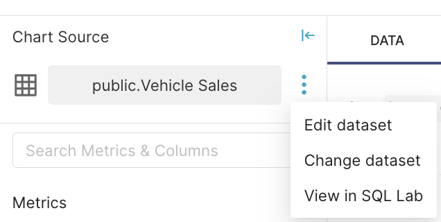
Review the Chart Source
Verify your chart source before creating any chart. The top left of the Chart Builder displays the query source. Depending on whether your using a Pre-saved Dataset or a SQL Editor query, you might see:
| Pre-saved Dataset | SQL Editor Query |
|---|---|
 |
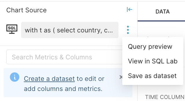 |
You can edit a pre-saved dataset directly from the Chart Builder, but this will change all charts using the same dataset.
Review the Metrics & Columns Panel
Directly below the Chart Source panel is the Metrics and Columns panel. Search Metrics & Columns field enables you to quickly find the data you need.
Each data type includes a small icon that conveys its type:
- ƒ: Function used for metrics
- Clock: The datasource's time column (used below)
- ABC: Text data
- #: Numeric value data
Metrics and Columns can be dragged & dropped into the Query panel to configure your visualization.
Review the Chart Type Panel
The Chart Type panel is used to change your visualization type.
Preset recommends using charts with the FEATURED tag in the chart gallery.
You can easily switch between the common chart types without loss of already configured fields.
Configure the Fields
Viewing Data Samples
Before configuring your fields for a chart, you can sample your data to understand what it contains. Above the Run a query to display results section, you can click Samples, which will pull some raw data in table form.
Choosing the Dimension for the X-axis
You can specify the x-axis dimension in the "Query" panel of the "Chart Builder."
Preset supports both the temporal (time series) and non-temporal x-axis dimensions.
If you select a temporal dataset column as the x-axis dimension, the "Time Grain" field appears, prompting you to define the granularity of the displayed x-axis values.
There are a number of different time range types offered in Preset — take a look at Time Configurations for a more detailed walkthrough.
Add a Metric or Column
You can then start dragging a metric or colum to the applicable destination fields.
When the metric or column is dropped, the field's associated pop-out window will automatically appear so that details can be entered.
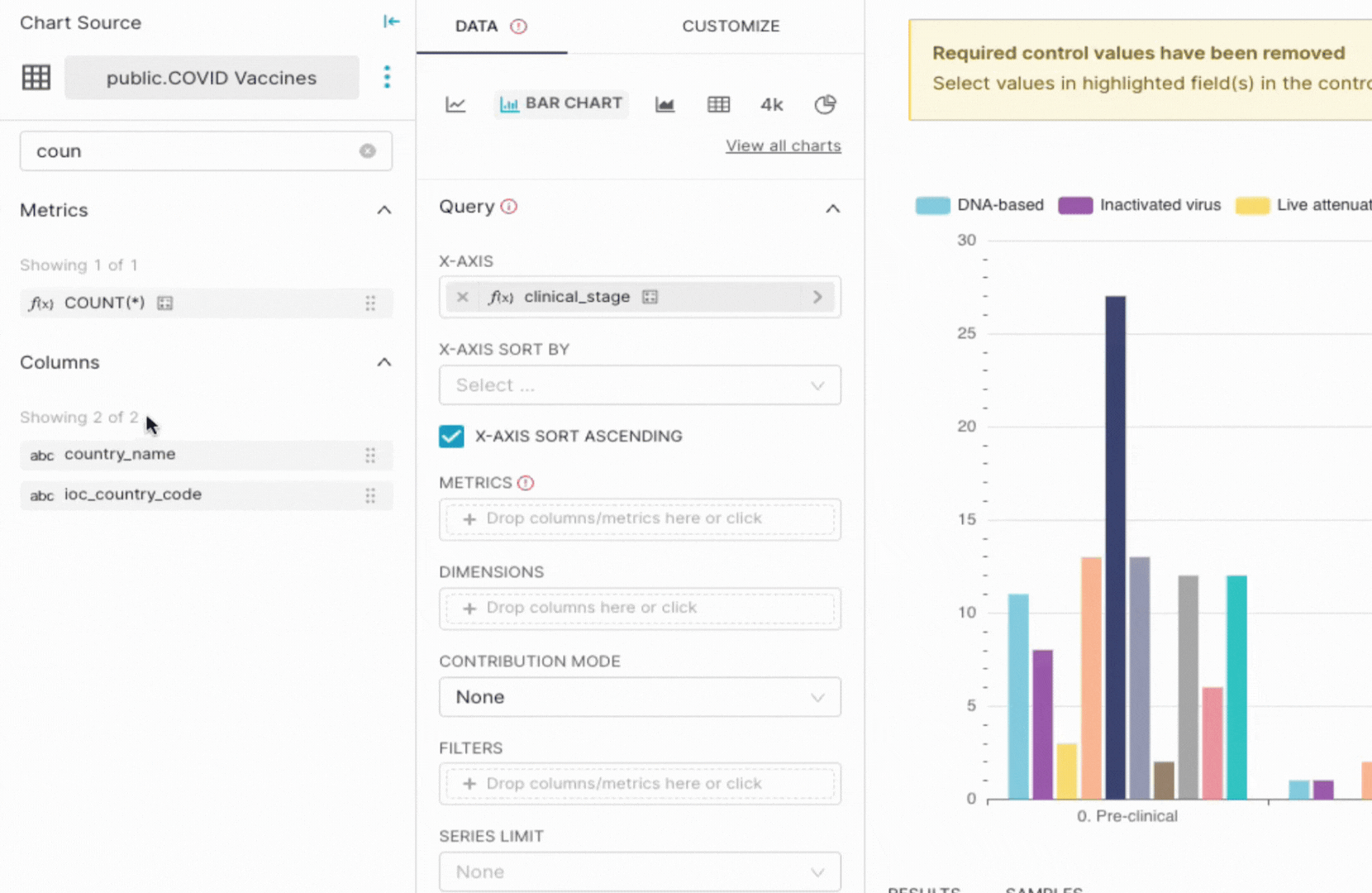
Intelligent color indicators help guide a user as to what column and metrics can be placed in a field. A red highlight conveys that a metric or column cannot be placed in a field destination because of:
- Adding a metric or column to an inapplicable field.
- Adding the same metric or column to a field where it is already placed.
Run the Query
Results Panel
Below the chart there is an expandable section called Results. If you select Data, this section expands and displays the the results of the fields you configured for your chart.
You can easily search the results in the search bar or copy your results to your clipboard on the right.
Viewing the Chart
After running the query, we can see the visualization of chart. Nearly every Preset chart is interactive -- feel free to hover your cursor over a slice of the pie to see additional details.
Further Customizations
Preset charts offer varying degrees of customization. To customize, just select the Customize tab to see what options are available to you for the chart type you've selected.
Try experimenting with different chart types and configuration settings to see how your data can be expressed in multiple ways.
Some tips:
- Try using different columns in different combinations to see what works best for the story you are trying to tell in your chart.
- Updating your time range or adding a filter to access more or less data.
Predictive Analytics and Annotations
Some charts will offer Advanced Analytics, Predictive Analytics, and Annotation. Further details can be found:
Save and Share the Chart
At the top right of Chart Builder, select Save.
In this Save chart dialogue, you are able to create a new dashboard and add the chart you're saving to the new dashboard in one go. If you're using a SQL Lab query as the Chart Source, you're also able to save it a Virtual Dataset for reuse.
Sharing and Other Options
In the top right of the Content panel next to Save, there is a meatballs icon containing the following chart tools:
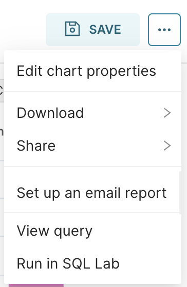
You can easily share this chart by downloading the data or PNG file, copy the chart permalink, or set up a regular email report of the chart.
For more advanced users, View query and Run in SQL Lab allow further interaction with the underlying SQL code generated behind the chart.
Ready for the Next Step?
If you'd like to see some other examples of different chart types, please see Chart Examples. If you're ready to learn about Dashboards, then let's dive in to Creating a Dashboard.