The Bar Chart (legacy) uses bars to help users compare metrics across groups or segments. Here are some examples:
If you're new to visualizing data in Preset, we recommend the following reference articles:
- Creating a Chart: A walkthrough of the overall process of chart selection and creation.
- Using Preset Chart Builder: How to work with the Chart Builder page, the primary interface used when creating a chart.
Creating a Bar Chart
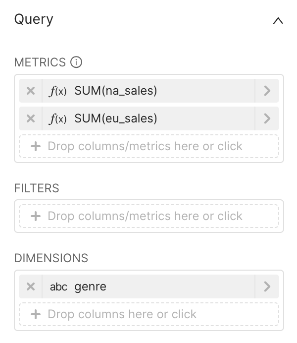
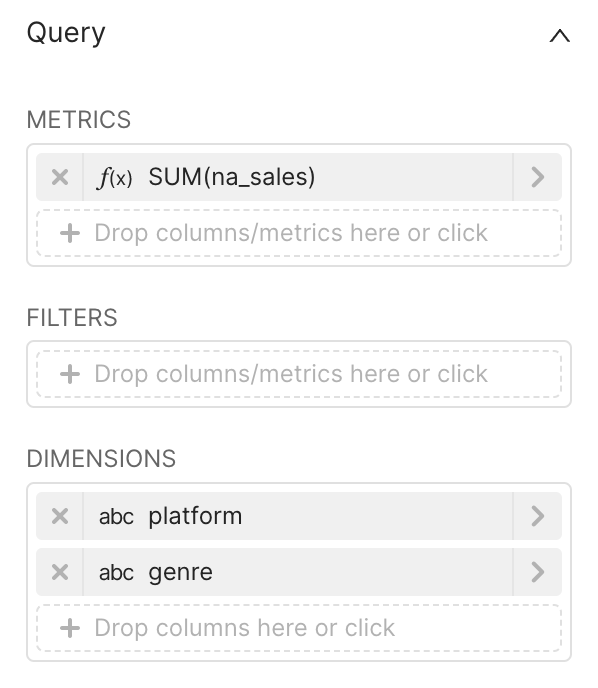
To create a Bar Chart, you need to define the following values:
- X-axis: the column(s) you want the metric(s) to be grouped/categorized by
- Y-axis: the metric(s) you want to visualize on the Y-axis
These are all defined in the Data tab within Chart Builder. Here's a concrete example, with a breakdown afterward:
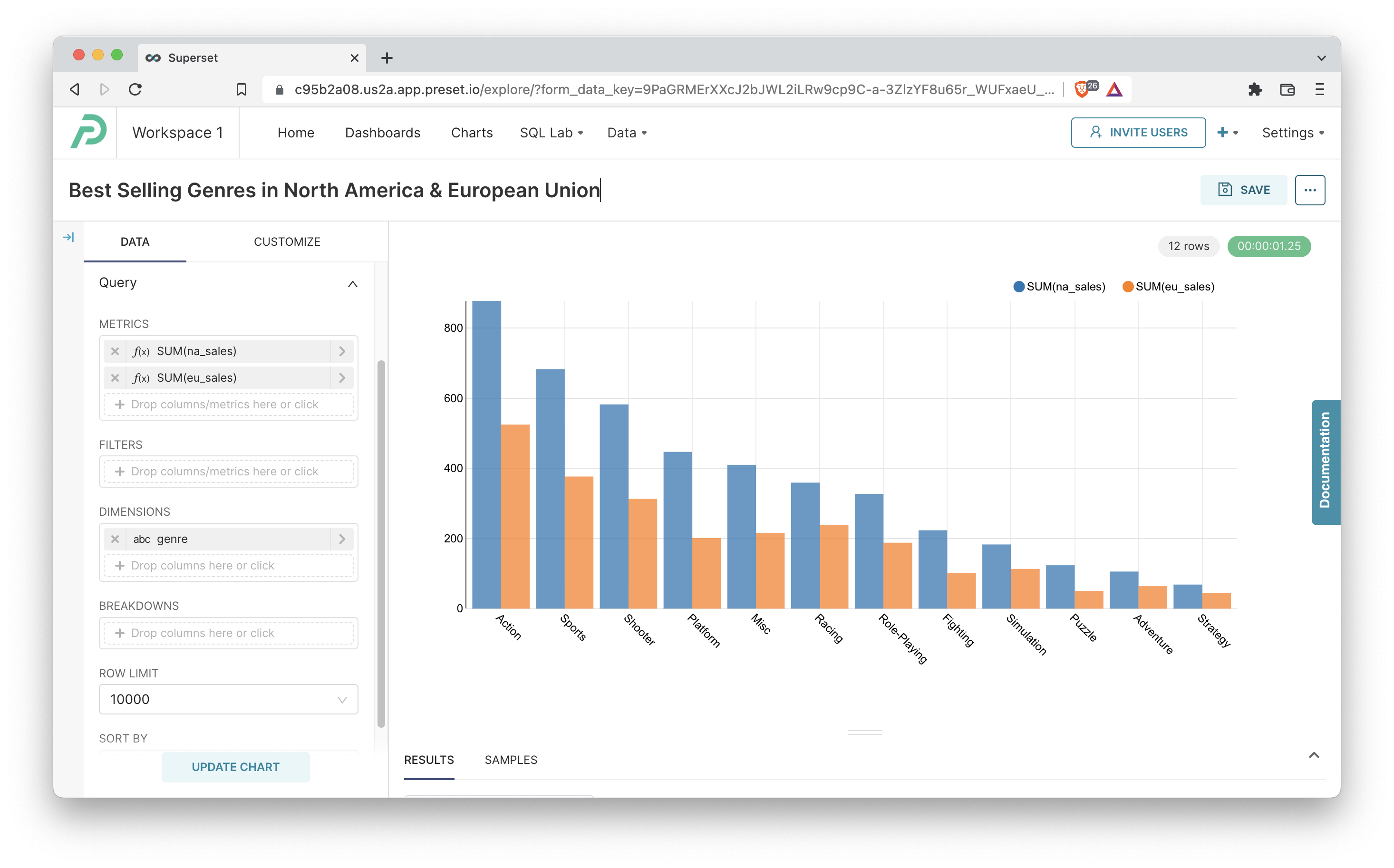
Here's an explanation of the selections we made in the chart builder interface to generate this chart.
 | Chart Builder options
|
 | Generated SQL Query
|
Bar Chart with More Complex Grouping
Multiple Dimensions
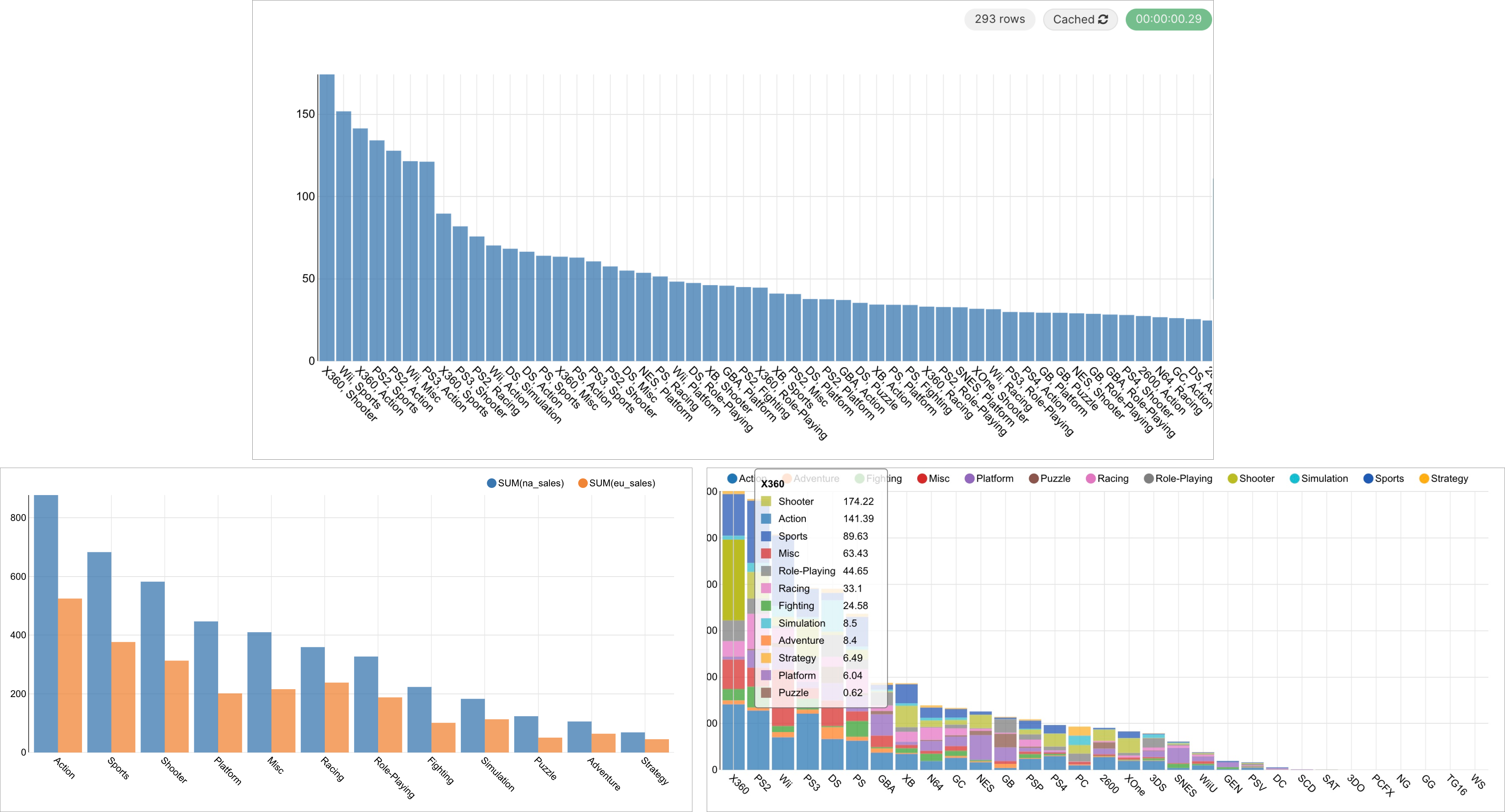
To showcase more complex pair-wise group metrics, you can use multiple Dimension columns in Chart Builder. This technique will do generate m by n bars, with m corresponding to the number of groups in the first column you choose and n corresponding to the number of groups in the second column you choose.
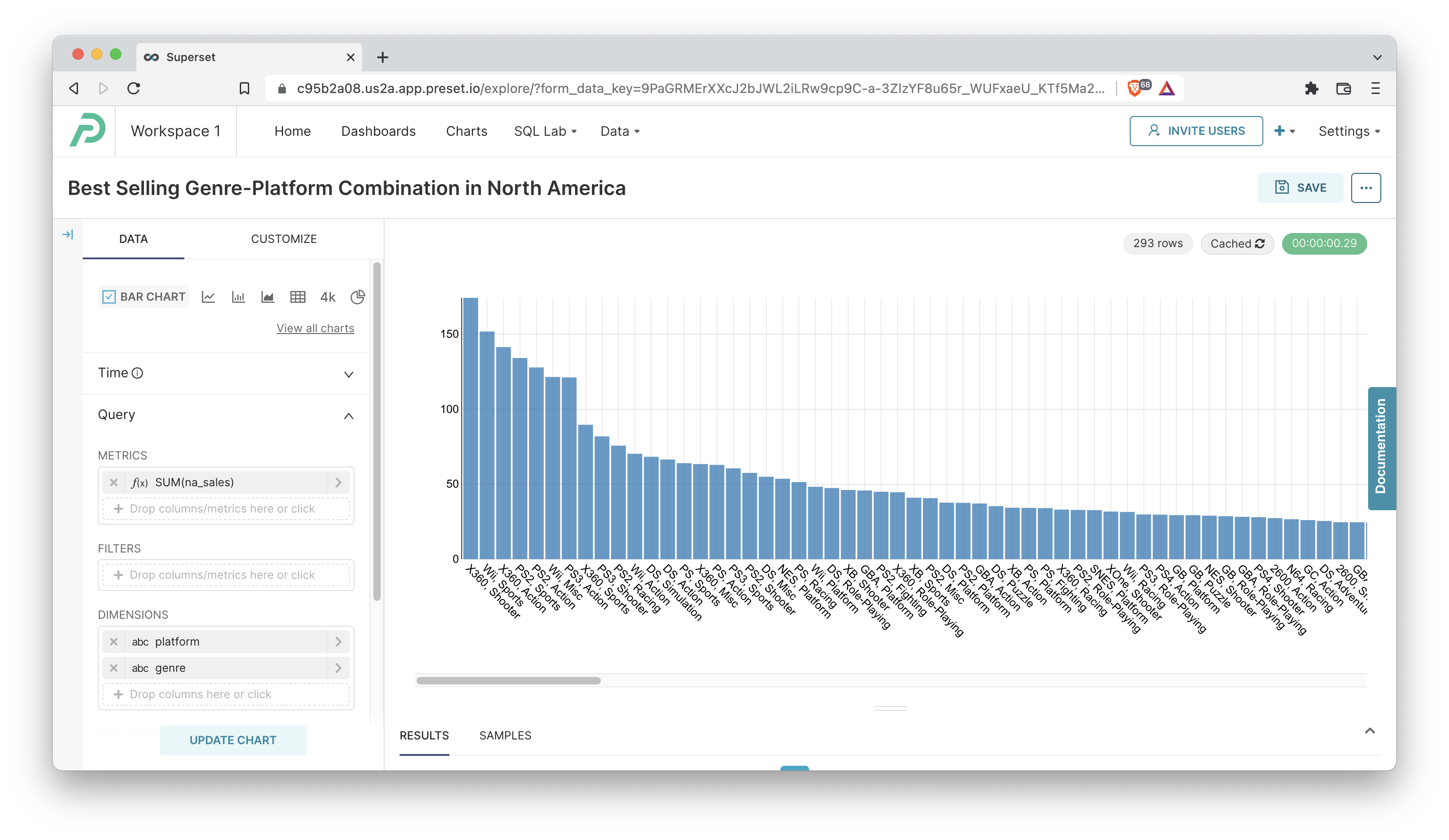
This chart has a staggering 293 bars, which means that we probably can't effectively showcase all of them here. Here's a breakdown of this chart:
 | Chart Builder options
|
 | Generated SQL Query
|
Dimensions and Breakdowns
Using the two dimensions above results in nearly 300 individual bars, which is difficult to both show and interpret. We can instead color segments of each bar by using the Breakdowns feature. This re-uses a dimensional column for breaking up existing bars, instead of generating new ones! Here's what the new chart looks like: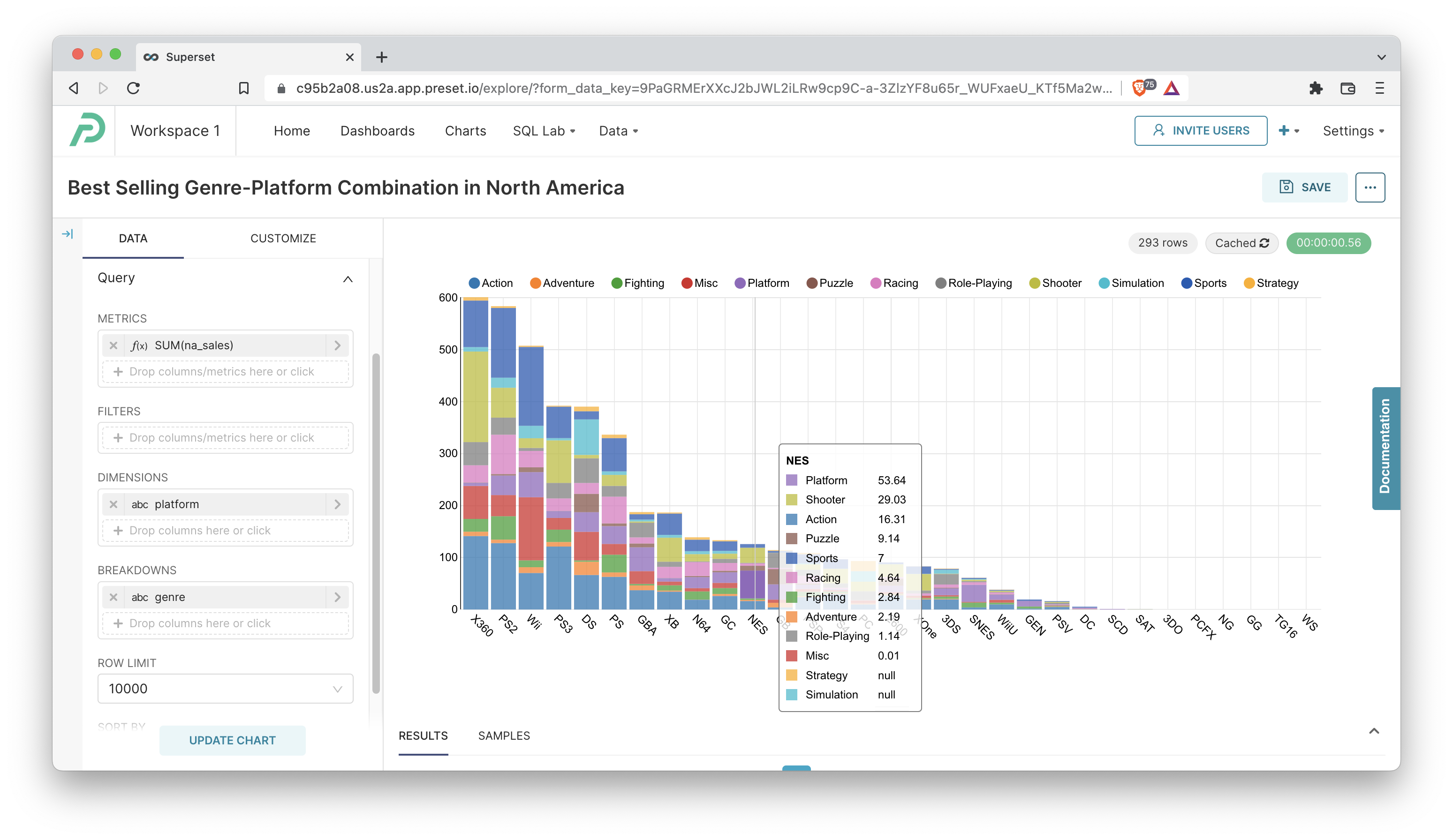
All we did was move the genre column from the Dimensions section to the Breakdowns section and check the Stacked Bars checkbox in the Customize panel! Even the final generated SQL query is exactly the same, but this chart now compactly visualizes all 293 data points but without needing 293 individual bars.
Customizing your Bar Chart
You can customize the table experience further using the following options under the Customize tab. Here's an explanation of some of them:
- Legend: if this checkbox is ticked, the legend for each dimension and color will be shown
- Bar Values: if this checkbox is ticked, the total value for each bar in the graph will be shown at the top of each bar
- Rich Tooltip: if this checkbox is ticked, the tooltip shown upon mouse hovering will contain lots of rich information on the data. We recommend disabling if you're seeing performance impacts for large numbers of groups
- Stacked Bars: if this checkbox is ticked, then the unique group values in the Breakdowns column will be stacked on top of each other
- Sort Bars: if this checkbox is ticked, then the bars will be sorted
- Y Axis Label: enter a descriptive name for your y-axis label
- X Axis Label: enter a descriptive name for your x-axis label