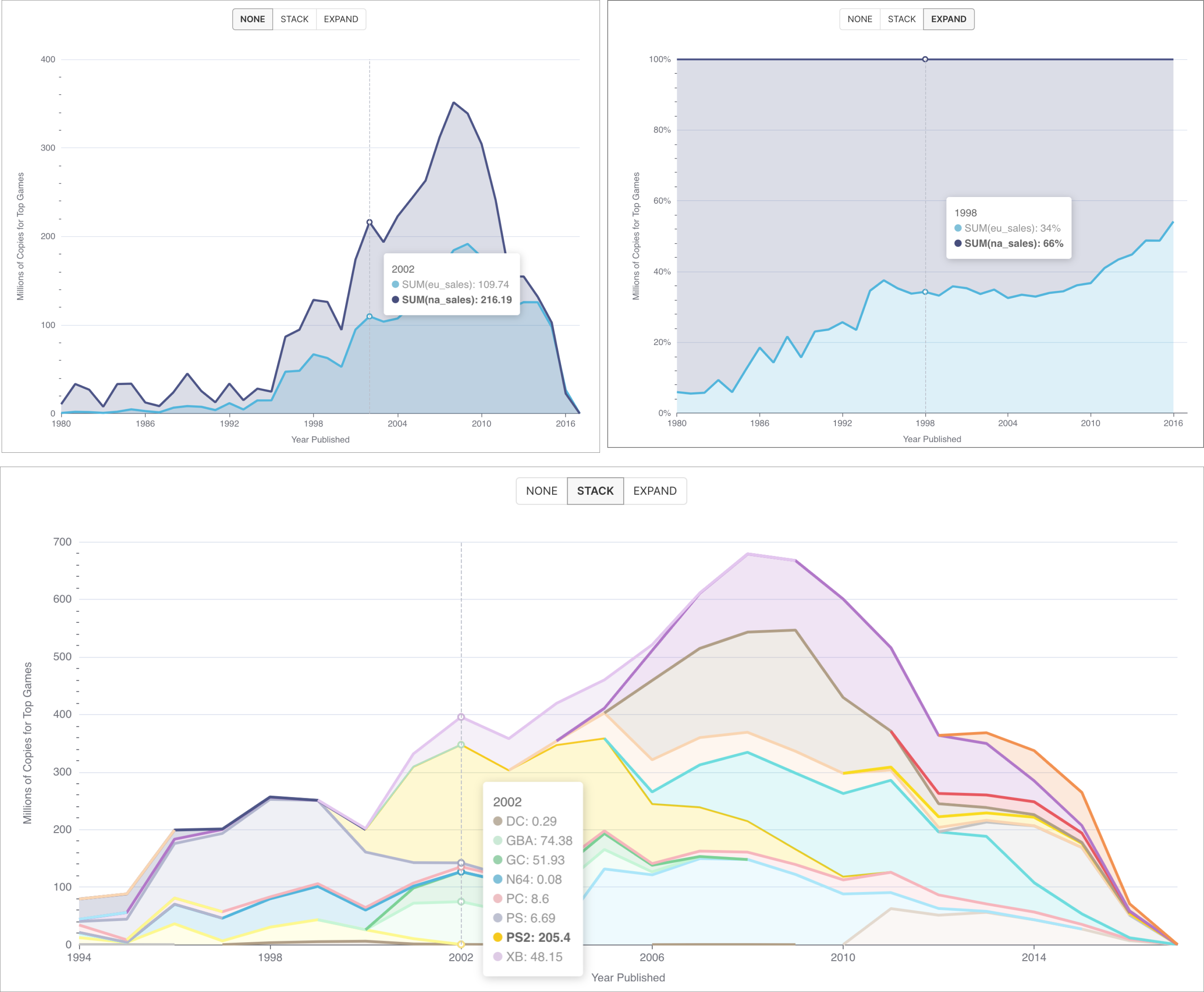
The Area Chart visualization type is best used for understanding how ratios, proportions, or percentages change over a dimension (e.g., time). Here are some examples of different area charts:
Reference Content
If you're new to visualizing data in Preset, we recommend the following reference articles:
- Creating a Chart: A walkthrough of the overall process of chart selection and creation.
- Using Preset Chart Builder: How to work with the Chart Builder page, the primary interface used when creating a chart.
Creating an Area Chart
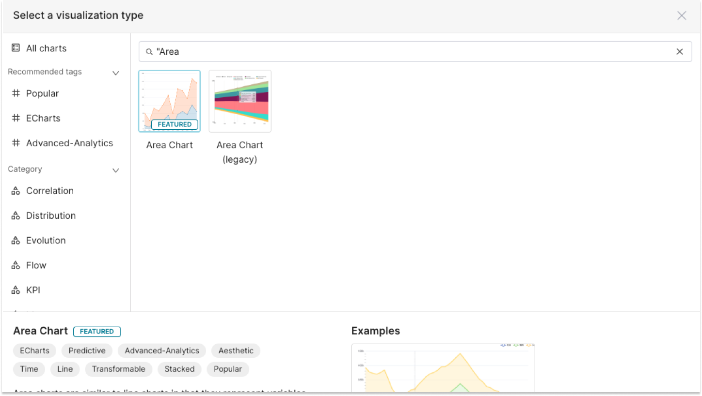
Preset currently has a few options for area charts in the visualization picker:
- Area Chart
- Area Chart (legacy)
We strongly recommend using the Area Chart visualization type, as it’s newer and supports more features.
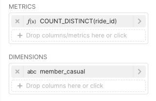
To create an Area Chart, you need to define the following values:
- the column you want as the X-axis
- the metric(s) you want to visualize on the Y-axis
- the column(s) you want the metric(s) to be grouped / categorized by
These are all defined in the Data tab within Chart Builder.
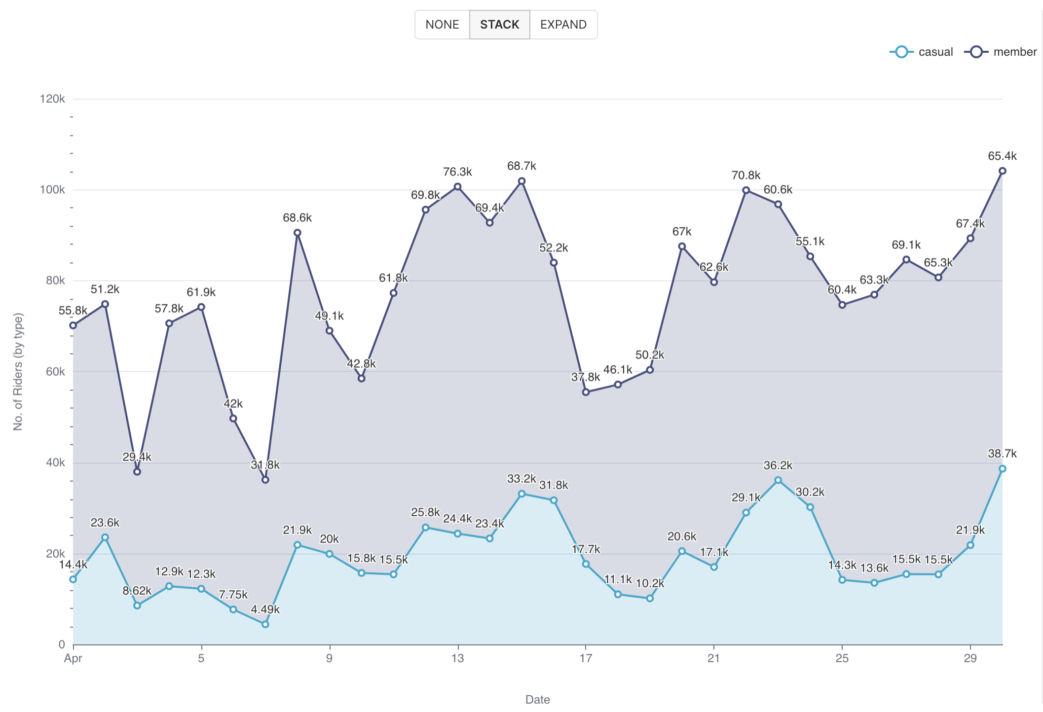
Simple Area Chart (no dimensions)
Below is a very simple area chart that shows a single metric varying over time.

Here's an explanation of the selections we made in the chart builder interface to generate this chart.
.png) | X-axis
|
.png) | Metric(s) on Y-axis
|
Here's the SQL query that Preset generated:
SELECT DATE_TRUNC('DAY', started_at) AS "started_at",
       count(DISTINCT ride_id) AS "COUNT_DISTINCT(ride_id)"
FROM dbt_smukherjee.citibike_trips
WHERE started_at >= '2022-04-01 00:00:00.000000'
  AND started_at < '2022-05-01 00:00:00.000000'
GROUP BY DATE_TRUNC('DAY', started_at)
ORDER BY "COUNT_DISTINCT(ride_id)" DESC
LIMIT 10000
This hopefully helps you understand the mapping from the chart builder options above to the final generated SQL query.
Area Chart (with dimensions)
Below is a similar chart to the one above but with a dimension (rider type) added.
To generate this chart, we re-used the same selections from the first chart but made the following, additional selections:
 | Dimensions
|
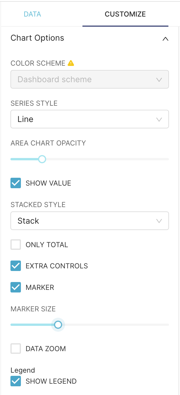 | Customization Options
|
Here's the SQL query that Preset generated:
SELECT DATE_TRUNC('DAY', started_at) AS "started_at",
       member_casual AS "member_casual",
       count(DISTINCT ride_id) AS "COUNT_DISTINCT(ride_id)"
FROM dbt_smukherjee.citibike_trips
WHERE started_at >= '2022-04-01 00:00:00.000000'
  AND started_at < '2022-05-01 00:00:00.000000'
GROUP BY DATE_TRUNC('DAY', started_at),
         member_casual
ORDER BY "COUNT_DISTINCT(ride_id)" DESC
LIMIT 10000
Advanced Analytics
As with most visualizations in Preset, the Area Chart supports Advanced Analytics features like: