Overview
Annotations are used to add more context to a chart by adding a layer of content. Each annotation layer can contain one or more annotations.
The types of annotation layers available include:
- Time Series: Enables you to add additional time series to the chart. The source is another line chart that can come from different data sets.
- Interval: Enables you to add marked date intervals to represent something. The annotation source can be:
- Superset Annotation (see below); or,
- Table: Table Chart that includes Start & End Dates to mark date intervals.
- Event: Similar to interval, but one date.
- Formula: Formula based on depend variable x that is the milliseconds since Epoch Date (1 Jan 1970).
Annotations can be difficult to apply and display. If your annotation is not displaying correctly, check the instructions below or try recreating your chart.
Interval Annotation
Interval annotation will mark time blocks on the chart. The source data of Interval annotation can be defined via the Annotation feature or extracted from a table with start and end dates.
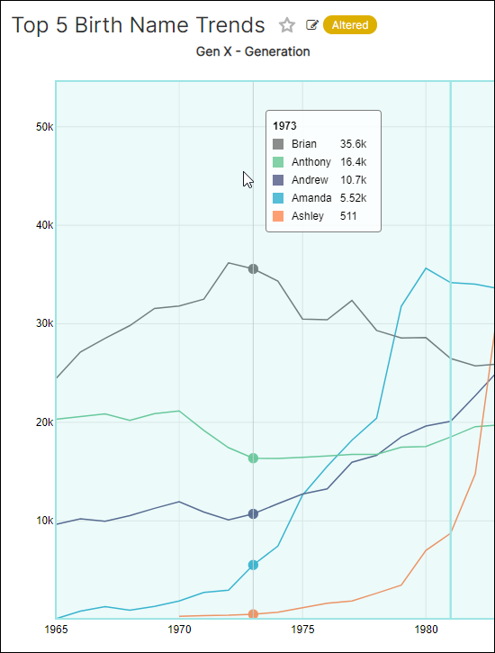
Let's learn how to define annotations within a layer and then apply them to a line chart. In the walkthrough below, we will highlight the different generations on a birth name trend chart from 1965 to 2008.
Create Annotation Layer
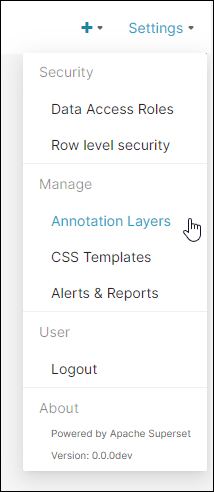
In the Toolbar, hover your cursor over Settings and then select Annotation Layers.
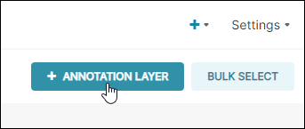
Select + Annotation Layer.
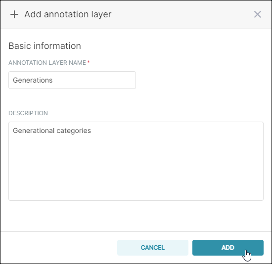
The Add annotation layer panel appears.
In the Annotation Layer Name field, enter a name for the new layer. Next, in the Description text-entry field, enter a brief description of the layer.
When done, select Add.
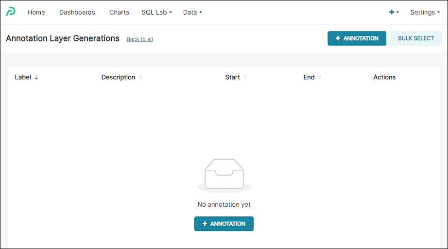
The Annotation screen appears. Now we can start adding annotations!
Add Annotations
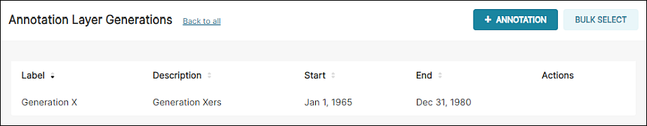
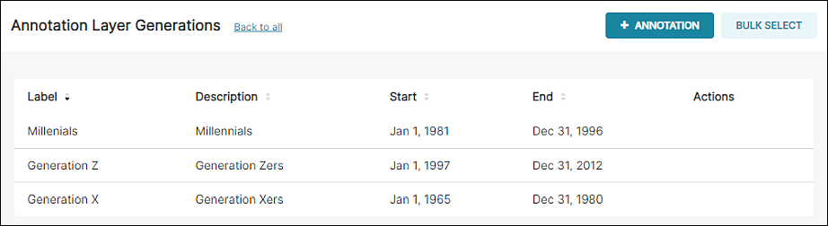
We will create three annotations based on the following generational categories:
- Gen X (1965-1980)
- Millennials (1981-1996)
- Gen Z (1997-2012)
Start by selecting + Annotation.
The Add annotation panel appears.
In the Annotation Name field, enter a memorable name for the annotation.
In the Date field, define starting & ending dates and, optionally, times. In this example, we are selecting the interval from January 1 1965 to December 31 1980.
In the Description field, enter a brief description of the annotation and then select Add.
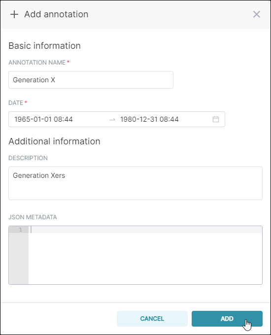
The new annotation appears in the list.
For this walkthrough, we have repeated the process to add Millennials and Gen Z:
Add Annotation Layer to a Chart
In this walkthrough we will use the Birth Name Trends chart as our base and then apply our annotation layer on top of that.
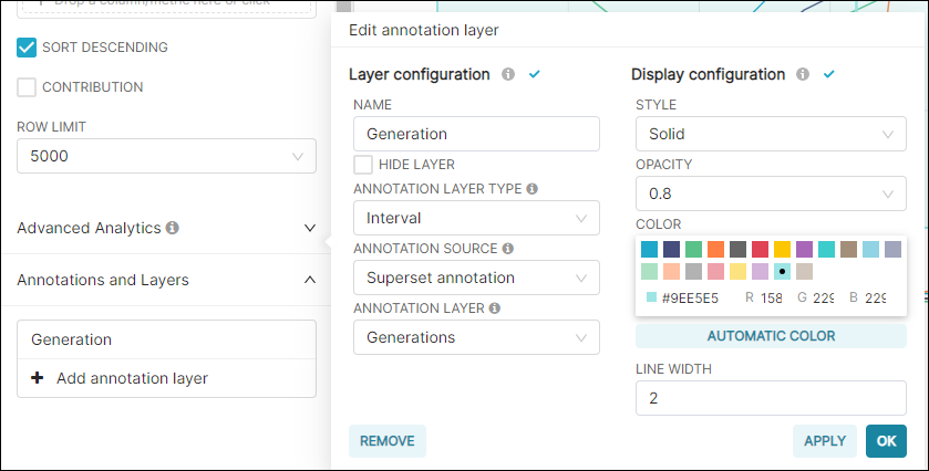
Open the chart, scroll down to the Annotations and Layers section, and then select + Add annotation layer.
Start by configuring options in the Layer configuration section.
In the Name field, enter a name for the chart-specific layer.
In the Annotation Layer Type field, select Interval and then, in the Annotation Source field, select Superset annotation.
Lastly, in the Annotation Layer field, select the annotation layer you just created.
In the Display cofiguration section, feel free to experiment with different styles to achieve the look & feel that you like.
When done, select Apply to see your configuration applied on the chart. To finalize, select OK.
The intervals are highlighted and labeled on the chart.
Event Annotation
Event annotations work in the same way as Intervals.
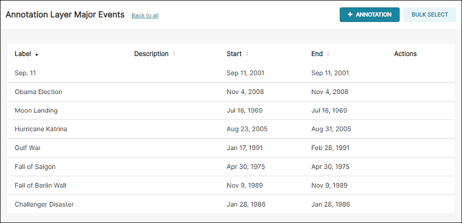
In this example, we created a series of annotations based on major historical events:
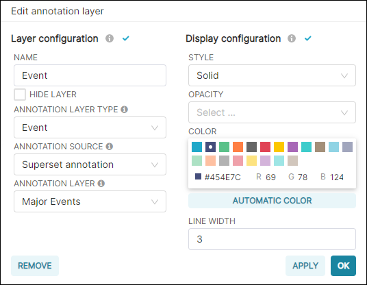
...we then configured the annotation layer for the chart.
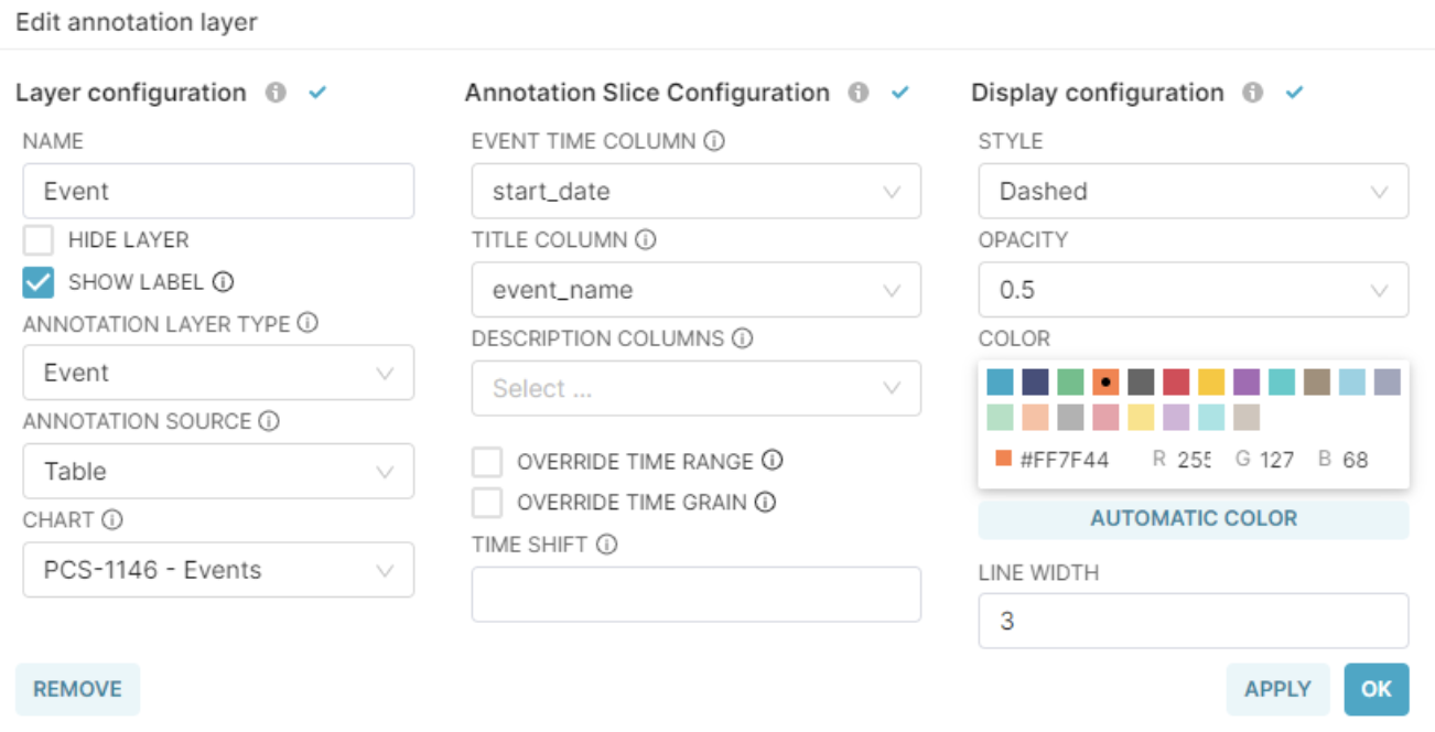
During the configuration, note that the Annotation Layer Type field is now set to Event.
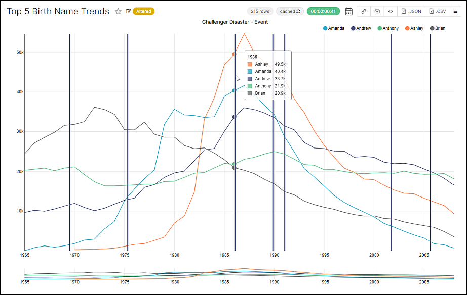
Select OK and view the chart:
Create and manage time annotations with Google Sheet
You can easily create and modify all your time annotations from a Google Sheet and apply them to Preset.
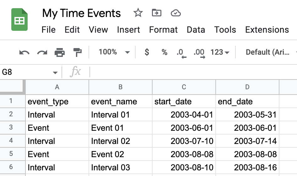
First create a Google Sheet with all your time Events and Intervals
Then connect this sheet to preset and create a dataset
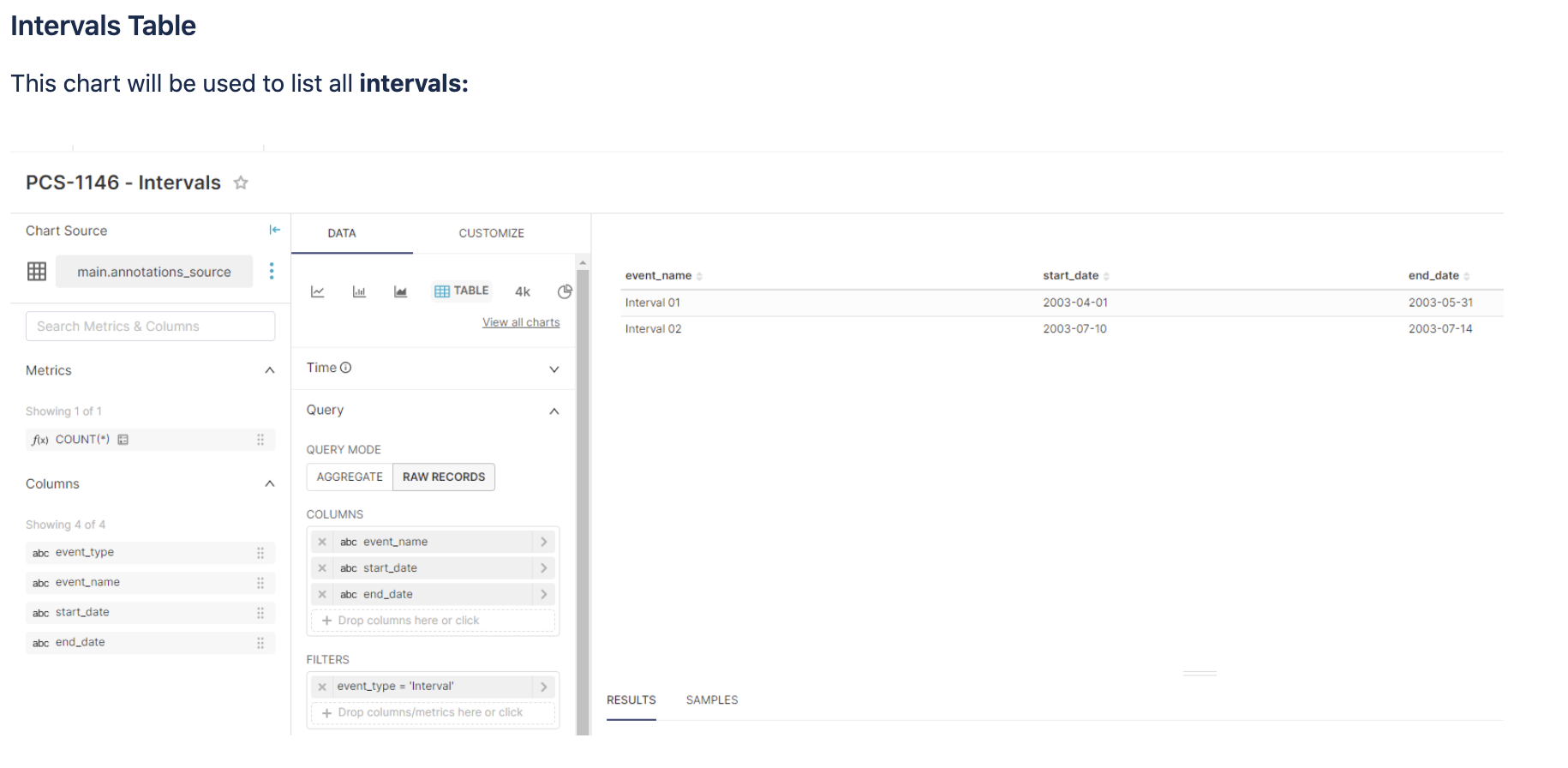
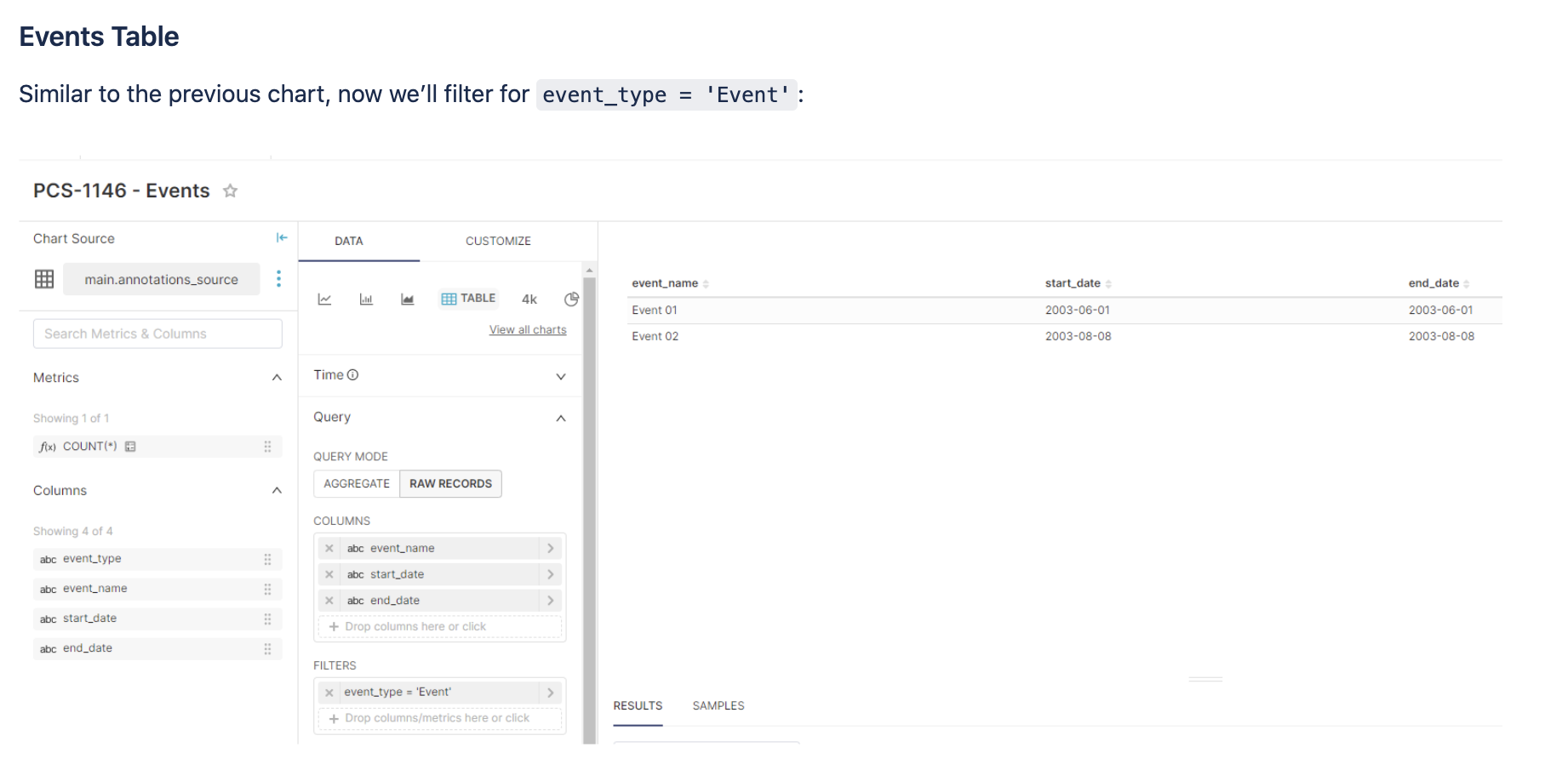
You can now create two tables charts, one for Events and one for Intervals
Now, let’s add this data as Annotation Layers to a Chart
We’ll be using a Line Chart created with the Vehicle Sales example data.
When configuring the Annotation Layer, we’ll select Table as the Annotation Source, and then find the table chart we have just created.
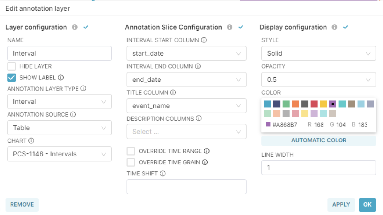
This is the configuration for the Interval Annotation Layer:
This the configuration for the Event Annotation Layer:
You can now add those annotations to any of your charts.
Here is an example with a line chart:
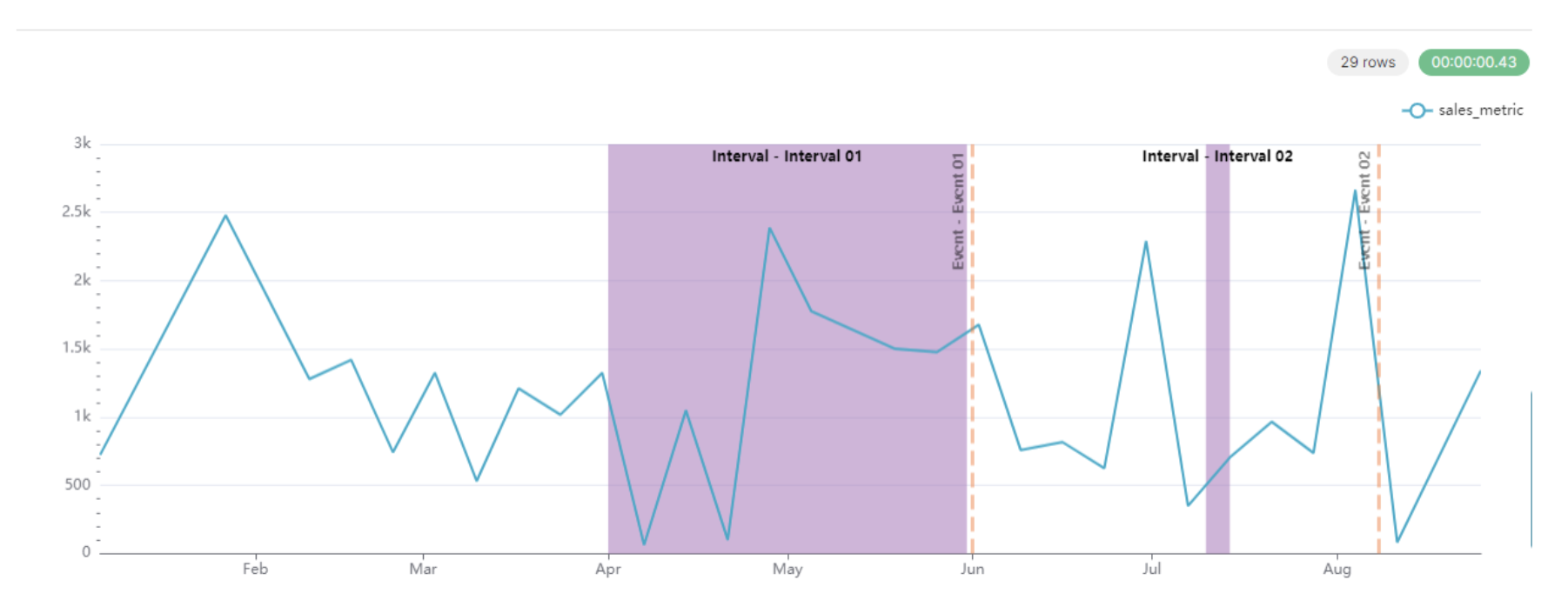
If you add new events to your dataset, the annotations will be added to the charts, which makes it convenient and easy to manage in a central place