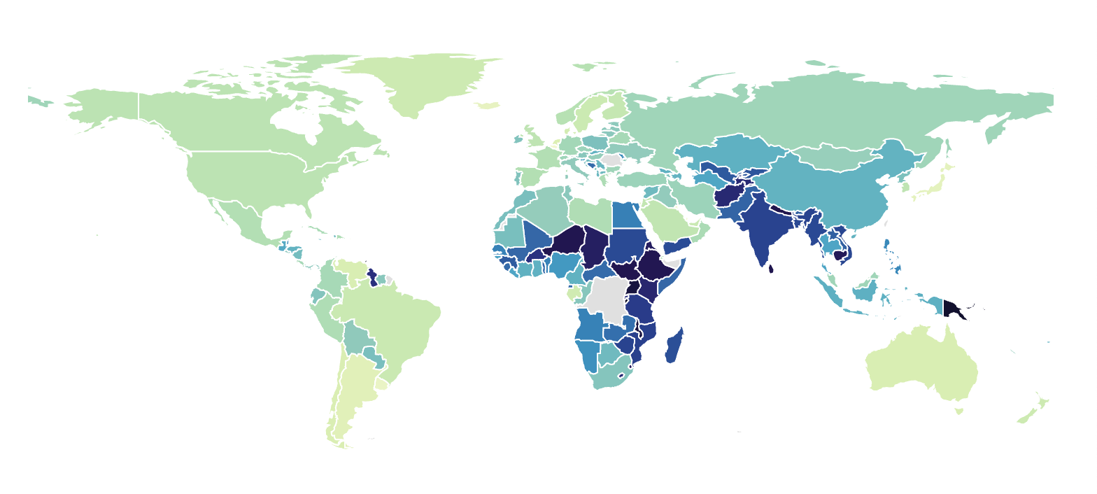
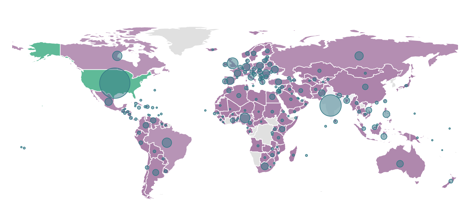
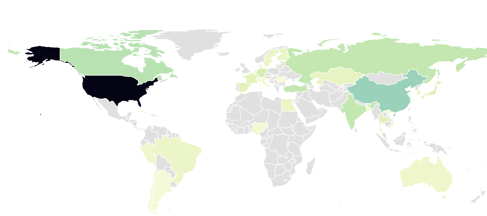
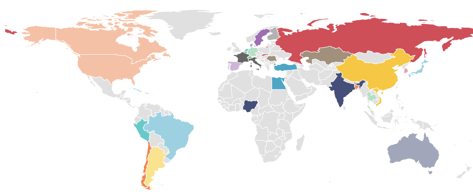
The world map is a core visualization for any BI tool. It's primarily a choropleth map that shades countries of the world according to the selected metric. Here are two examples of the same pie chart, one as a pure choropleth, and one with the addition of scatter plot circles (a.k.a. "bubbles).
 |  |
Reference Content
The following articles may be useful resources as you build your chart:
- Creating a Chart: A walkthrough of the overall process of chart selection and creation.
- Using Preset Chart Builder: How to work with the Chart Builder page, the primary interface used when creating a chart.
Creating a World Map
To create a World Map, you need to define:
- the Metric you want to visualize
- the Dimension(s) you want the metric to be sliced by
Here's a simple example from one of Superset's built-in example dashboards:
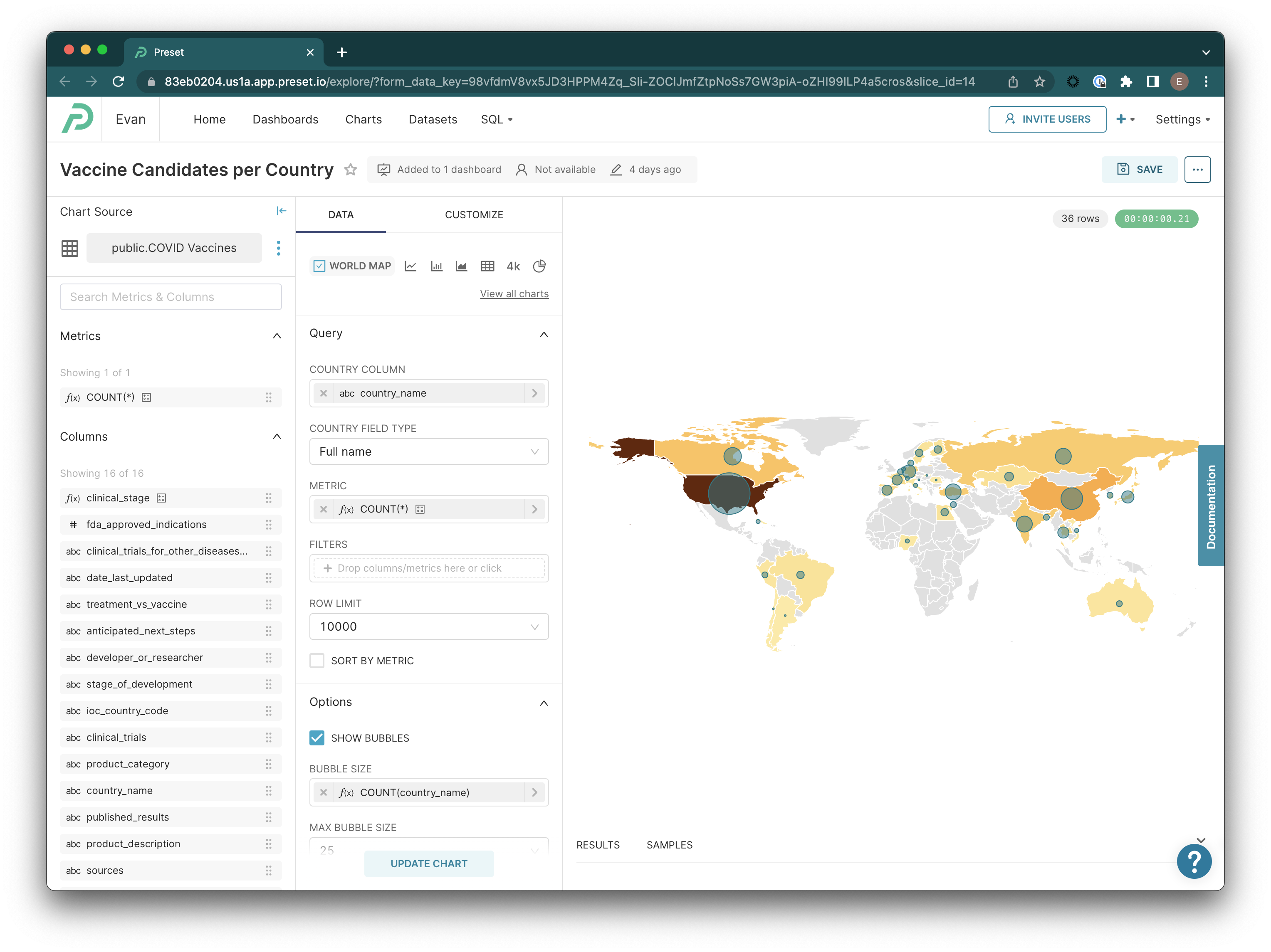
In this example using the COVID vaccines table, we set the Country Column (which is essentially a dimension column referencing three letter ISO 3166-1 country codes) to country_name and the Metric to COUNT(*), which resulted in the following SQL query:
SELECT country_name AS country_name,
       COUNT(*) AS count,
       count(country_name) AS "COUNT(Country_Name)"
FROM public."COVID Vaccines"
GROUP BY country_name
LIMIT 10000
Note that in this example (again, from a stock chart), you see count(country_name) included in the query. That's because in this chart, we've also elected to the "Show Bubbles" option to enable the circles representing this metric centered on each country. Note that the metric selected for these bubbles is part of the query, whether or not the "Show Bubbles" checkbox is enabled.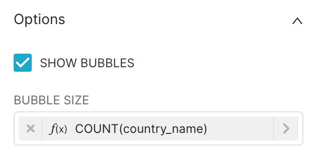
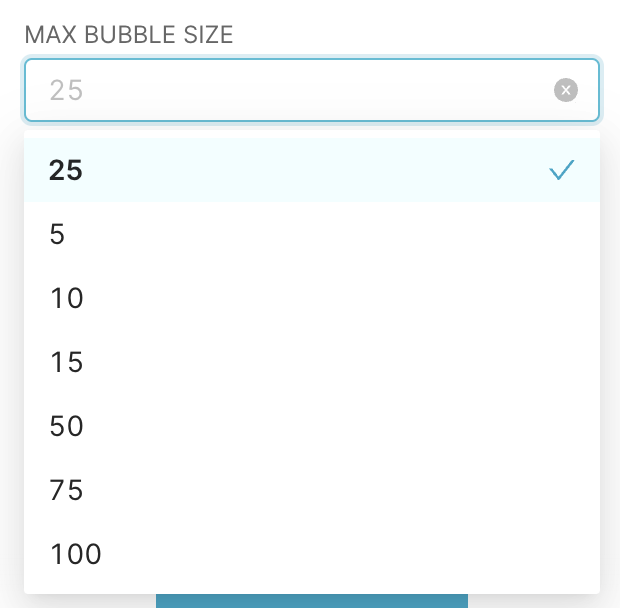
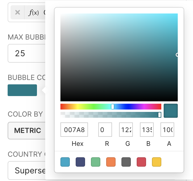
Additionally, you are able to select a maximum bubble size (the upper extent of the radius, based on your metric's maximum value), and a color for the bubbles. You can also select a bubble color using the built-in color picker. Note that while the selected "Bubble Size" metric affects the query, these options do not... they're just grouped together in the UI for conceptual/organizational reasons.
 |  |
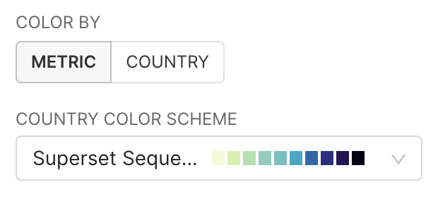
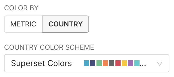
Lastly, you may also adjust the colors applied to your map. You can pick between two coloring methods using the "Color By" control. The Metric option applies a sequential color palette according to the countries in the map, whilst the Country option allows you to select a categorical color palette to the countries on the map. Note that if you do not have enough colors in a sequential color palette, you may see duplicate colors in your map. For more on both types of color palettes, and how to build your own with Preset, please visit this blog post.
 |  |
 |  |