Overview
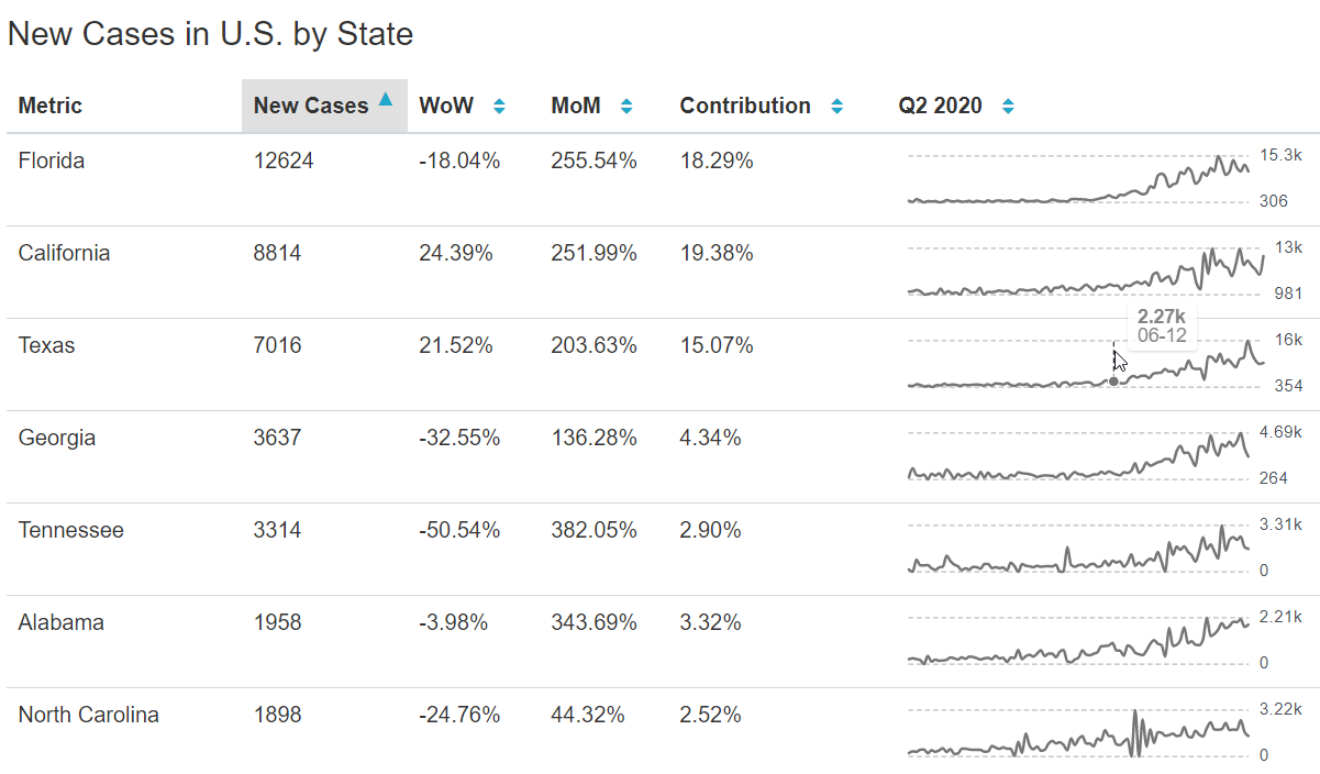
Time-series Table charts combine a tabular presentation of data with time series columns & charts that convey data point snapshots and progression over time. With a Time-series Table, you can easily detect anomalies in a specific cohort while also seeing trends across all cohorts.
Reference Content
The following articles may be useful resources as you build your chart:
- Creating a Chart: A walkthrough of the overall process of chart selection and creation.
- Using Preset Chart Builder: How to work with the Chart Builder page, the primary interface used when creating a chart.
Creating a Time-series Table Chart
Preset currently has a few options for table charts in the visualization picker:
- Table Chart
- Time-series Table Chart
- Pivot Table
Look for the Time-series Table chart type—or use the Search feature to filter by the word “Time”—and then select.
To create a Time-series Table, you need to define in the Chart Builder:
- the Time Column you want use for any time-series visualizations
- the Metric(s) that is being plotted over time
- the Dimension(s) you want to use for to define new rows of the table
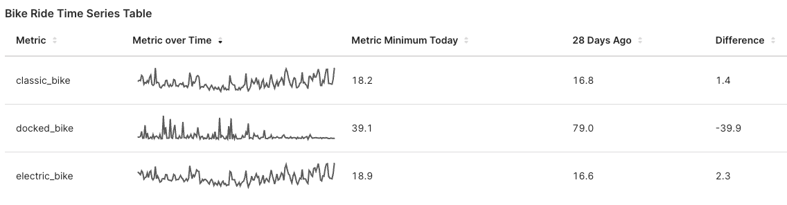
We will walk through an example of finding average ride times for different types of Citi bikes from the public Citi Bike System Data.
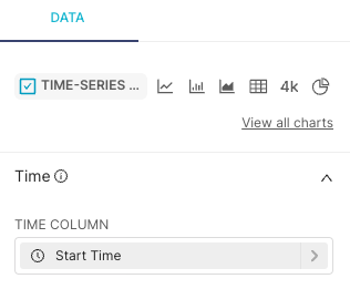 | Time Column
|
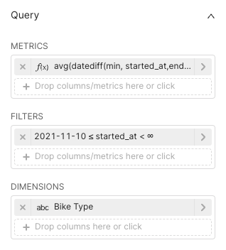 | Metrics
|
  | Time Series Columns
|
Different Column Configurations
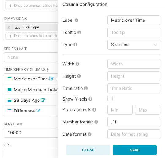
There are 4 different types of Column Configurations available for the table columns:
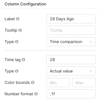
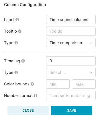
- Time comparison: Produces data points as a result of a direct comparison between time points (e.g., percentile change week over week - WoW).
- Actual Value: Shows the metric value without any time comparison.
- Difference: Shows the difference between the last data point vs. the data point of Time Lag period granularity.
- Percentage: Shows the percentage that represents the last data point vs. the data point of Time Lag Period Granularity.
- Percentage Change: Shows the percentile change based on the first and last data points within the Time Lag period.
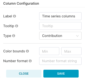
- Contribution: Shows the contributory percentage of the row metric relative to the total of all rows.
- Sparkline: Shows a line chart of metric values for the time range specified.
- Period average: Shows the average of the numbers of periods specified in the Time Lag.
 |  | 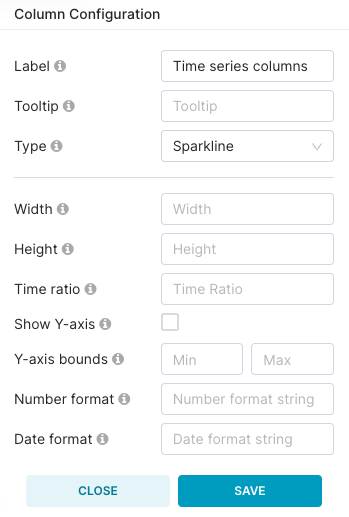 | 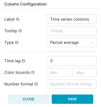 |
Each configuration provides a different set of additional settings:
- Label: Column title name
- Tooltip: Hover tooltip information for column title
- Type: Type of configuration (comparison, value difference, or percentage) for new column
- Time lag: Number of periods to compare against — how far back will we retrieve the data point? This value uses the time granularity of the underlying data
- Color bounds: Number bounds used for color encoding from red to blue. Reverse the numbers for blue to red. To get pure red or blue, you enter either only min or max
- Width: Width of sparkline graph
- Height: Height of sparkline graph
- Time ratio: Number of periods to ratio against
- Show Y-axis: Show Y-axis on the sparkline. Will display the manually set min/max if set or min/max values in the data otherwise
- Y-axis bounds: Manually set min/max for the Y-axis
- Number/Date format: Optional d3 format string
Other Customizations
- URL: Templated link, it's possible to include {{ metric }} or other values coming from the controls