A radar chart lets you visualize a parallel set of metrics across multiple groups or categories. Here are some examples: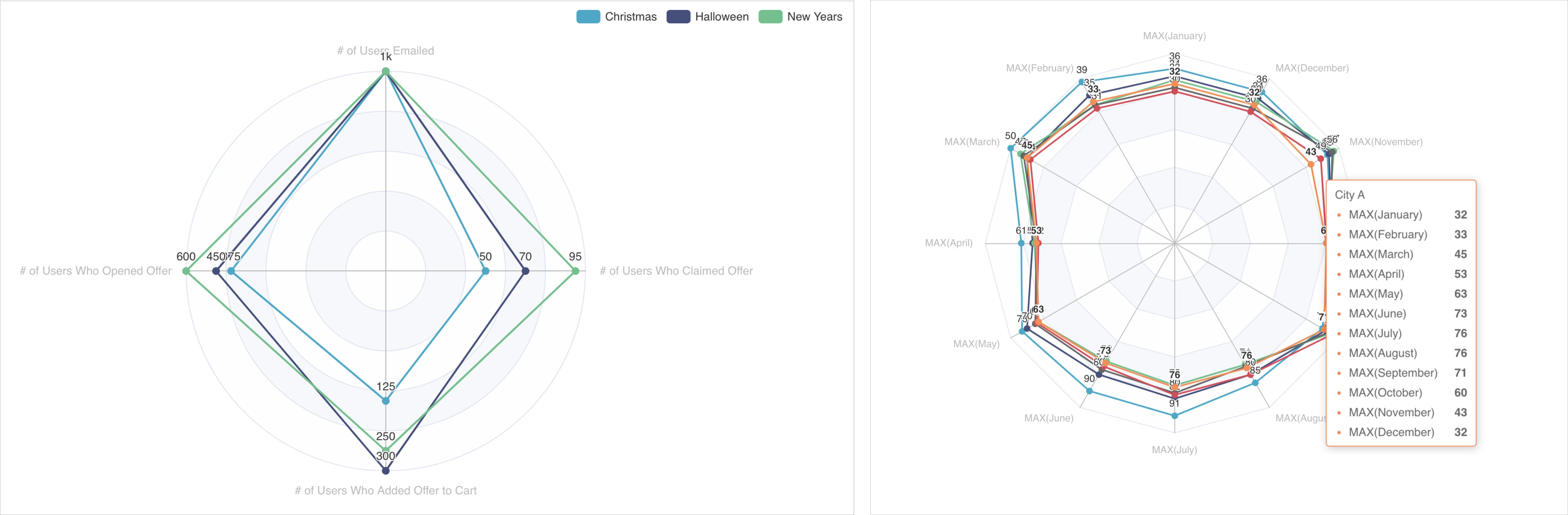
Reference Content
The following articles may be useful resources as you build your chart:
- Creating a Chart: A walkthrough of the overall process of chart selection and creation.
- Using Preset Chart Builder: How to work with the Chart Builder page, the primary interface used when creating a chart.
Creating a Basic Radar Chart
The radar chart is a very unique and flexible visualization type. Here's a breakdown of how the data flows when creating a radar chart in Preset.
 | Shape of your data
|
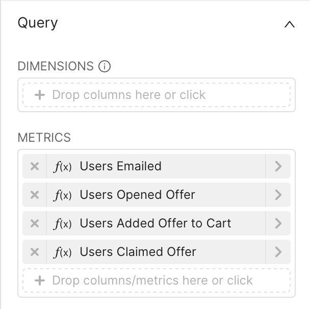 | Chart Builder options
|
 | Generated Query |
 | Resulting Dataset
|
Here's what the final chart looks like:
.png)
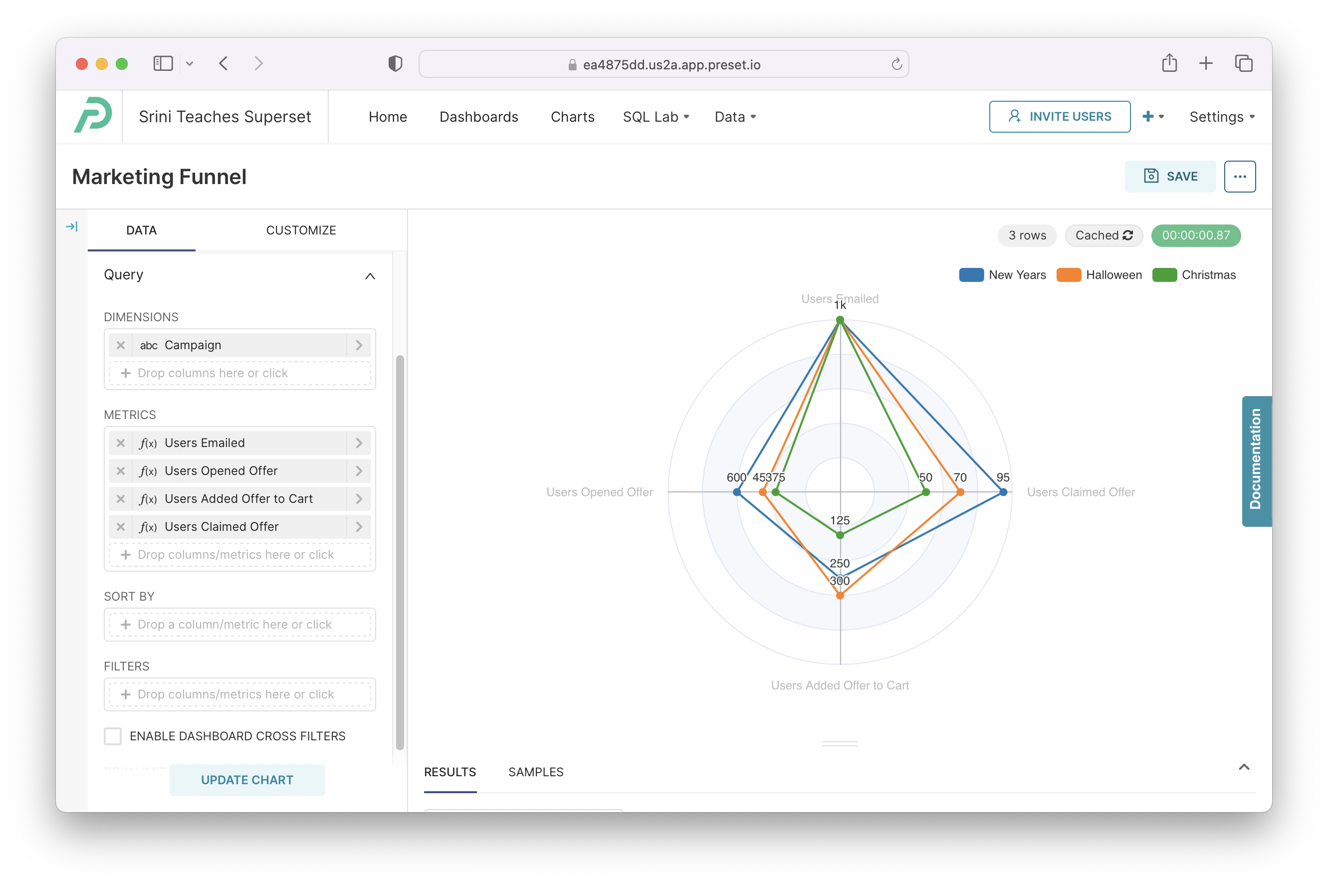
Creating a Radar Chart with Dimensions
We can incorporate a dimension to the chart we just created by using the Dimension option in Chart Builder. The unique values will be used to group the data and the resulting nodes and edges.
.png) | Shape of your Data
|
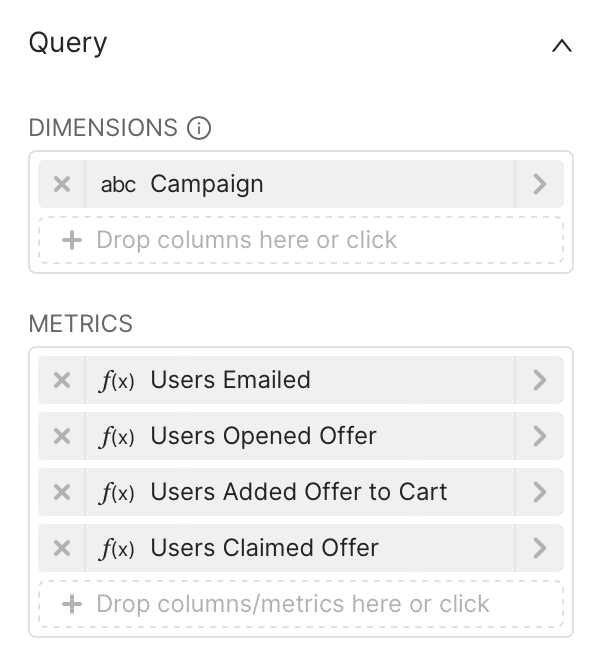 | Chart Builder options
|
.png) | Generated Query
|
 | Resulting Dataset
|
Here's how that chart looks like:
Customizing your Radar Chart
Under the Customize tab, you can find a number of options for customizing your tree chart further. Here are some of the options:
- Color Scheme: choose the color palette you want used in your chart
- Legend
- Show Legend: checkbox that shows the legend (containing the dimensions and colors) if ticked
- Type: choose the type of scrolling behavior for the legend
- Margin: extra padding, in pixels, that you may want to add for the legend
- Labels
- Show Labels: checkbox that shows the metric values as labels if ticked
- Label Position: location of labels
- Number Format: how you want the numbers formatted for display
- Date Format: how you want the date values formatted for display
- Radar
- Customize Metrics: choose which metrics you want included in your visualization
- Circle Radar Shape: checkbox that enables a circular radar as the background if ticked