Overview
A Pivot Table is table of grouped values that aggregates the individual items of a more extensive table within one or more discrete categories.
In this walkthrough, we will create a pivot table that conveys video game publications by gaming platform and grouped by video game genres.
Reference Content
The following articles may be useful resources as you build your chart:
- Creating a Chart: A walkthrough of the overall process of chart selection and creation.
- The Chart Builder Interface: How to work with the Chart Builder page, the primary interface used when creating a chart.
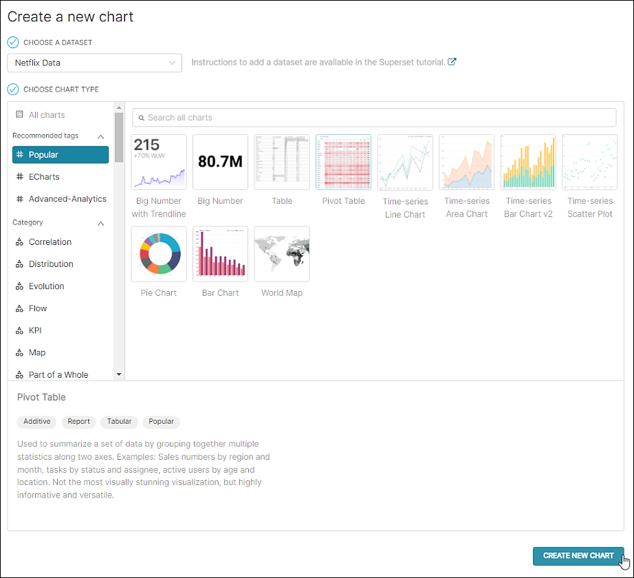
Step 1: Create New Chart
To create a bar chart, in the Toolbar, select + Chart.
The Create a new chart screen appears.
In the Choose a Dataset field, select a dataset to build your query from. In this case, we are selecting a dataset that includes video game sales data.
By default, the #Popular category is selected — from here, you can select a Pivot Table in the chart gallery. Alternatively, enter pivot in the search field.
Next, select Create New Chart.
Step 2: Configure the Chart
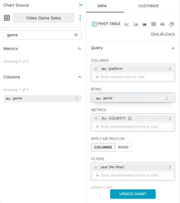
Query Panel
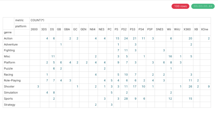
For the table, we will use genre to define rows, and platform to define the columns. We'll use our only available metric, COUNT, and apply that metric to the rows.
Let's start by dragging & dropping the genre column to the Rows field, then drag & drop the platform column to the Columns field.
In the Metric field, drag & drop the COUNT metric and we'll apply that metric on the rows.
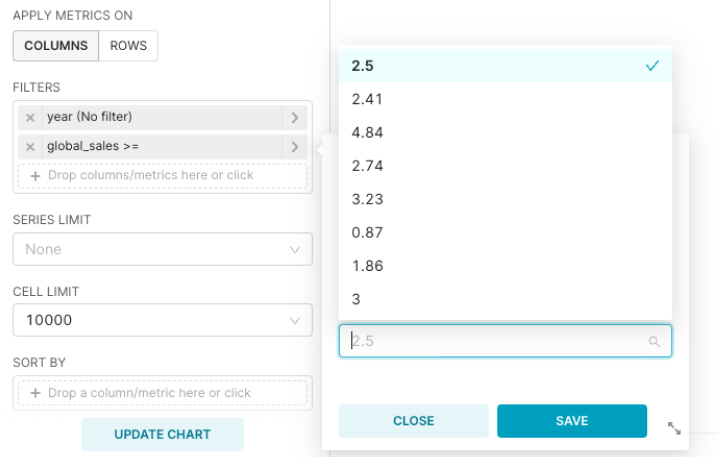
Next, let's configure the filter. We will filter by global sales: Greater than or equal to 2.5.
Drag & drop the Global Sales column to the Filters field.
A sub-menu appears. By default, the operator is "in." Select "Greater or equal to (>=). In the text field, select 2.5. If desired, you can enter a search term and then select the matching option.
In the Row Limit field, select 100 — if you don't see "100" as an option, then enter the value 100 and then select in the drop-down.
This field is used to limit the number of columns that appear in the chart — if this number is too small or too large, then the pivot table may not be useful. So be sure to experiment with some values to find the Row Limit that works best for you.
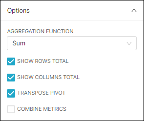
Also, in the Pivot Options panel, complete as follows:
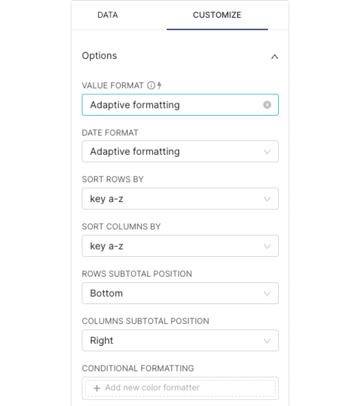
Step 3: Customize the chart
You can customize your pivot table configurations such as output format, sorting orders, and the position of sub-totals from the "Customize" tab.
Step 4: Run the Query
Reference: The Content Panel
Click on Update Chart to run the query.
The pivot table appears in the Content panel.
You can also expand the Data section to view data results and samples from the query.
Step 5: Finalizing the Chart
If you're happy with the visualization, be sure to give it a name.
Save your chart. Remember that you can also save your chart to a dashboard—or create a brand new dashboard—directly from the Save menu!