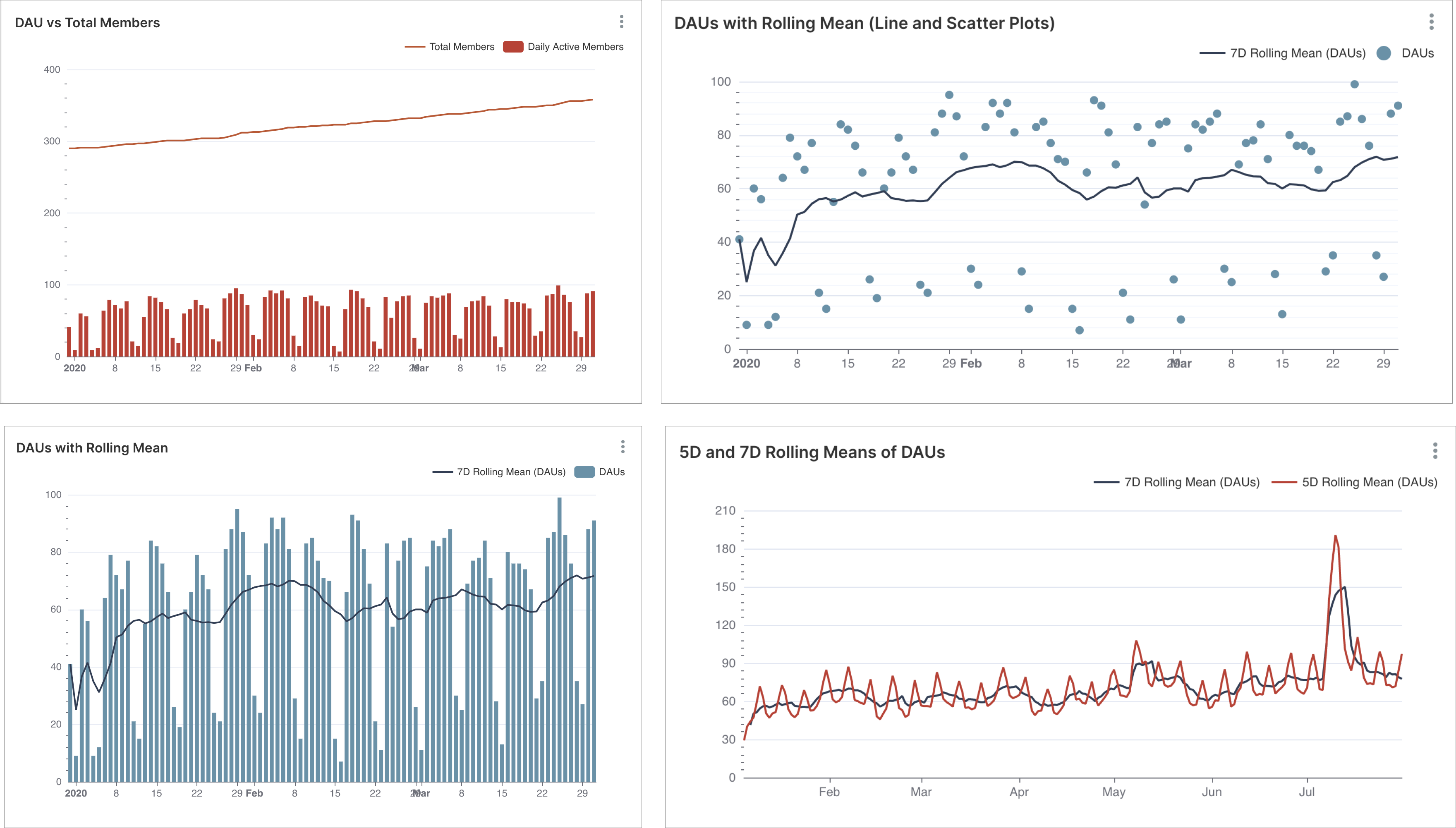
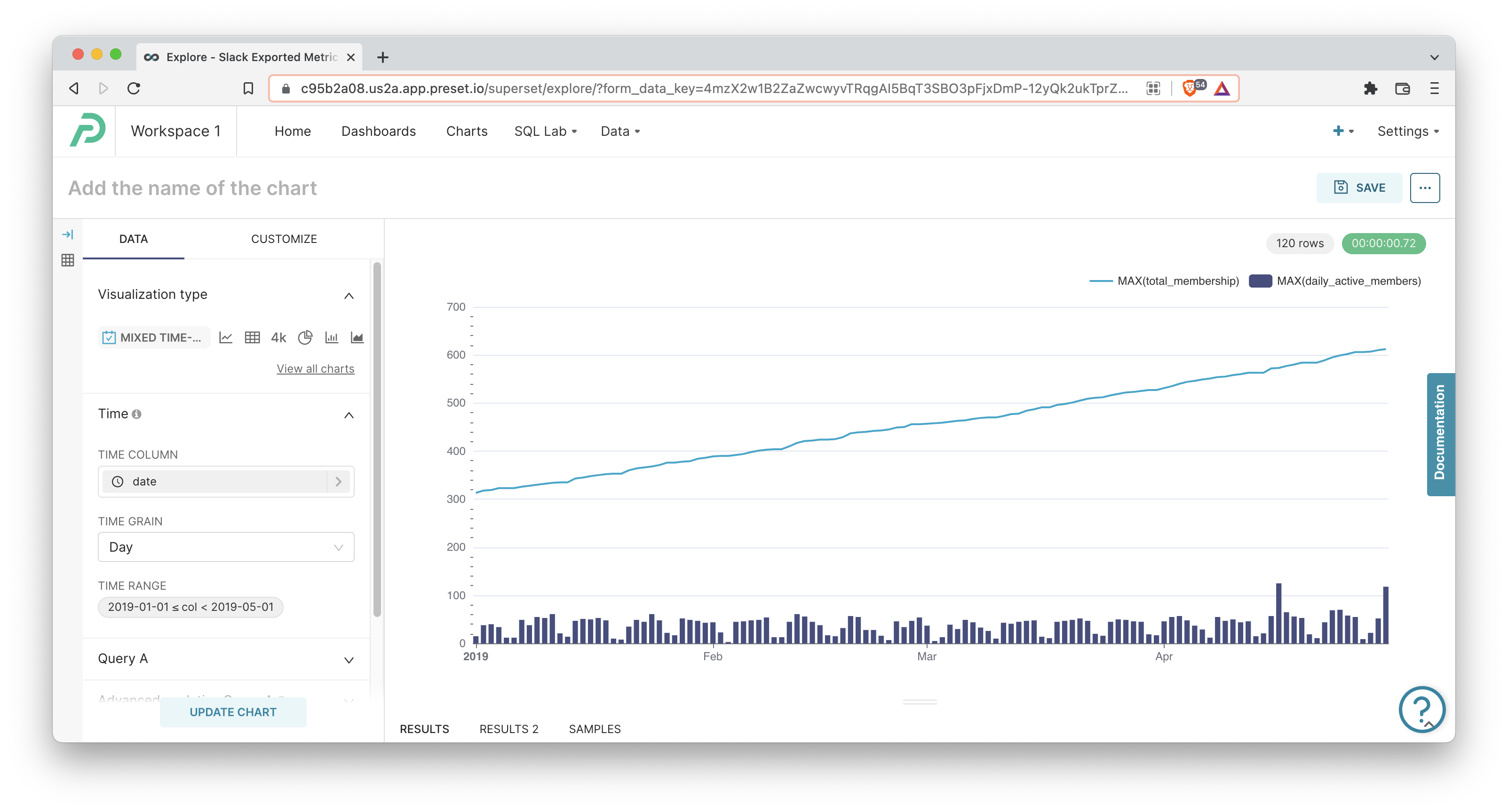
The Mixed Chart lets you combine two different charts in a single chart container using a shared X-axis. Here are some examples:
If you're unsure how to combine charts effectively, this blog post explains some common use cases.
Reference Content
The following articles may be useful resources as you build your chart:
- Creating a Chart: A walkthrough of the overall process of chart selection and creation.
- Using Preset Chart Builder: How to work with the Chart Builder page, the primary interface used when creating a chart.
Creating a Mixed Chart
To create a simple Mixed Chart, you need to define:
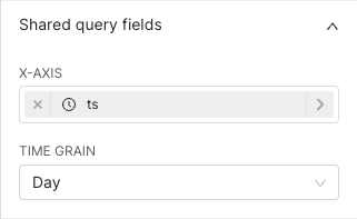
- A shared X-axis for both visualizations
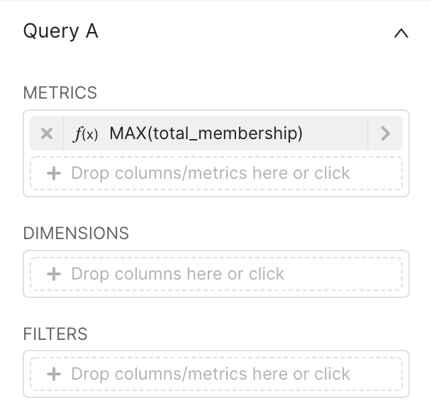
- The attributes for the 1st visualization (Query A)
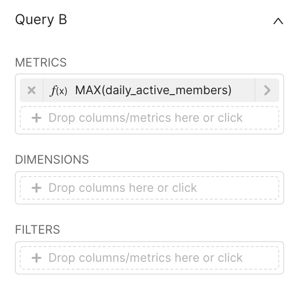
- The attributes for the 2nd visualization (Query B)
These are all defined in the Data tab within Chart Builder.
 | Shared X-axis
|
 | 1st Visualization (Query A)
|
 | 2nd Visualization (Query B)
|
Click Create Chart or Update Chart to generate the queries, run the queries, and visualize the results.
Understanding Both Queries and Results
The Mixed Chart is unique because the Preset backend generates two different SQL queries and aligns the results on the shared X-axis.
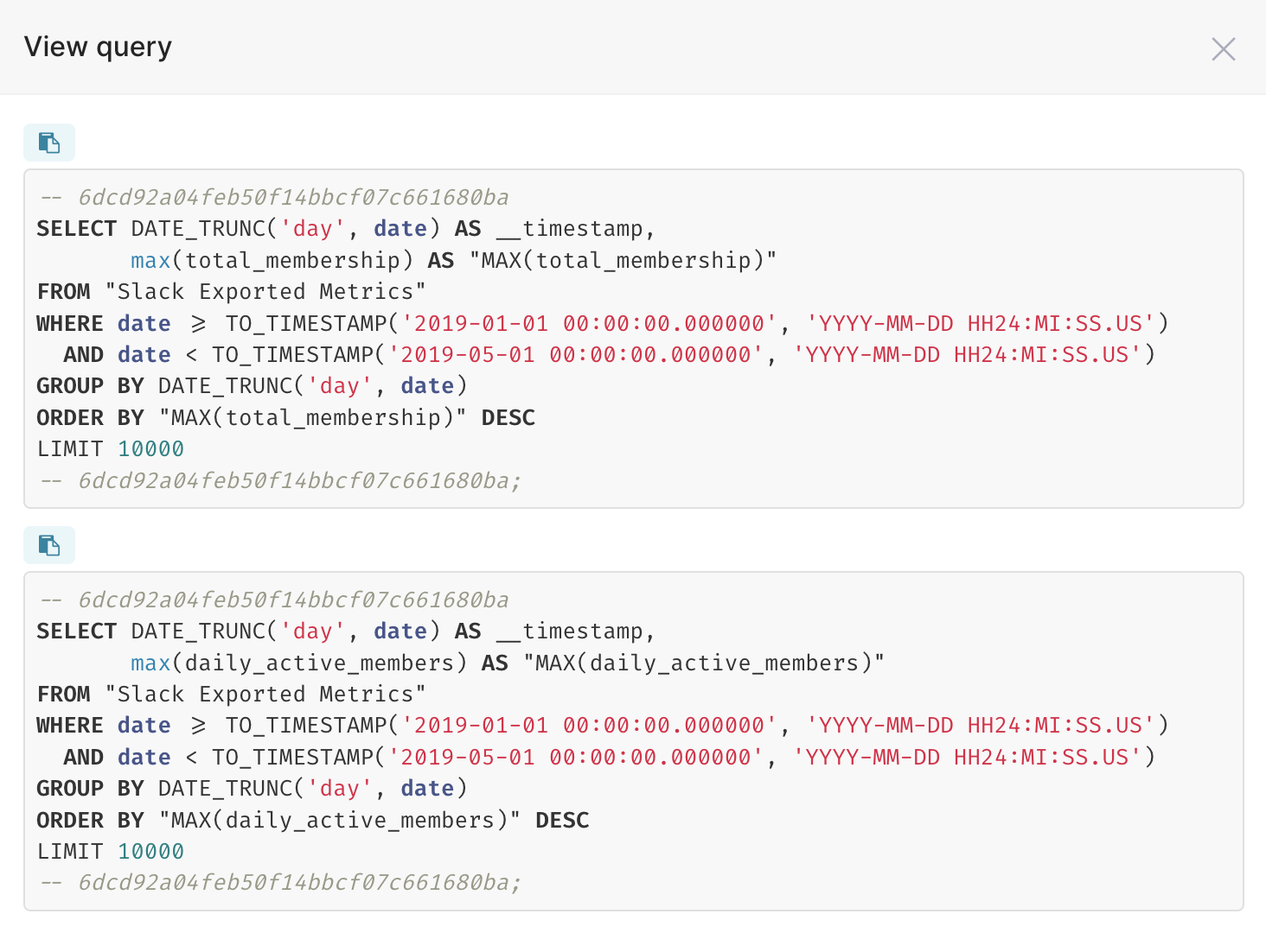 | View Both Queries You can click the [...] button in the top right corner of the Chart Builder interface and then click View Query in any chart to see the queries generated.
|
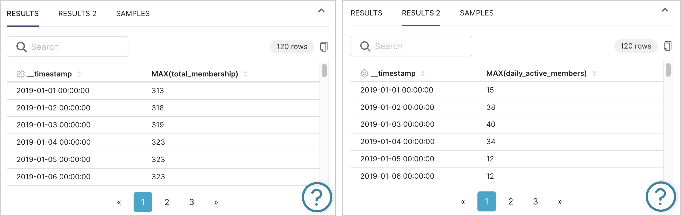 | View Both Results Sets There are two Results tabs underneath the rendered chart, corresponding to the results of both queries.
|
Advanced Analytics
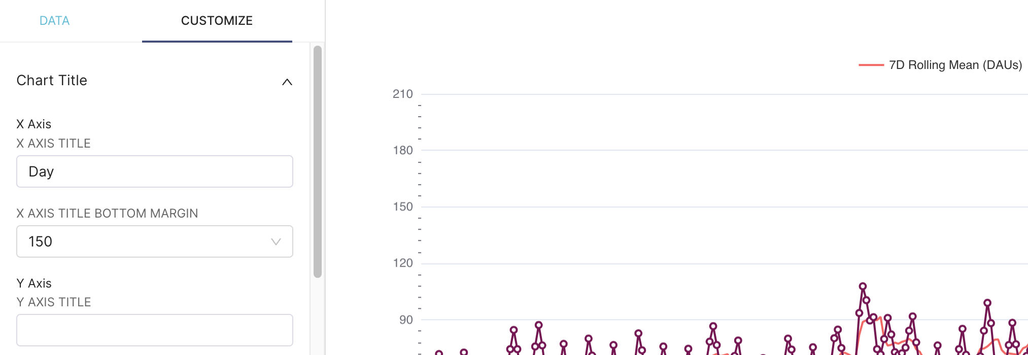
As with most visualizations in Preset, the Mixed Chart supports Advanced Analytics features like:
Because the Mixed Charts combine two queries, results, and charts, you can apply these settings at the individual chart level. In the following example, we apply a 7-day rolling mean to one line chart and a 5-Day rolling mean to the other line chart.
.png)
You can find more examples of Advanced Analytics workflows for this chart type in our blog post.
Customization Options
The Customize tab exposes a number of options for tweaking the look and feel of this chart.
- X Axis section: Customize the name and bottom margin in pixels for the shared X-axis.
- Y Axis section: Customize the name, margin, and position of the Y-axis.
- Color Scheme: Pick a range of colors used for visualization.
- Query A and Query B sections: All customization options for each chart
- Series Type: Choose chart type between Line, Scatter, Smooth Line, Bar, and Step.
- Stack Series checkbox: If the chart has multiple X-axis, checking this checkbox will stack the series (useful for stacking bar charts).
- Area Chart checkbox and Opacity slider: Shade the area under a line chart if checkbox is ticked and use the Opacity slider to specify the degree of opacity.
- Show Values checkbox: Ticking this will show each data point, as a number, for this chart.
- Marker and Marker Size: For line charts, you can enable markers (or circles) for the data points and use the slider to choose the size.
- Y Axis
- If set to Primary, this chart's computed Y-axis will be on the left hand side.
- If set to Secondary, this chart's computed Y-axis will be on the right hand side.
- You can enable two different Y-axis ranges by setting one chart to Primary and the other chart to Secondary.
- Legend
- Show Legend checkbox: If ticked, will show each Metric in the Legend.
- Type: If set to Scroll, the Legend will only show a few Metrics at a time and will hide the rest. If set to Plain, the Legend will attempt to show all Metrics.
- Orientation: Location of the Legend as it relates to the chart container (Top, Bottom, Left, or Right).
- Margin: Additional whitespace margin between Legend and chart container (in pixels).
- X Axis
- Format: Choose the format for the X-axis labels or default to Adaptive Formatting to let the tool decide.
- Rotate Axis Label: Optionally rotate the X-axis label.
- Tooltip
- Rich Tooltip checkbox: If ticked, shows all Metric / Series values as you hover across the X-axis.
- Tooltip Sort by Metric checkbox: If ticked, sorts the tooltip by the selected metric in descending order.