What is Matrixify?
Matrixify transforms a single chart into a grid of multiple charts, making it easy to compare metrics across dimensions or view multiple metrics side-by-side. Matrixify creates a matrix layout where each cell shows a variation of your chart:
- Different metrics - Compare sales, profit, and quantity side-by-side
- Different dimension values - View data for each region, product category, or time period
- Combinations of both - Show multiple metrics across different segments
.png)
When to Use Matrixify
- Comparative analysis - Compare metrics across regions, departments, or product lines
- Trend analysis - View the same metric across different time periods or segments
- Multi-metric dashboards - Display several KPIs in a compact layout
- Small multiples - Create visualizations for pattern recognition
Getting Started
Step 1: Create Your Base Chart
Create and fully configure your chart (metrics, filters, colors, styling) before enabling Matrixify.
Step 2: Enable Matrixify
- Click the Matrixify tab at the top of the chart controls panel (next to Data and Customize)
- Toggle Enable matrixify to ON
- Configuration options will appear below
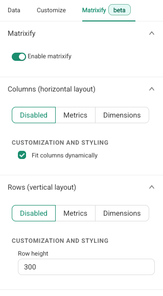
Step 3: Configure Axes
Configure at least one axis (rows or columns). Each axis can be:
Metrics
Select multiple metrics (Sales, Profit, Quantity, etc.). Each metric generates a separate chart in the matrix.
Dimensions
Filter by dimension values. Choose a selection method:
- Dimension members - Manually select specific values
- Top N - Automatically select top values by a metric
- All dimensions - Use all available values (limited to 25)
.png)
Step 4: Customize Layout
- Charts per row - Number of columns in your grid
- Row height - Height of each chart in pixels (default: 300px)
- Fit columns dynamically - Auto-adjust column widths
- Cell title template - Customize titles with
{{rowLabel}}and{{colLabel}}
Step 5: Update and View
Click Update chart to generate your matrix with:
- Row labels on the left (if enabled)
- Column headers at the top (if enabled)
- Individual filtered charts in each cell
Turning Off Matrixify
- Go to the Matrixify tab
- Toggle Enable matrixify to OFF
- Click Update chart
Your chart will return to its original single-chart view without the matrix. Your Matrixify configuration is preserved for future use.
Using Matrixify on Dashboards
Adding Matrixify to Dashboards
- Drag and drop like any other chart
- Resize and position - The entire matrix acts as a single element
- Layout adapts - Grid adjusts based on your "Charts per row" setting
Dashboard Filters
- Filters apply to all cells in the matrix
- All cells are filtered consistently for meaningful comparisons
- Cross-filtering works the same as regular charts
Performance Tips
- Keep matrices at 3-5 rows/columns
- Use simpler chart types for large matrices
- Monitor total Matrixify charts per dashboard
Configuration Examples
Example 1: Multiple Metrics
Configuration: Rows = Sales, Profit Margin, Order Count | Columns = Disabled
Result: Three charts stacked vertically
Example 2: Regional Analysis
Configuration: Rows = Region (all values) | Columns = Disabled
Result: One chart per region
Example 3: Full Matrix
Configuration: Rows = Product Category (Top 5) | Columns = Revenue, Profit, Units Sold
Result: 5x3 grid with 15 charts
Supported Charts
Matrixify works with most chart types:
- Time series - Line, area, bar charts
- Categorical - Bar, pie, funnel charts
- Statistical - Box plots, histograms, bubble charts
- Comparison - Big Number, gauge charts
- Geographic - Map visualizations
- Text - Word clouds, pivot tables
Not Supported
- Table charts - Cannot be used with Matrixify
Tip: Simpler chart types work best in matrix layouts.
Best Practices
Keep It Readable
- Limit to 3-5 rows and columns
- Adjust row height for chart complexity
- Use consistent scales across cells
Optimize Performance
- Use appropriate row limits
- Choose simple chart types for large matrices
Enhance Clarity
- Customize cell titles
- Toggle labels based on needs
- Consider chart type for small formats
FAQ
What happens if I select too many dimension values?
"All dimensions" is limited to 25 values. For more, use "Top N" or manual selection.
Can I use the same dimension for rows and columns?
Yes, with different values or selection methods (e.g., Top 5 by sales vs. manually selected regions).
Can I export a matrix chart?
Yes, the entire matrix grid is included when downloading or exporting.