Overview
The Interactive Table chart brings new interactive features to our previous table visualization. This visualization type adds the ability to filter specific columns and to resize and rearrange to fit your design needs.

Interactive Table Features
Reference Content
The following articles may be useful resources as you build your chart:
Creating a Chart: A walkthrough of the overall process of chart selection and creation.
Using Preset Chart Builder: How to work with the Chart Builder page, the primary interface used when creating a chart.
Storytelling with Charts Mini Guide: How to create charts to effectively communicate with viewers
Types of Tables
You'll notice a few different options for tables in the visualization picker:
Interactive Table
In this article, we'll be focusing on the Interactive Table visualization type.

Interactive Table chart type in the visualization gallery
If you have a Table that you’d like to switch to an Interactive Table, use the chart type switcher at the top of the Chart Builder configuration panel to select the Interactive Table.
.png)
Aggregated vs Raw
With the Interactive Table visualization type, you can either showcase the raw data directly from your database or first apply aggregations.

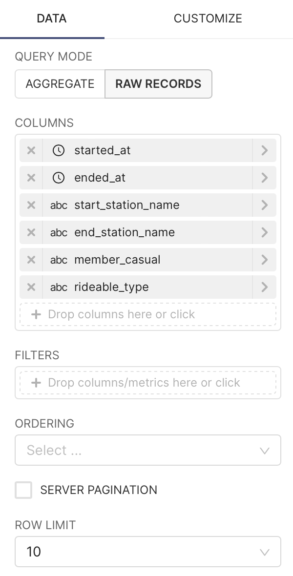
Building a Table from Raw Data
The following example is a table that showcases 10 rows and 6 specific columns from the underlying table in our database:
For this mode, the only requirement is to select which Columns you want to include. Here's a breakdown of all the things we chose in Chart Builder to create the chart above:
|
|
| Generated Query
|

Building a Table from Aggregated Data
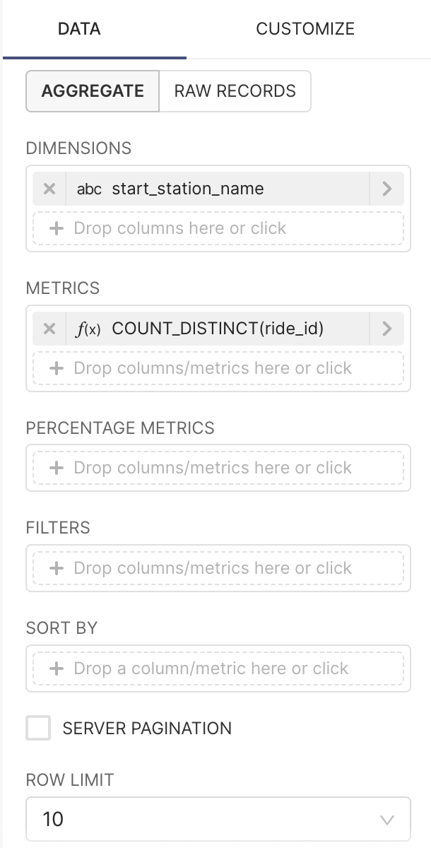
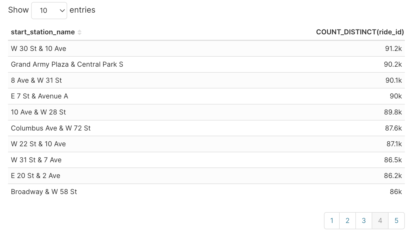
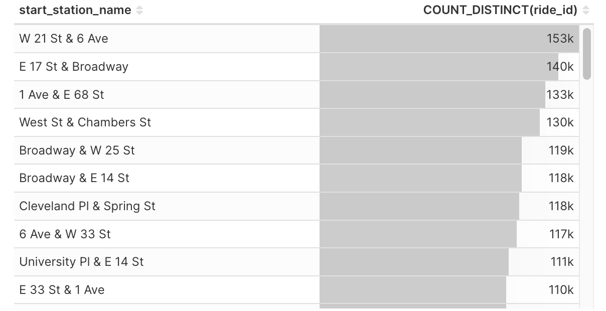
Alternatively, you can apply aggregate functions on your data to showcase aggregate values in your table instead. Here's an example of a table with aggregated values:

Aggregate data in the Interactive Table
Besides changing the Query Mode to Aggregate, you now need to choose the Dimensions and Metrics instead.
|
|
| Generated Query
|

Customizing your Table
The Interactive Table allows for customization directly in the table. You can customize the following:
Column sorting
Column width
Pin / Unpin columns
Showing and hiding columns: Use the Choose Columns and Reset Columns to configure column visibility
Column order: Drag a column header to reorder it within the table
.png)
Column filtering: Click the filter icon at the top of a column to access the filter options. Use the dropdown menu at the top of the filter to switch between filter types. Once one filter is applied, AND / OR options appear to allow for adding further filters. Note that text based columns and numeric columns support different filtering options.
.png)
Copying and Exporting data: Right click in the Interactive Table to access copy and export options. Data can be exported to either a CSV or an Excel file.
Page size updates: Use the Page Size dropdown at the bottom right of the Interactive Table to adjust the number of results per page.
In addition to these in-table customization options, the Customize tab of the Chart Builder also has the following customization options:
Timestamp Format: choose how you want timestamp values to be formatted
Page Length: select the number of rows you want in each page. Pagination is an effective way to showcase hundreds of rows without showing all of them at once and overwhelming the dashboard.
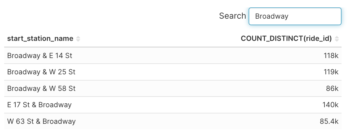
Search Box: if this checkbox is ticked, a search bar will be added for chart consumers to search the filtered data in your table.
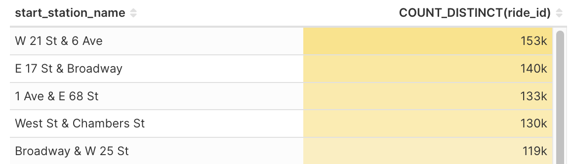
Cell Bars: if this checkbox is ticked, cells with numerical values will be shaded by the magnitude of the value.
Color +/-: if this checkbox is ticked, cells with numerical values will be colorized if they are positive or negative.
Allows Columns to be Rearranged: if this checkbox is ticked, users can temporarily change the order of the columns in the chart.
Customize Columns: additional options for column width and text alignment.
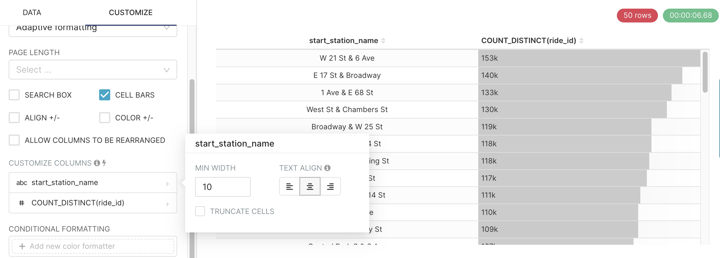
Conditional Formatting: add criteria for conditionally coloring values in columns based on their magnitude.
Any Interactive Table customization that are done in the Chart Builder will be saved when you save your chart.
When your Interactive Table is added to a dashboard, users are able to make customizations within the Interactive Table as they explore their data, but changes will not be saved.