The graph chart lets you visualize links between categories. The circles represent separate categories or entities while the lines connecting the circles, also called edges, represent the links between these categories. Here are some examples:
 Reference Content
The following articles may be useful resources as you build your chart:
- Creating a Chart: A walkthrough of the overall process of chart selection and creation.
- Using Preset Chart Builder: How to work with the Chart Builder page, the primary interface used when creating a chart.
Creating a Basic Graph Chart
Understanding the Shape of the Data
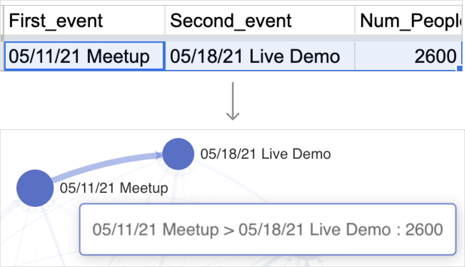
To create a graph chart, it's crucial to first understand how your data should be structured in your database and how it will be transformed through the options you select in Chart Builder. Here's a concrete example of a single data point that specifies both circles and the connecting line between them.
Here are the options you have in Chart Builder to re-shape your data.
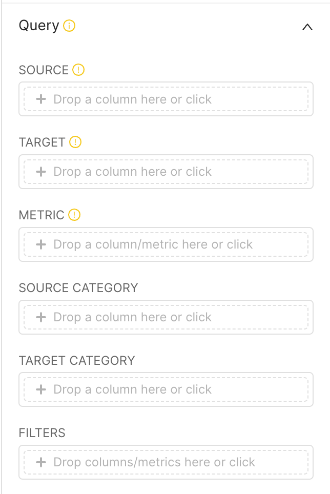 | In Chart Builder, you're required to select a Source column, a Target column, and a Metric to apply. For every unique group-by value in both the Source and Target columns you chose:
|
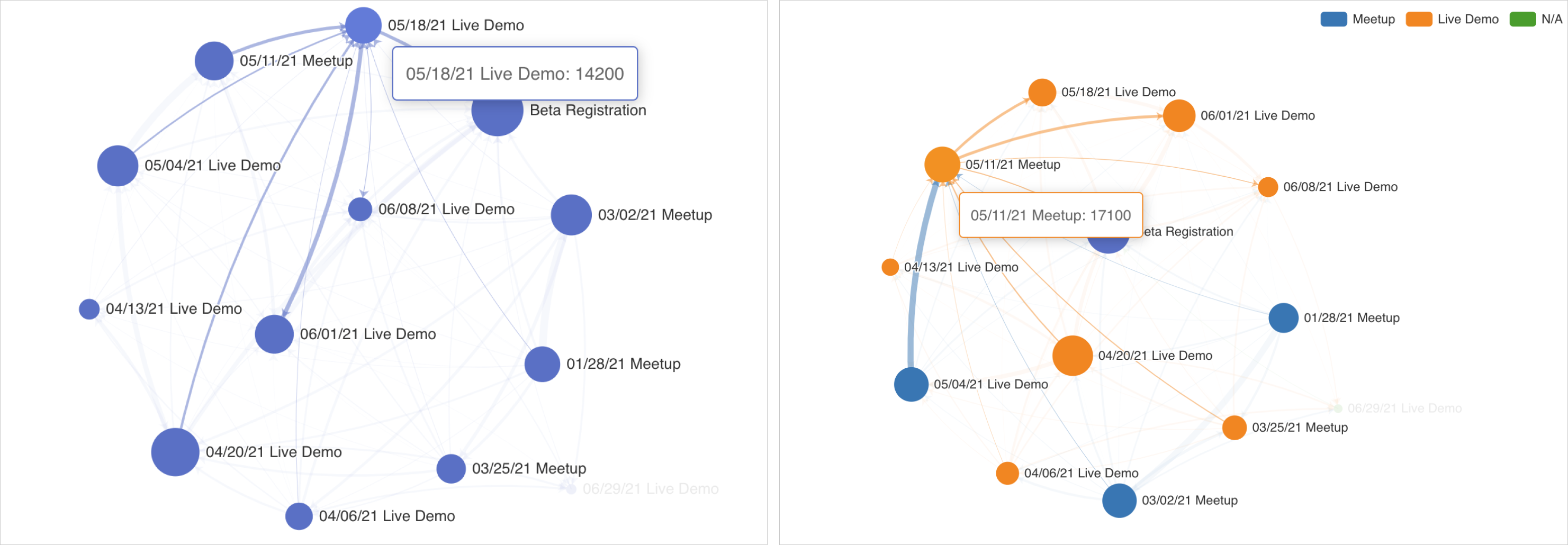
The size of each node is calculated by summing all of the metric values linked to the edges pointing to or from the node. The following screenshot showcases 2 nodes and their relevant areas:
.png)
From Un-Aggregated Data
If your data is not already aggregated along the pair-wise values in the Source and Target columns, then you'll need to use the Metric option in Chart Builder to aggregate the data.
.png)
From Pre-Aggregated Data
If your data is already aggregated along the pair-wise values in the Source and Target columns, then you just need to select an aggregate function that will return the same value (e.g. MAX or MIN are good choices).
.png)
Creating a Graph Chart with Dimensions
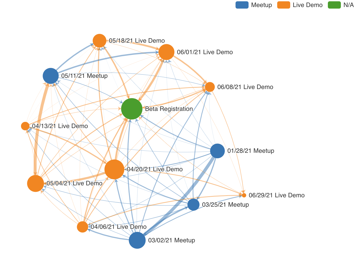
To add extra dimensionality to your charts, you can optionally chose a column to be used for coloring the graph chart.
- We recommend using either the Source Category or the Target Category option for the best charting experience.
- Whichever one you use, the unique values in the selected column will be used to generate the colors.
- For missing values, the value N/A will be used.
Customizing your Graph Chart
The Customize panel for a graph chart exposes a large variety of options to further clarify your chart.
Enabling or Disabling the Legend
- Show Legend: Check or uncheck this checkbox to show or hide the legend. The legend is only used to show the dimensions, if you chose any, and the colors they map to.
- Orientation: Choose the location of the legend
- Margin: Add any additional padding for the legend, in pixels
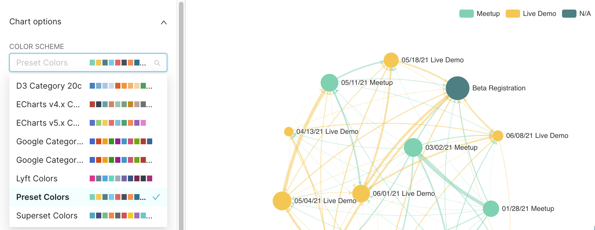
Color Scheme
Change the color palette used for coloring the nodes and edges in the chart.
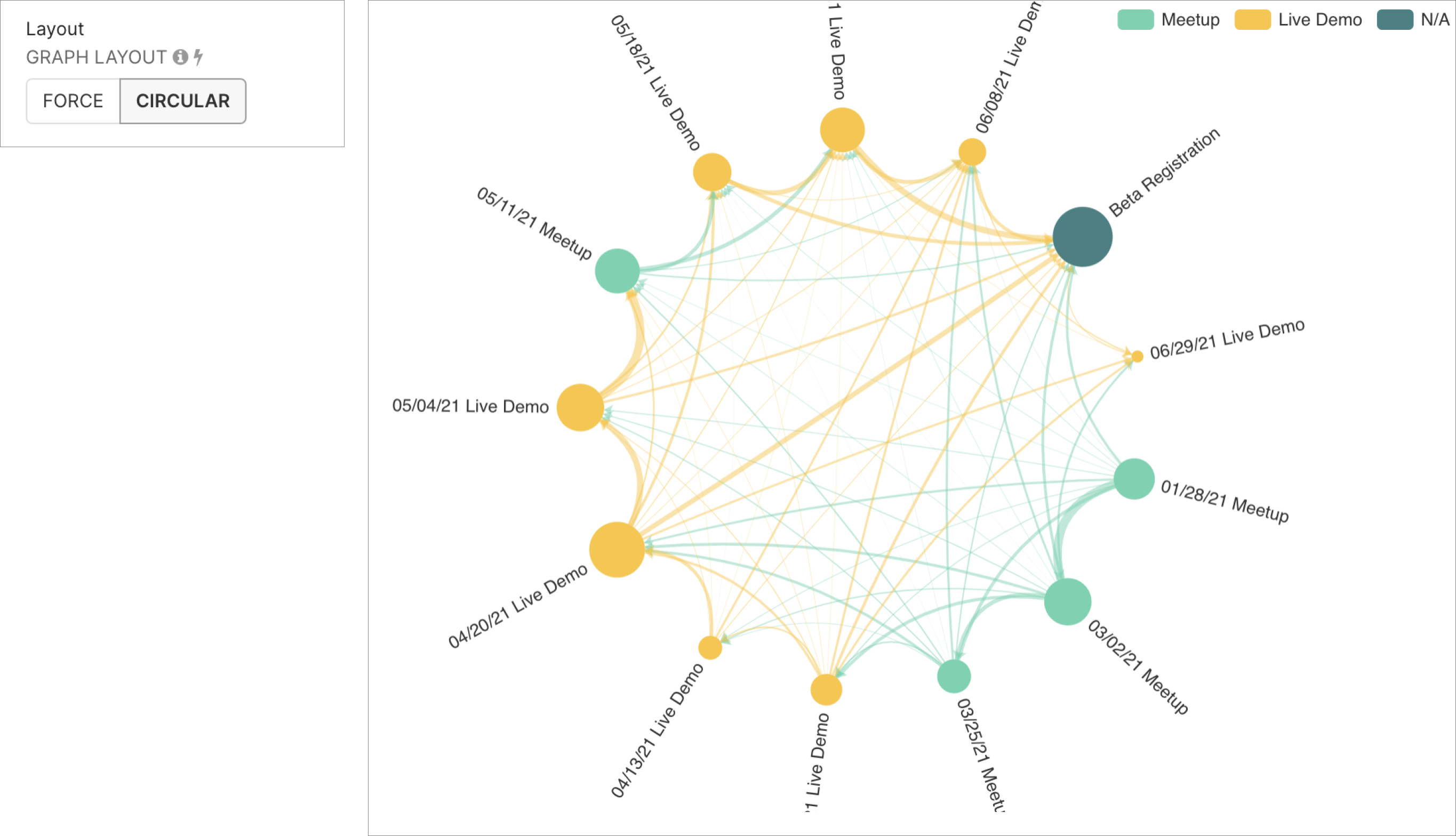
Circular Graph Chart
With a click of a button, you can switch from the default Force graph chart to the Circular graph chart.
Style of Edges
You can change how the ends of the edges, or connecting lines, are represented in your graph chart using the Edge Symbols drop-down:
- None-None: no arrows, just simple lines
- None-Arrow: arrow only on the side touching the Target column
- Circle-Circle: circle on each end
- Circle-Arrow: circle on the Source side, arrow on the Target side
Interaction Mechanisms
You can modify how end-users can interact with your graph chart:
- Enable Graph Roaming: If you are visualizing a large number of nodes and edges and notice a slow down while scaling and moving, we recommend disabling some of the behaviors.
- Move only: chart users can click and drag the chart view but not zoom in or out.
- Scale only: chart users can zoom in or out but not click and drag the chart view.
- Scale and Move: chart users can both zoom in or out or click and drag to move around the chart view.
- Disabled: fixed chart view, no scaling or moving
- Node Select Mode:
- Single: enable clicking and selecting an individual node
- Multiple: enable clicking and selecting multiple nodes
- Disabled: disable all clicking and selecting of nodes
- Label Threshold:
- Labels are only shown when computed metric value exceeds the value you specify here.
- Node Size: Median node size, largest node will be 4 times larger than the smallest.
- Edge Width: Median edge width, thickest edge will be 4 times thicker than the thinnest.