Overview
Customize your dashboards to improve the user experience and better align with the look and feel of your organization.
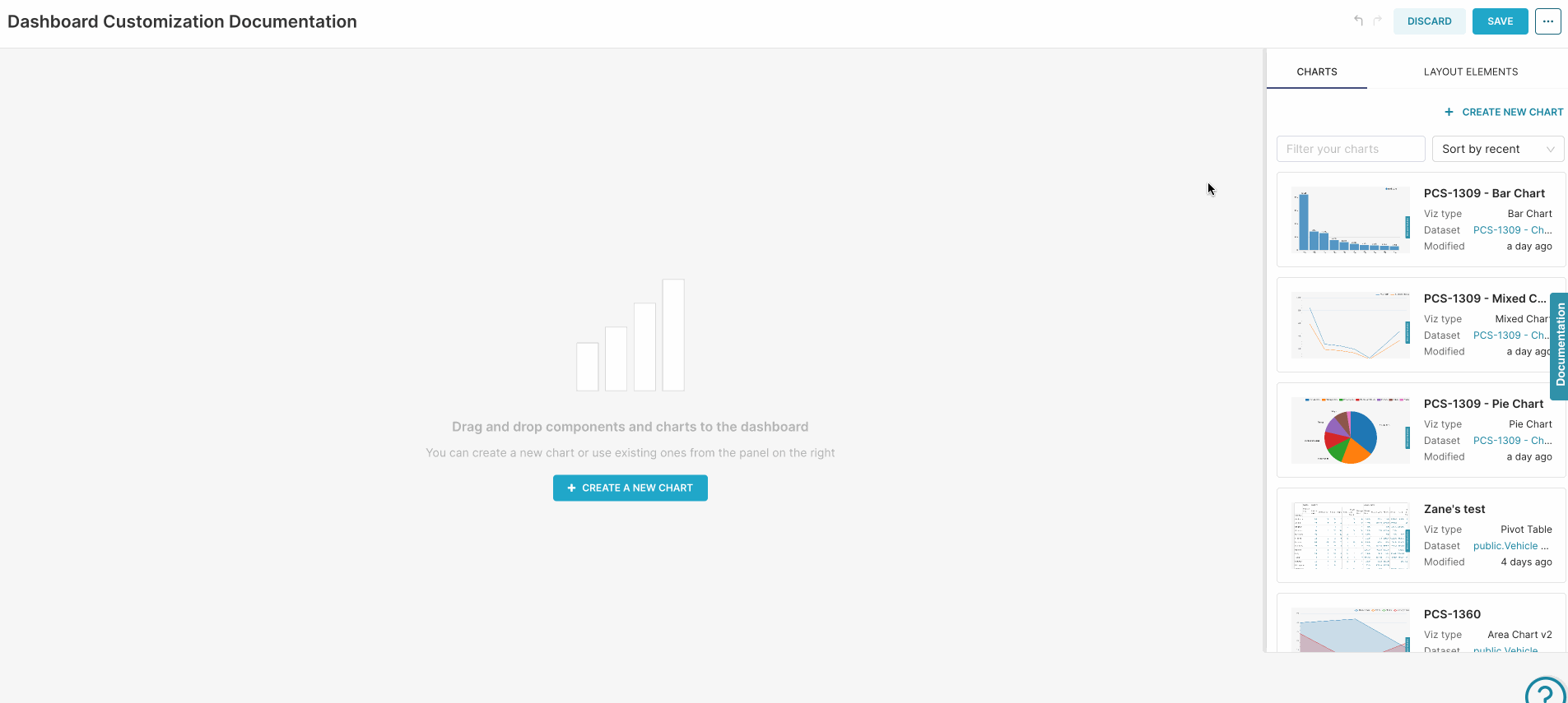
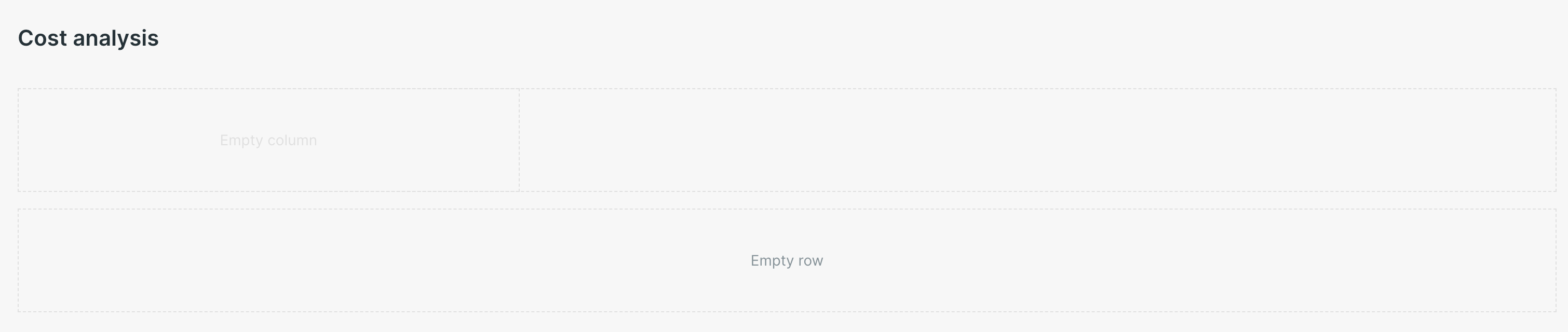
Dashboard Layout Elements
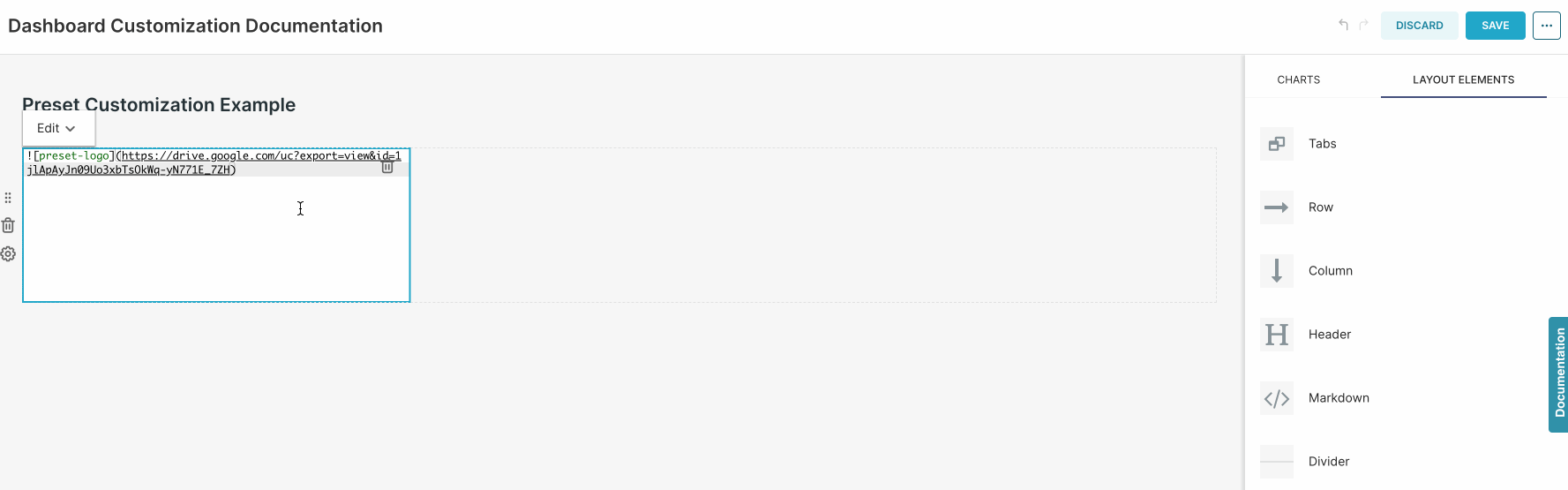
Superset has a variety of layout elements that can be used to organize and segment your content on dashboards. To add one, simply navigate to the LAYOUT ELEMENTS tab and drag and drop it to your dashboard:
Hover over the element, to view the options available - Note that you can either use a Transparent or White background for Rows, Columns and also Headers:
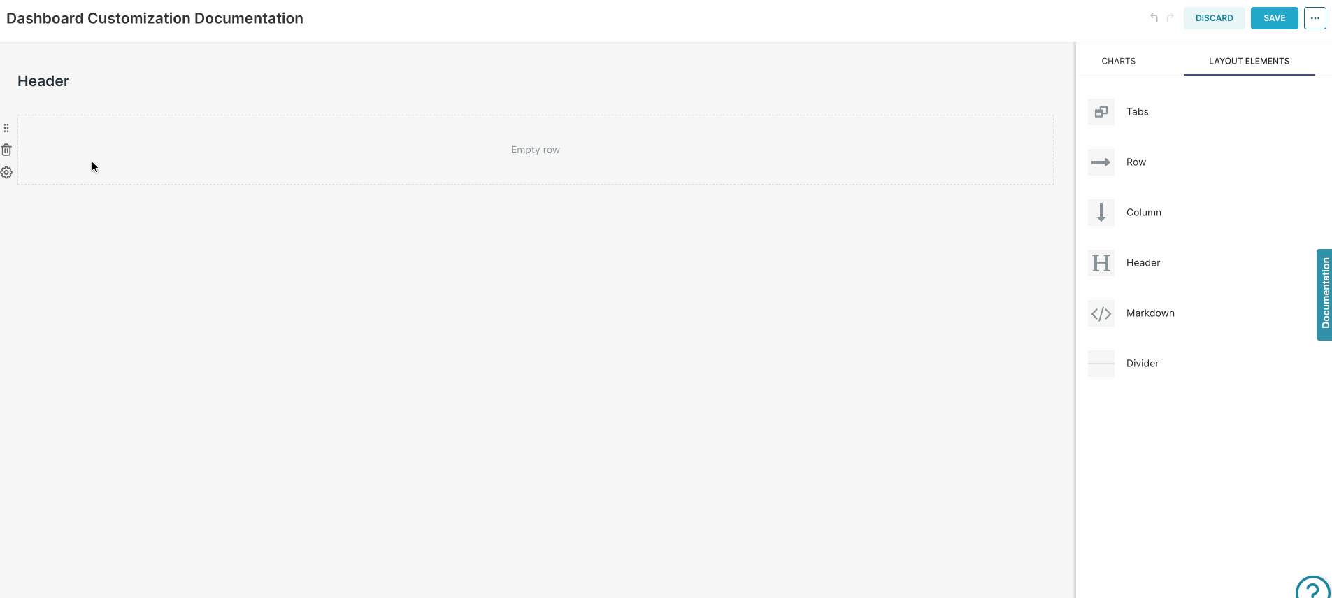
Let's take a closer look on the elements available:
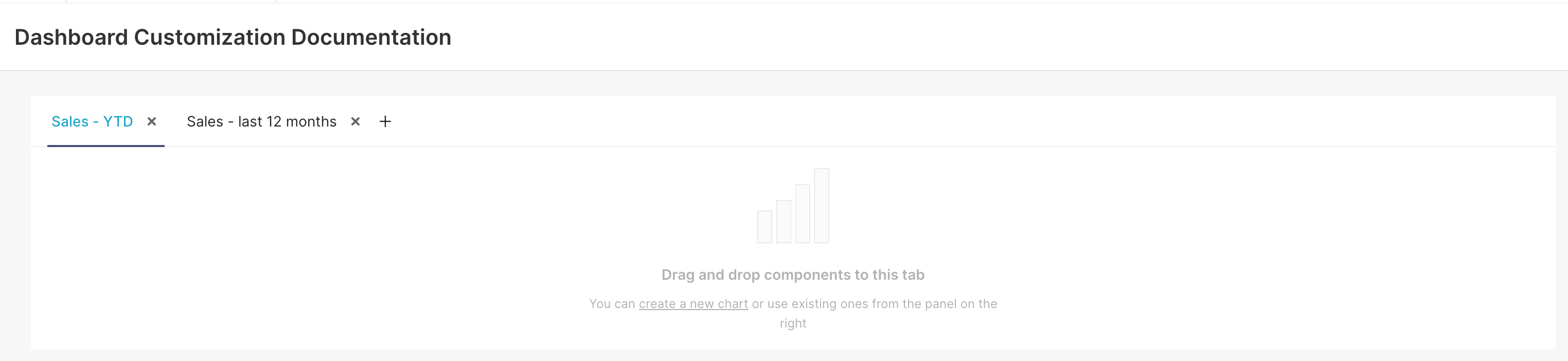
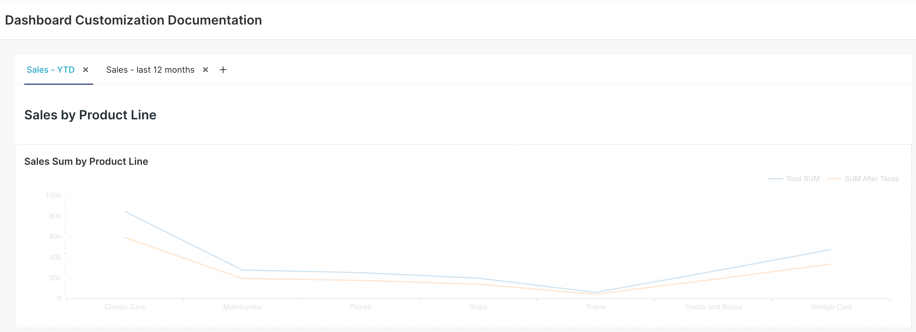
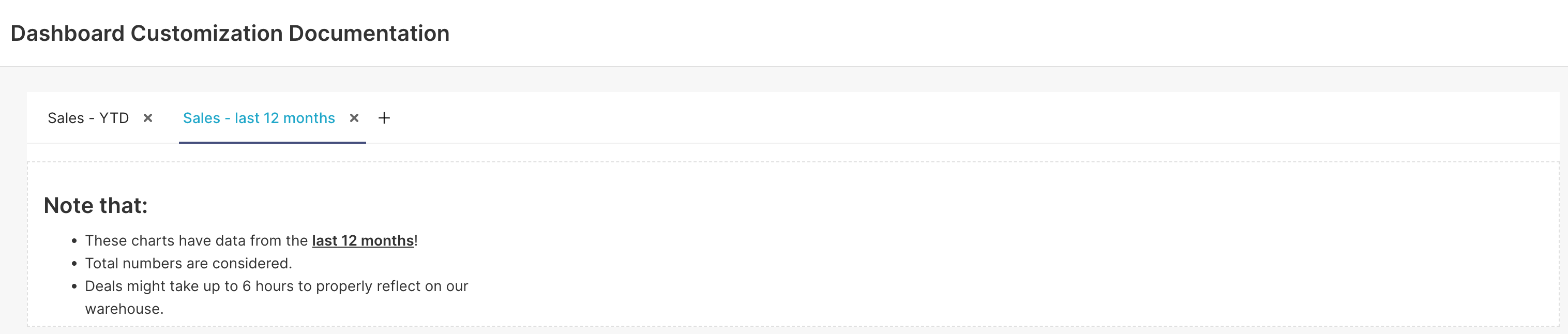
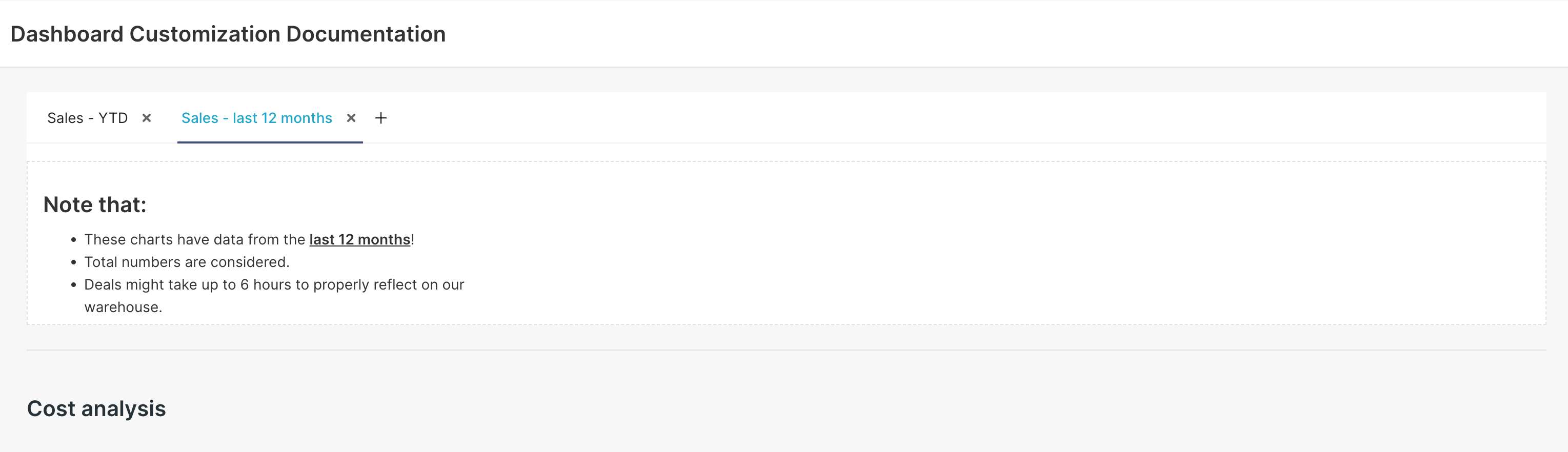
| Tabs are very useful to segment your charts into different groups. |
| Header is used to add titles. |
| Text can be used to add text and advanced features, such as images and HTML content. |
| Divider is useful to isolate parts of your dashboard. |
| Rows and Columns can be added to further configure the charts layout. |
Adding Images to Dashboards
Superset allows you to add images based on URL to your dashboard.
Want to add an image from your computer?
You can upload the desired image to a Cloud hosting application (such as Google Drive) to add it to your dashboard. After uploading it to Google Drive:
Change the sharing settings to Anyone with the link.
Copy the image URL - it should be something according to this structure:
https://drive.google.com/file/d/{{FileID}}/view?usp=sharing.Get the
{{FileID}}from the link, and replace it on this structure:https://drive.google.com/thumbnail?id={{FileID}}&sz=w1000. Use this link to add the image to the dashboard, following the steps below.
There are two different ways to add an image to your dashboard:
Using HTML
This is the easiest way to add an image to your dashboard:
Add a Text element to your dashboard.
Create a new
<img>tag on it:
<img src="{{Image URL}}" width="{{Width}}" height="{{Height}}">
Replace:
{{Image URL}}with a link to your image (make sure that the image is accessible from the internet).{{Width}}with the desired image width (either inpxor%).{{Height}}with the desired height (either inpxor%).
Note that, if you set the width and height to 100%, the image size would fit the Text block, allowing you to control the image size via the Text element size:
.gif)
Using Markdown
Add a Text element to your dashboard.
Use below syntax to add the image:
Replace:
{{Image Name}}with a title for this image (this can to be used on CSS to style it).{{Image URL}}with a link to your image (make sure that the image is accessible from the internet).
Adding Tables to Dashboards
It's also possible to add tables to your dashboards, using HTML with the Text element. For example:
<table>
  <tr>
    <th>Header 01</th>
    <th>Header 02</th>
  </tr>
  <tr>
    <td>First Row First Column</td>
    <td>First Row Second Column</td>
  </tr>
  <tr>
    <td>Second Row First Column</td>
    <td>Second Row Second Column</td>
  </tr>
</table>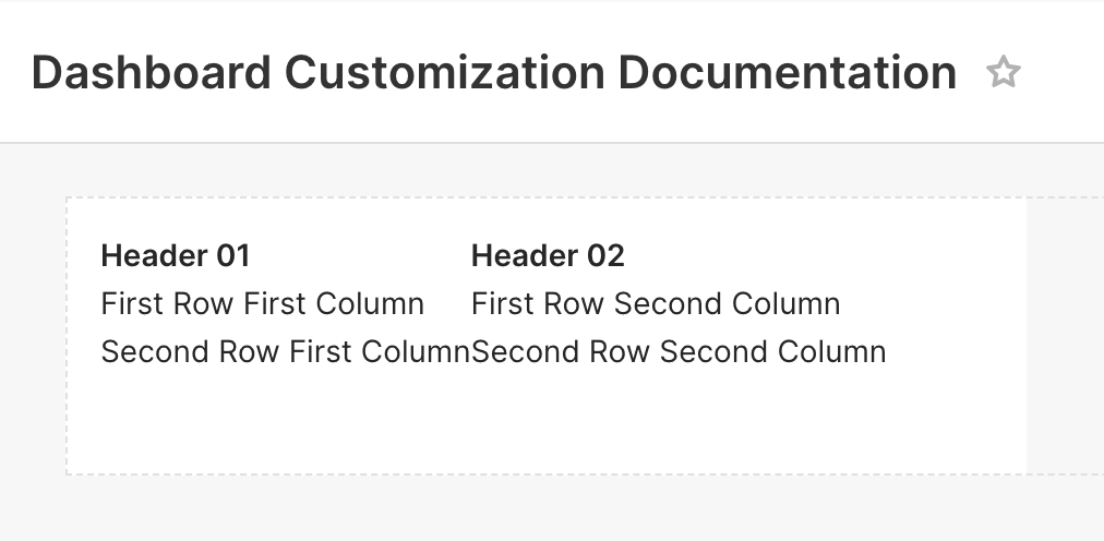
Table styling (borders, colors, size, etc) can also be configured via CSS.
Adding Iframes to Dashboards
Enablement required
Iframes are not supported in Text elements by default. A Team Admin must enable this feature and specify which domain(s) are allowed to be used in Iframe elements. To do so:
Access Preset Manager.
Click on the three ellipses on the top right corner of the Workspace tile > Edit Workspace Settings.
Navigate to the Iframes Tab and check the Enable Embedding Iframes in dashboard option.
Specify which domains are allowed to be used in iframe elements.
.gif)
It’s possible to add Iframes to dashboards to embed external websites:
Add a Text element to your dashboard.
Click on it to edit its content.
Use the
<iframe>tag. For example:# Preset Documentation <iframe src="https://docs.preset.io/docs/getting-started" width="100%" height="600" frameborder="0"> </iframe>Click outside the Text element, and the code will render the Iframe.

Color Palettes
As part of the chart creation process, creators specify a color palette for it. On the dashboard level, it is possible to specify a single categorical color palette that would be used by all charts on your dashboard - the chart color palette would still be used when viewing the chart directly, or on other dashboards. Today, the sequential color palette is specified at the chart level and can be configured from the "Chart Builder" view of the compatible charts (e.g., World Maps, Heatmap, Country Map, deck.gl Polygon).
To set up a dashboard-level color palette:
Access your dashboard.
Click on EDIT DASHBOARD, on the top right corner.
Click on the three ellipses on the top right corner > Edit properties.
Choose a palette under the COLOR SCHEME drop-down.
Save changes.
Superset would use the same color for metrics/dimensions displayed on multiple charts (in the same tab). However, if you want to have more control over the columns that are applied to each dimension, you can manually specify the colors (using hexadecimal or RGBA code) on the dashboard JSON metadata. To do so:
Access the dashboard.
Click on EDIT DASHBOARD, on the top right corner.
Click on the three ellipsis (...) > Edit properties.
Expand the ADVANCED section.
Create a new section inside the JSON METADATA named
label_colors, specifying the desired colors for each metric/dimension. For example: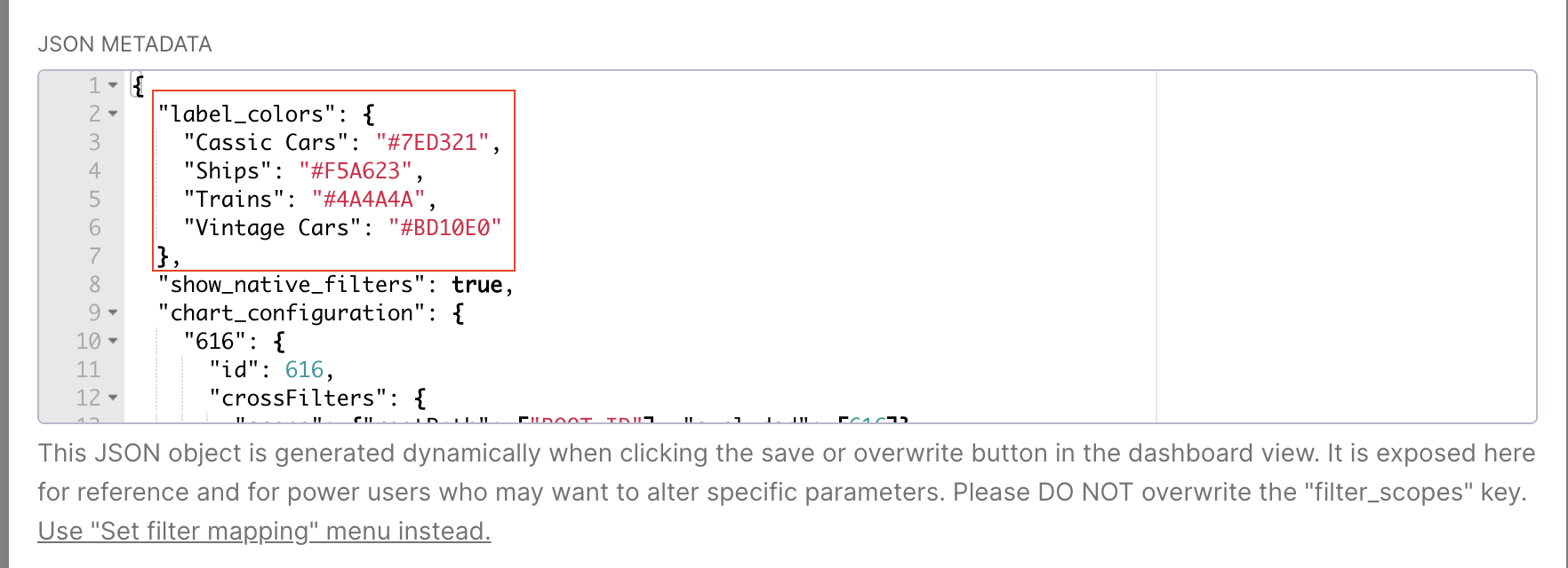
Creating a New Color Palette
Color Palette Builder
The Color Palette Builder is only available on the Enterprise plan.
Team Admins can add and configure custom color schemas to create charts and dashboards that match your brand’s look and feel.
There are two types of color palettes you can create in Preset:
Categorical: Color scales that distinguish between categories that don’t have an intrinsic order.
Sequential: Gradient color scales that go from bright to dark or the other way around.
Walkthrough:
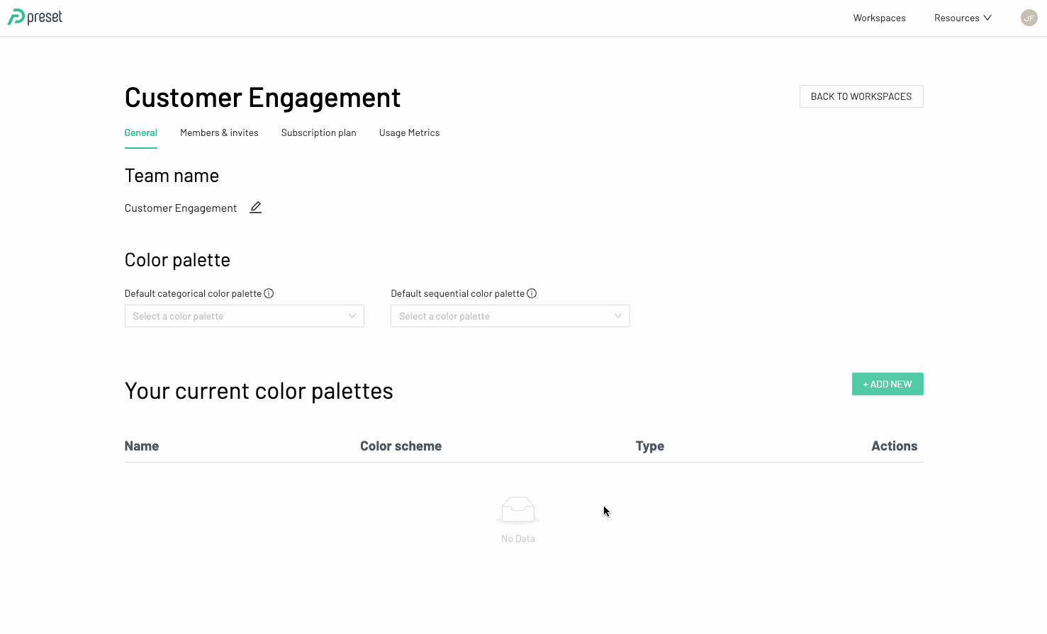
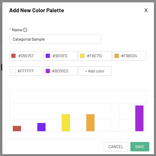
To add a new color palette:
From the Preset Manager page, select Manage Team. Under the General tab, Click on +Add New to create a new color palette.
Assign a “Name” to your color palette and choose a palette type.
Define color schema.
For a categorical color palette: Add at least 6 colors to create a palette
For a sequential color palette: Define the two colors to make the gradient. You may also add a middle color as an option.
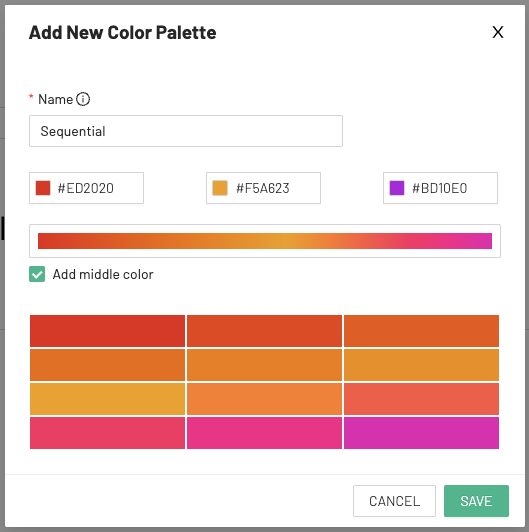
When finished, click to Save.
Setting a Default Color Palette
To set a default color palette:
From the Preset Manager page, select Manage Team.
Under the General tab, go to the dropdown "Default categorical color palette"
Select the color palette which will be used as the default for categorical charts types.
Repeat for the sequential drop down:
Go to the dropdown "Default sequential color palette"
Select the color palette check will be used be default for sequential charts types.
Sequential Chart types include:
Calendar Heatmap
Country Map
deck.gl Polygon
Heatmap
World Map
All other chart types are Categorical.
Permanently display chart descriptions in the dashboard
.png)
You can add descriptions to your charts to explain their purpose or provide extra context. If you want, you can also make these descriptions visible in the dashboard at all times, so users can easily understand the goal of each chart while exploring the data.
For this, you can implement this configuration through the dashboard JSON metadata. To do so:
Access your Workspace.
Navigate to Dashboards, in the top navigation bar.
Search for the dashboard you want to enable this option, and click on the pencil icon under the Actions column to modify its properties.
Expand the ADVANCED section to view the dashboard JSON metadata.
.png)
You should find a configuration for "expanded_slices" in the JSON. You can set the desired Chart IDs as true in this field so that they show the description by default.
For example, in this dashboard, I have two charts:
Chart ID 759.
Chart ID 765.
If I want to configure both to show their description by default, I would configure the field like this:
"expanded_slices": {
  "759": true,
  "765": true
},.png)
Once you edit that section, apply all these changes and reaccess your dashboard to see the descriptions.
You can locate the ID of each chart directly within the dashboard by hovering your cursor over the chart name. A URL will appear in the bottom-left corner of your screen. The chart ID corresponds to the value of the slice_id parameter in that URL:
.png)
Customizing Dashboards with CSS
Please see the related documentation page.