👤 This documentation is intended for Limited Creators, Secondary Creators, Primary Creators, and Workspace Admins. Check with your Team Admin for additional access.
Overview
There are two starting sources to use for creating a chart in Preset:
| Starting Data Source | Access Requirement |
|---|---|
| 1. Pre-saved Dataset | Limited Creators and above |
| 2. SQL Lab Query | Primary Creators and above |
How to create a chart?
From Any Page - Start with a dataset
Starting your chart creation with Physical or Virtual datasets allows your to scale chart building and re-use pre-defined metrics. Here's how to create a chart from anywhere in the product.
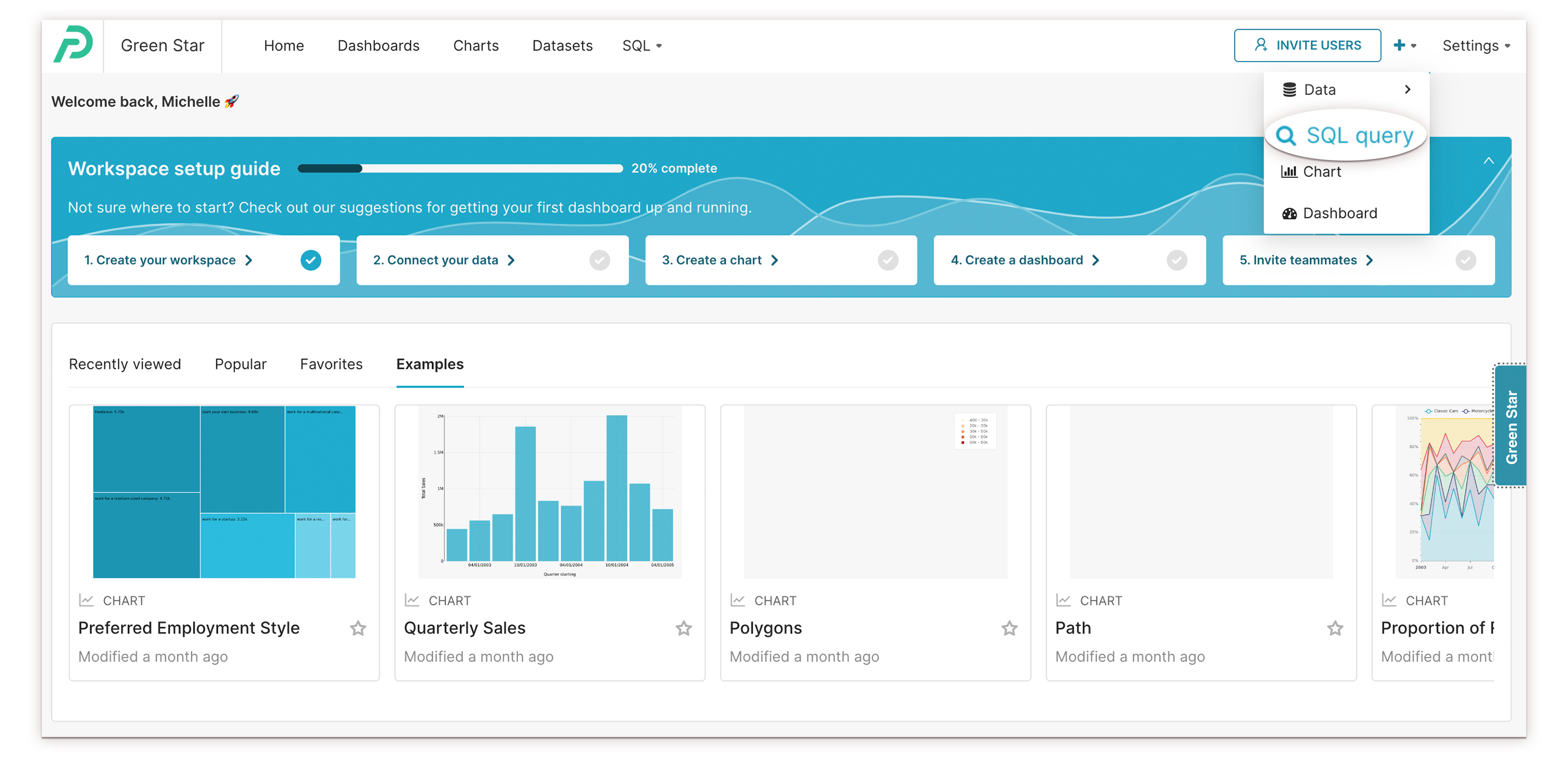
- In the top navigation, select the plus icon '+', and then, in the drop-down menu, select Chart.
.png)
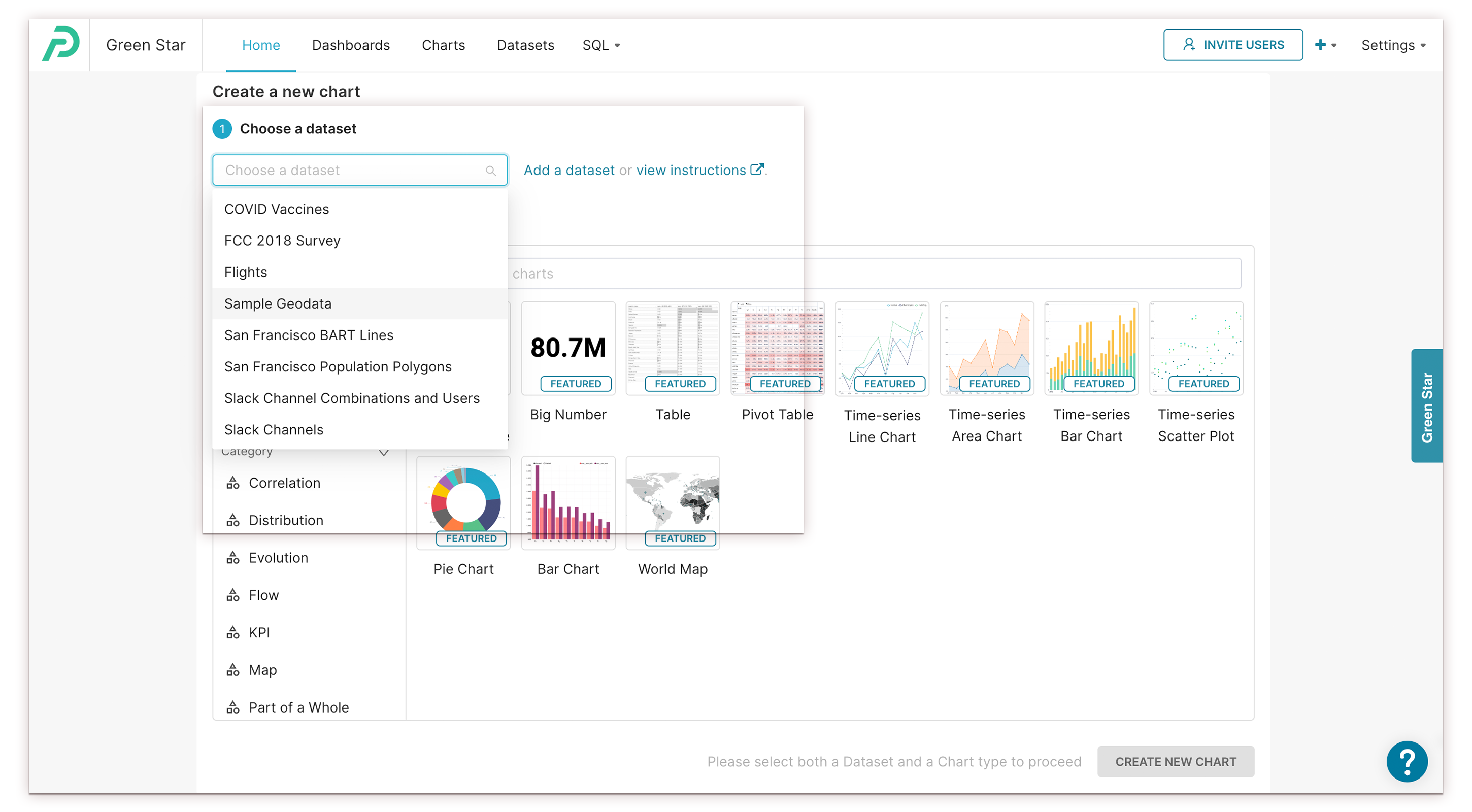
- The Create a new chart screen appears. In the Choose a Dataset field, select the drop-down arrow and then choose a dataset.
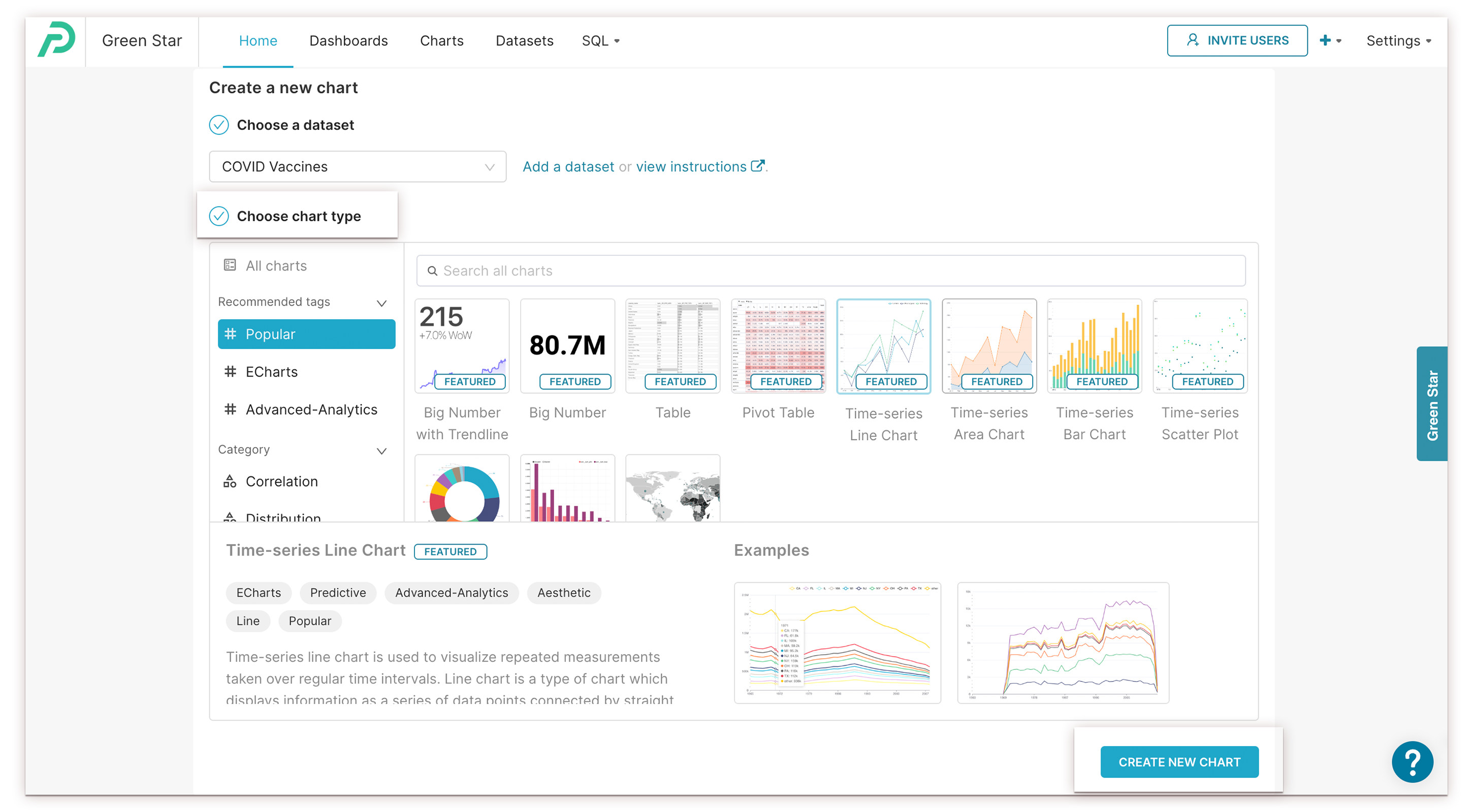
- Choose a chart type and click Create new chart. Preset recommends using charts with the FEATURED tag in the chart gallery. You can select the desired chart from the Create a new chart dialogue and change the chart type in the Data tab of Preset Chart Builder.
- To configure the chart, within the Chart Builder Page, drag entries from the Metrics and Columns panel on the left and drop them into the adjacent Configuration panel.
From SQL Lab - Start with a SQL Query
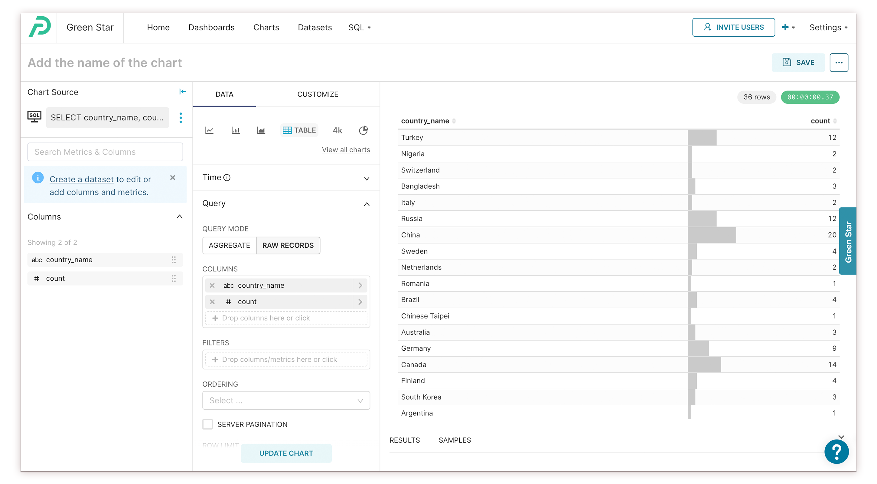
Alternatively, starting your chart creation with a SQL query provides you the flexibility to explore your data ad-hoc and decide how to define new metrics. Here's how to create a chart from a SQL query.
- Navigate to SQL Query in the drop-down that appears when you hover over the '+' at the top right corner of the dashboard.
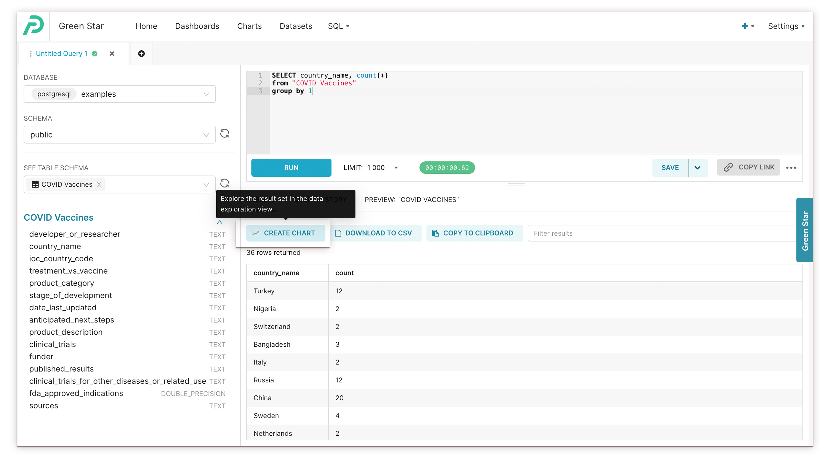
- Choose the right data source on the left-hand side, type in a SQL query in the text box, and click Run to expose the Create Chart button.

- Once it runs successfully, click Create Chart.
- To configure the chart, within the Chart Builder Page, drag entries from the Metrics and Columns panel on the left and drop them into the adjacent Configuration panel. Here's a preview of what your chart would look like.
Congratulations on your first chart! To learn more about configuring charts using the Chart Builder page, have a look at a more detailed walkthrough at Using Preset Chart Builder. You can also view example charts and walkthroughs.
Ready to start building collections of charts in a dashboard? Have a look at Creating a Dashboard to get started.