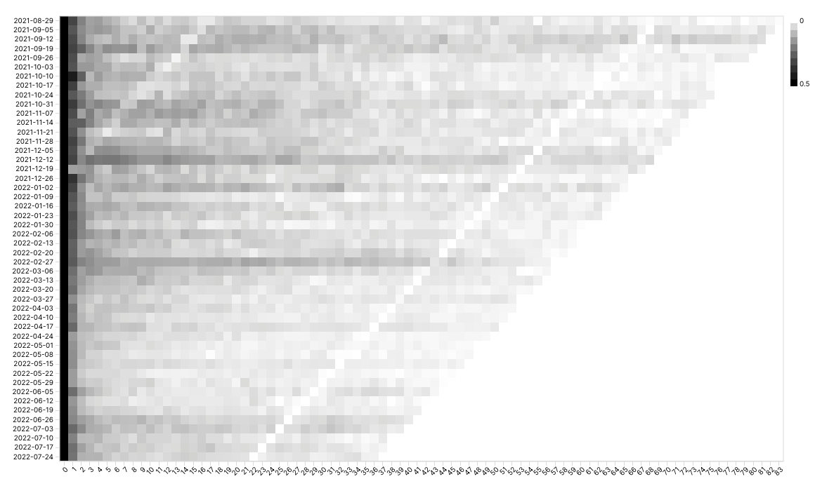
A heatmap chart or a cohort chart is a powerful analytical technique that involves analyzing and comparing groups of data that share similar characteristics or experiences over time. A cohort can be customers who made their first purchase in a specific month, users who signed up for a service in a particular year, or even origin city for flights.
Cohort analysis can generate 3-dimensional visual representations to compare across the X and Y axes, enabling you to compare a metric across different data segments over time. Here's are a couple of examples:
Reference Content
The following articles may be useful resources as you build your chart:
- Creating a Chart: A walkthrough of the overall process of chart selection and creation.
- Using Preset Chart Builder: How to work with the Chart Builder page, the primary interface used when creating a chart.
Creating a Heatmap / Cohort Chart
To create a cohort chart, you need to consider the following steps:
- Define the cohort
- Group data into different cohorts
- Define and calculate the metric across the cohort
Cohort Heatmap / Cohort Chart from Unaggregated Data
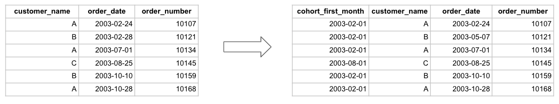
If you have unaggregated data for your cohort chart, you'll need to define and label the cohorts in your data ahead of time. Cohort can be created using a time based or categorical based factors.
X Axis
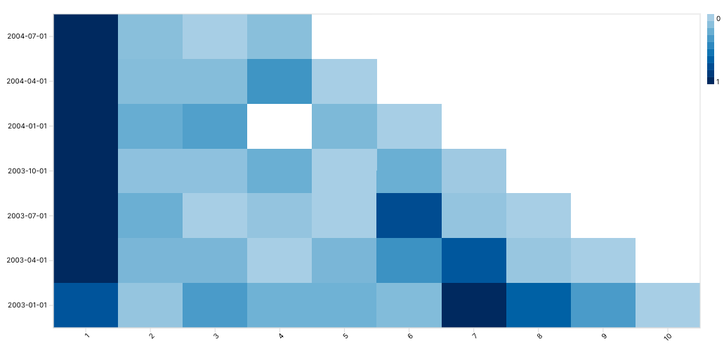
Here's an example of cohorts created using a time-based grouping.
In this example, we are cohorting using the first month that a customer has ever placed an order. This is a time-based category that can then be used to subdivides customers.
Y Axis
After defining this customer cohort, we will define how we are observing this cohort of customers over another dimension. If we would like to see how a cohort of customers' purchasing behavior over time, then time would be the second dimension used to pivot the data. In this example, we use number of quarters since first purchase as the second dimension.
Here's the resulting chart:
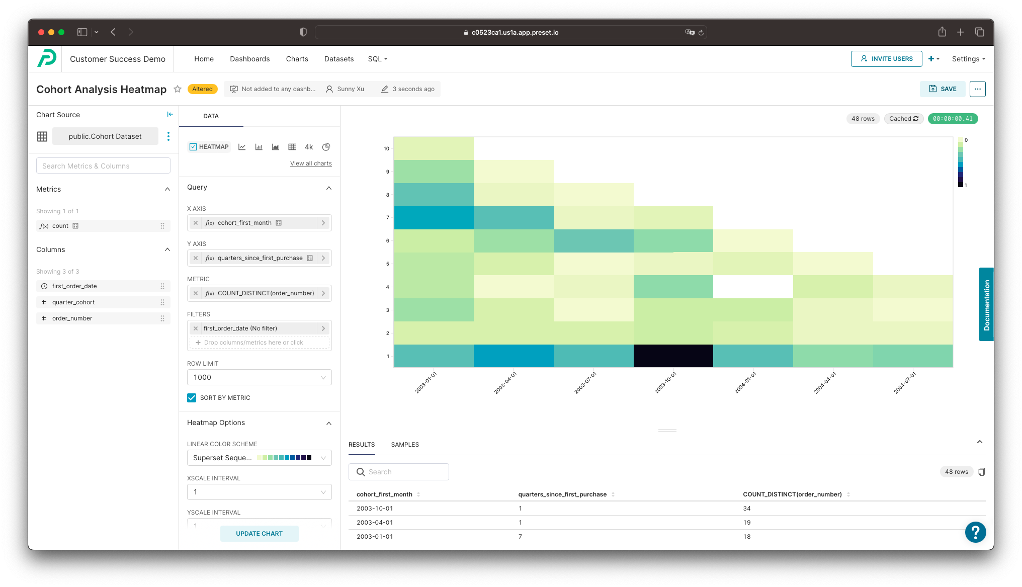
Here's an explanation of the selections we made in the chart builder interface to generate this chart.
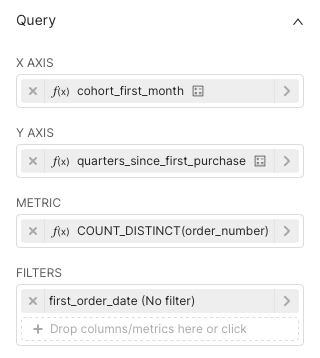
- X Axis: The month of the first purchase is the cohort that the customer belongs to
- Y Axis: For each new purchase made, we calculate how many quarter it has been since the first purchase
Customizing Your Heatmap / Cohort Chart
In the Data panel, below the Query section, we can see a large variety of options to further clarify your chart. Here's a breakdown of some of these fields:
- Linear Color Scheme: Color gradient of the resulting chart
- XScale/YScale Interval: Number of steps to take between ticks when displaying the X scale/Y scale
- Rendering: Image-rendering CSS attribute of the canvas object that defines how the browser scales up the image
- Normalize Across: Color will be shaded based the normalized (0% to 100%) value of a given cell against the other cells in the selected range:
- x: values are normalized within each column
- y: values are normalized within each row
- heatmap: values are normalized across the entire heatmap
- Left/Bottom Margin: Number of pixels, allowing for more room for axis labels
- Value Bounds: Hard value bounds applied for color coding. Is only relevant and applied when the normalization is applied against the whole heatmap.
- Value Format: Format values based on the D3 format
- Sort X/Y Axis: Order the X/Y axis values or metric values
- Legend: D3 Format: Format values based on the D3 format.
- Show Percentage: Whether to include the percentage in the tooltip
- Show Values: Whether to display the numerical values within the cells
- Normalized: Whether to apply a normal distribution based on rank on the color scale