Overview
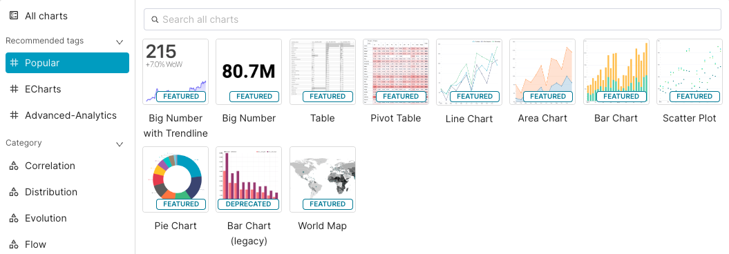
Preset offers many different charts designed to bring your data to life. If you'd like to get a quick look at all the possibilities, in the Toolbar just select + Chart and filter by All Charts:
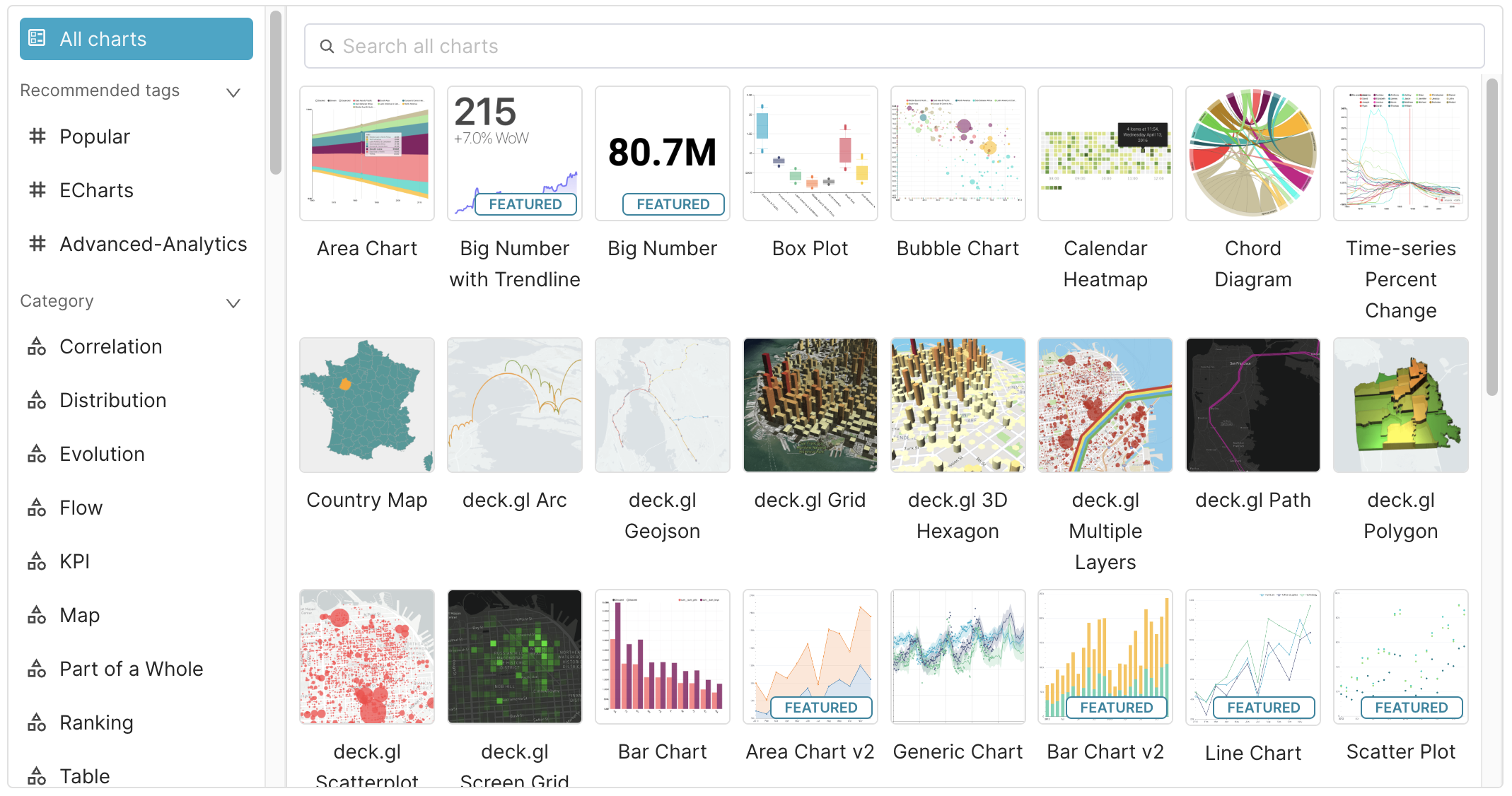
Chart Creation Walkthroughs
| Chart Name | Description |
|---|---|
| Area Chart | Uses the changing area under the lines to visualize how ratios, proportions, or percentages of metric(s) change over a dimension (e.g., time). |
| Bar Chart | Uses bars to visualize how metric(s) change over a dimension (e.g., time). |
| Bar Chart (legacy) | Bar charts provide an easy-to-understand way to visually convey categorical data. |
| Big Number | Useful for emphasizing a single metric or KPI at a specific point in time. |
| Big Number with Trendline | Variation of Big Number chart that also includes trendline to showcase recent changes in the metric. |
| Funnel Chart | Uses the thickness of the components of a physical funnel to showcase the different stages of a pipeline in your operations. |
| Gauge Chart | This chart type re-uses gauges from the scientific and industrial settings to showcase partial progress towards a specific number. |
| Graph Chart | Visualizes connected objects or events using nodes/circles and edges/connected lines between nodes. |
| Line Chart | Uses lines to visualize how metric(s) change over a dimension (e.g., time). |
| Mixed Chart | Combine multiple visualizations within a single chart container, using a shared X-axis. |
| Pie Chart | A circular statistical graphic that shows the proportion of different data conveyed as slices within a circle (i.e., pie). |
| Pivot Table | Table of grouped values that aggregates the individual items of a more extensive table within one or more discrete categories. |
| Radar Chart | A radar chart lets you visualize a parallel set of metrics across multiple groups or categories. |
| Sankey Diagram | A flow diagram that conveys the relative size of metric data based on the size of flow lines from a source to a target. |
| Scatter Plot | Uses dots to visualize how metric(s) change over a dimension (e.g., time). |
| Smooth Line Plot | Variation of the line chart that connects smooths out the line connecting two data points. |
| Stepped Line Chart | Variation of the line chart that connects two data points using 90-degree stepped lines. |
| Table Chart | Classic row-by-column spreadsheet-like view of a dataset. Use tables to showcase a view of the underlying data or to show aggregated metrics. |
| Tree Chart | A tree chart excels at visualizing hierarchy. |
| Treemap | A tree map uses scaled rectangles to visualize the same metric across multiple different groups. |
Recommended Chart Types
Preset actively maintains and supports its Featured Charts, noted with the "FEATURED" badge in the chart picker. While Preset supports over 50 chart types, Featured Charts receive the most upgrades and bug fixes than other charts. Users are welcomed to contribute to the open source Superset repository for chart updates and bug fixes.