Big Number and Big Number with Trendline Charts
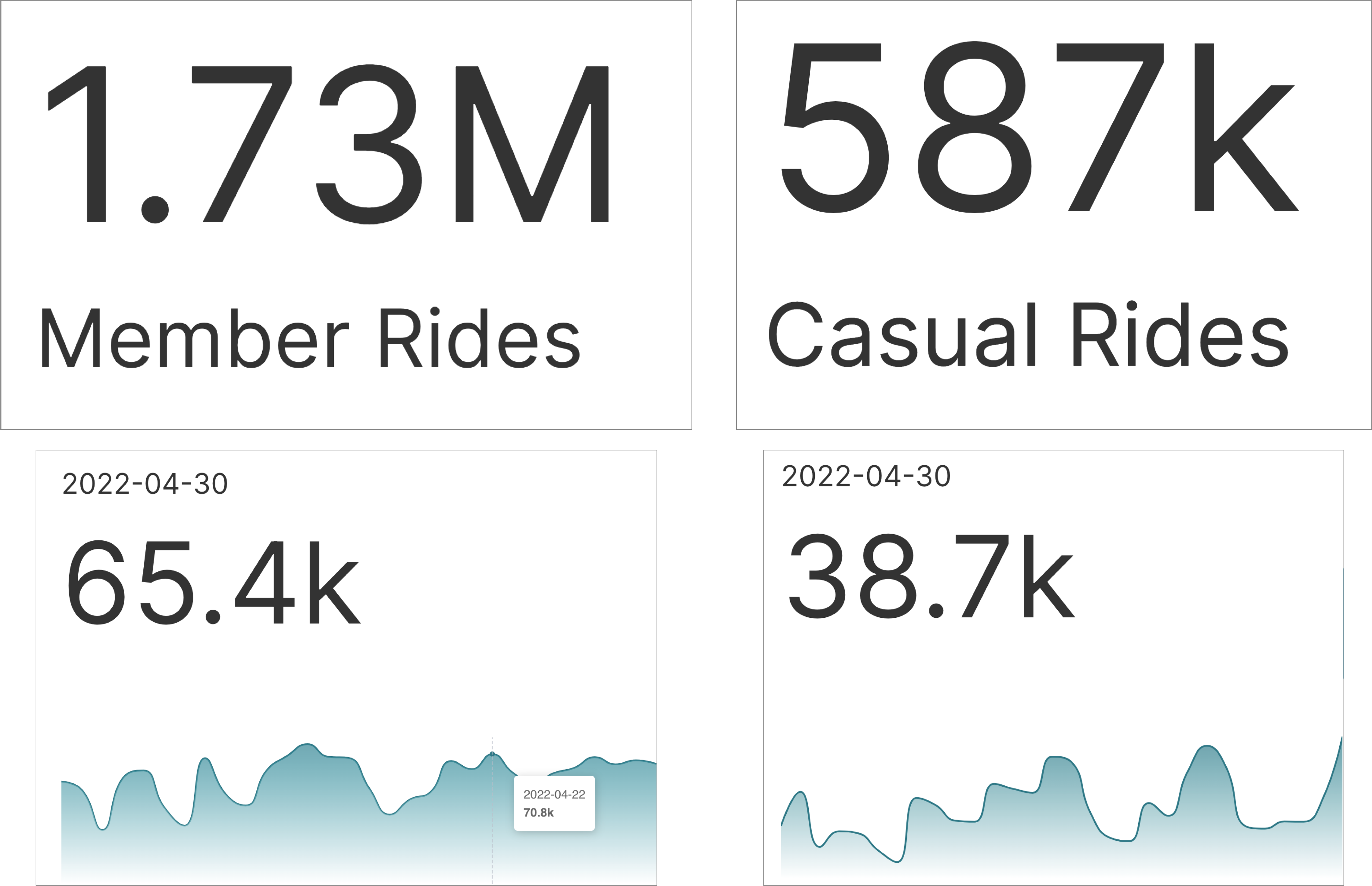
The Big Number chart lets you emphasize an important aggregate metric or KPI (key performance indicator). The Big Number with Trendline chart helps you emphasize the recent state of your aggregate metric and want to showcase a trendline. Here are some examples of both charts.
If you're new to visualizing data in Preset, we recommend the following reference articles:
- Creating a Chart: A walkthrough of the overall process of chart selection and creation.
- Using Preset Chart Builder: How to work with the Chart Builder page, the primary interface used when creating a chart.
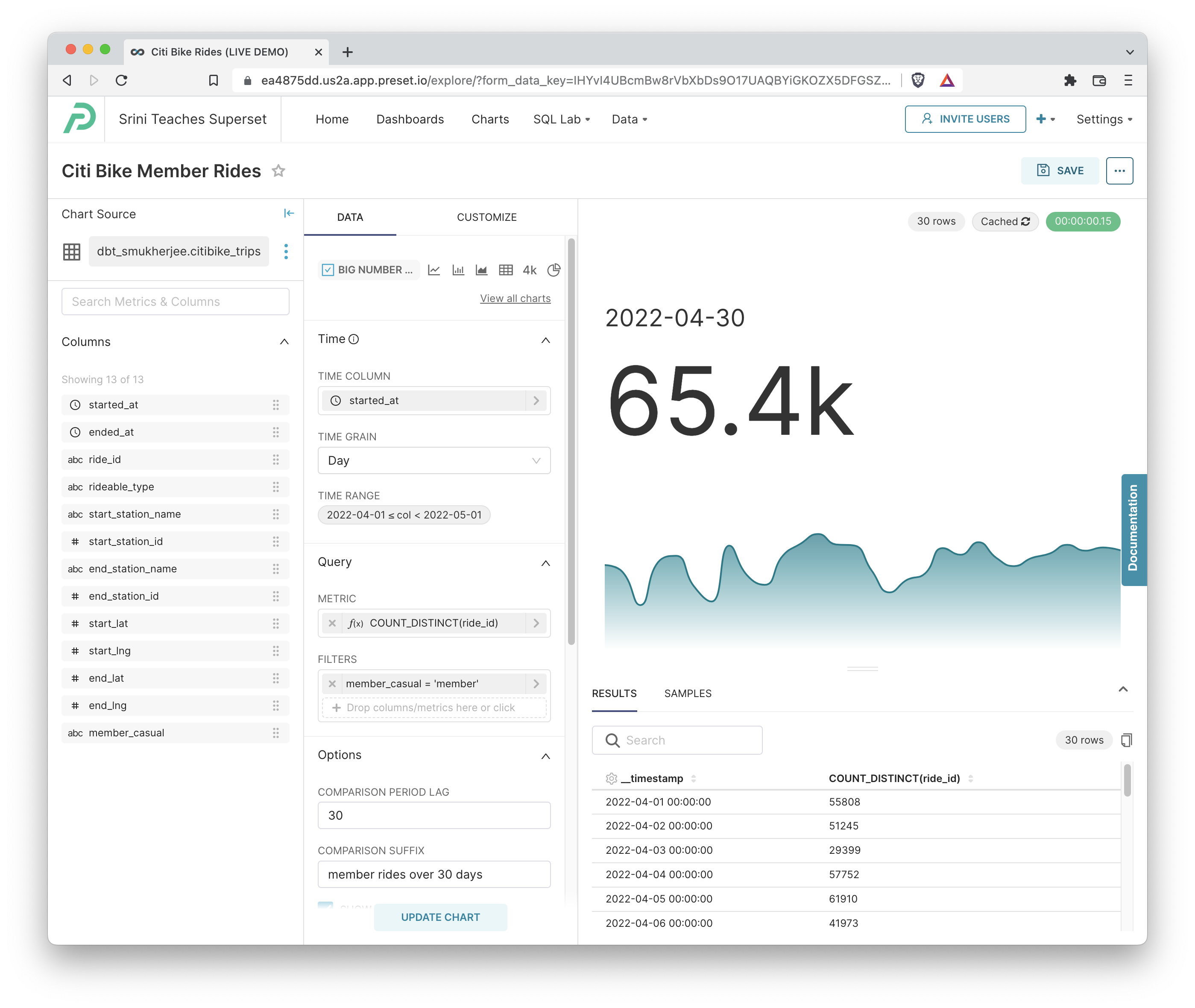
Creating a Big Number Chart
To create a basic Big Number chart, you need to define:
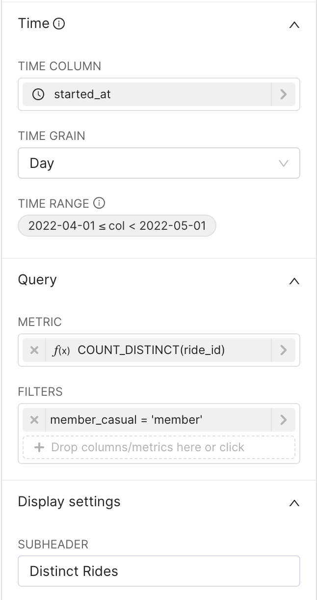 | Time (optional)
Filters (optional)
Subheader (optional)
|
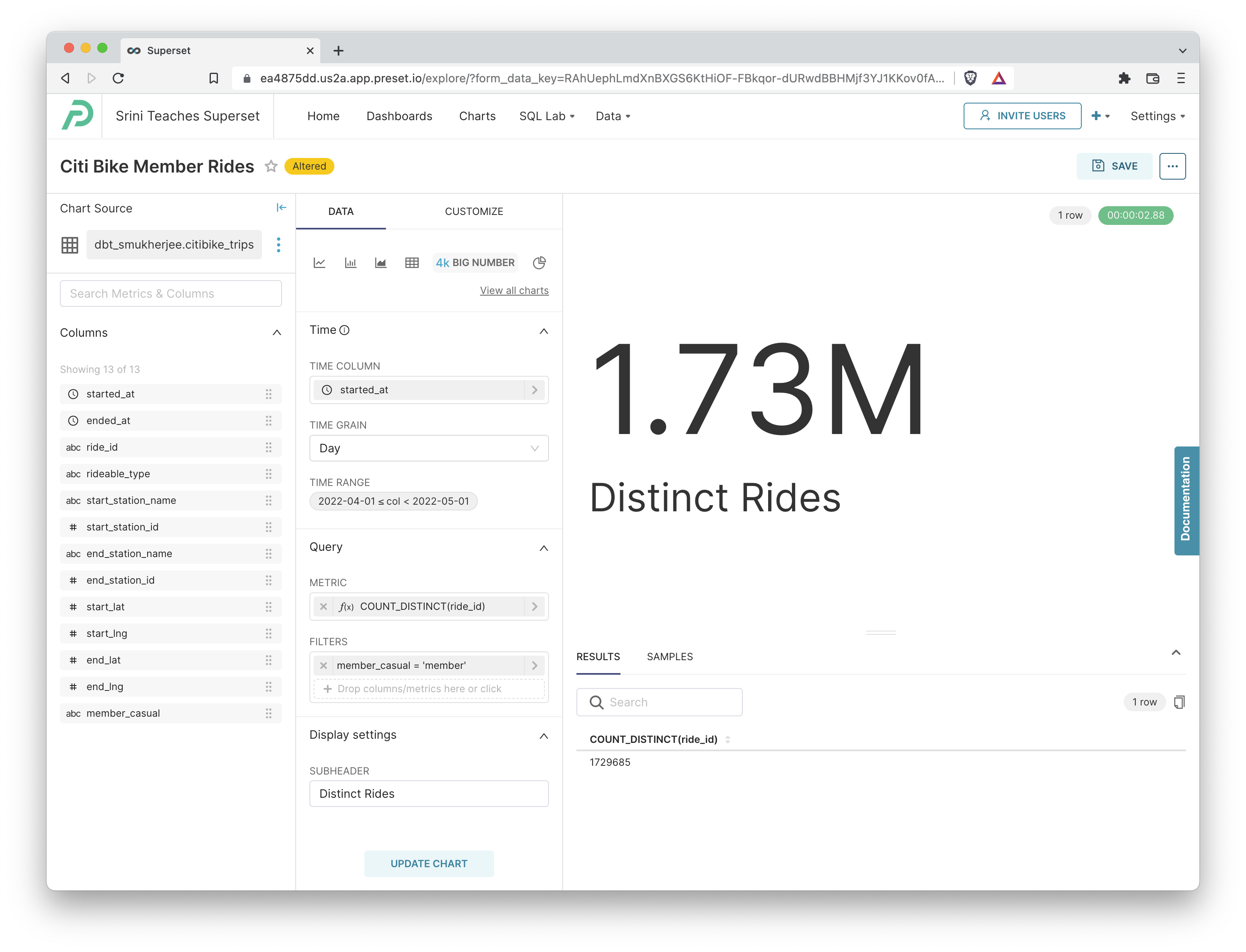
Click Create Chart or Update Chart to generate the queries, run the queries, and visualize the results.
Creating a Big Number with Trendline Chart
If you instead want to emphasize the recent state of your aggregate metric and want to showcase a trendline, you can use the Big Number with Trendline chart instead.
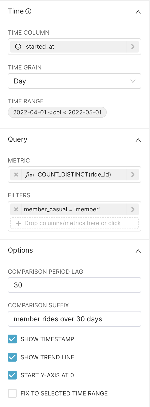 | Time (optional)
Filters (optional)
Options
|
Click Create Chart or Update Chart to generate the queries, run the queries, and visualize the results.
Here's the SQL query that was generated by Preset:
SELECT DATE_TRUNC('DAY', started_at) AS "__timestamp",
       count(DISTINCT ride_id) AS "COUNT_DISTINCT(ride_id)"
FROM dbt_smukherjee.citibike_trips
WHERE started_at >= '2022-04-01 00:00:00.000000'
  AND started_at < '2022-05-01 00:00:00.000000'
  AND member_casual = 'member'
GROUP BY DATE_TRUNC('DAY', started_at)
LIMIT 5000